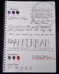
 P.W. Akkerman
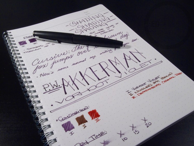
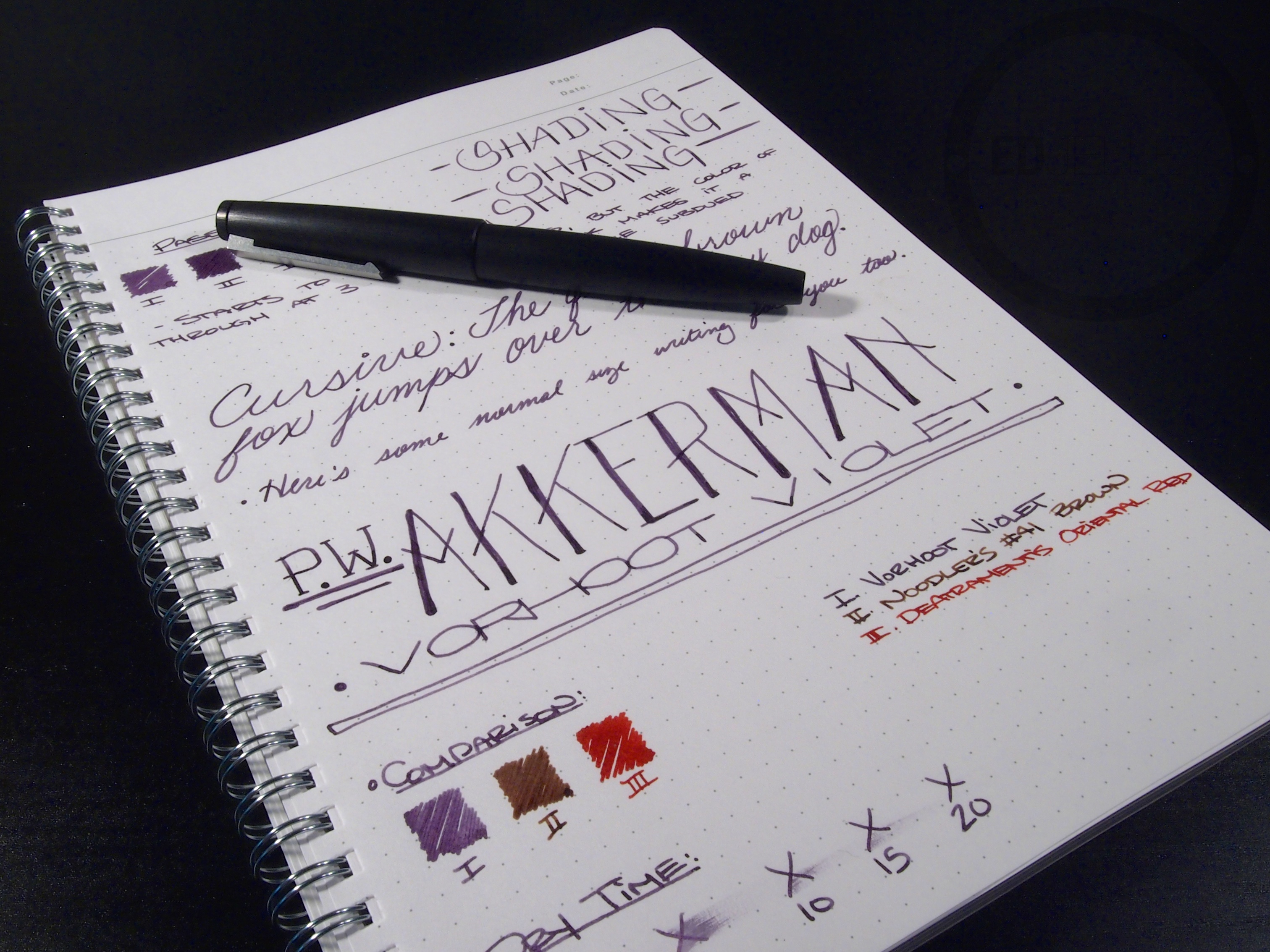
Vorhoot Violet
Fountain Pen Ink
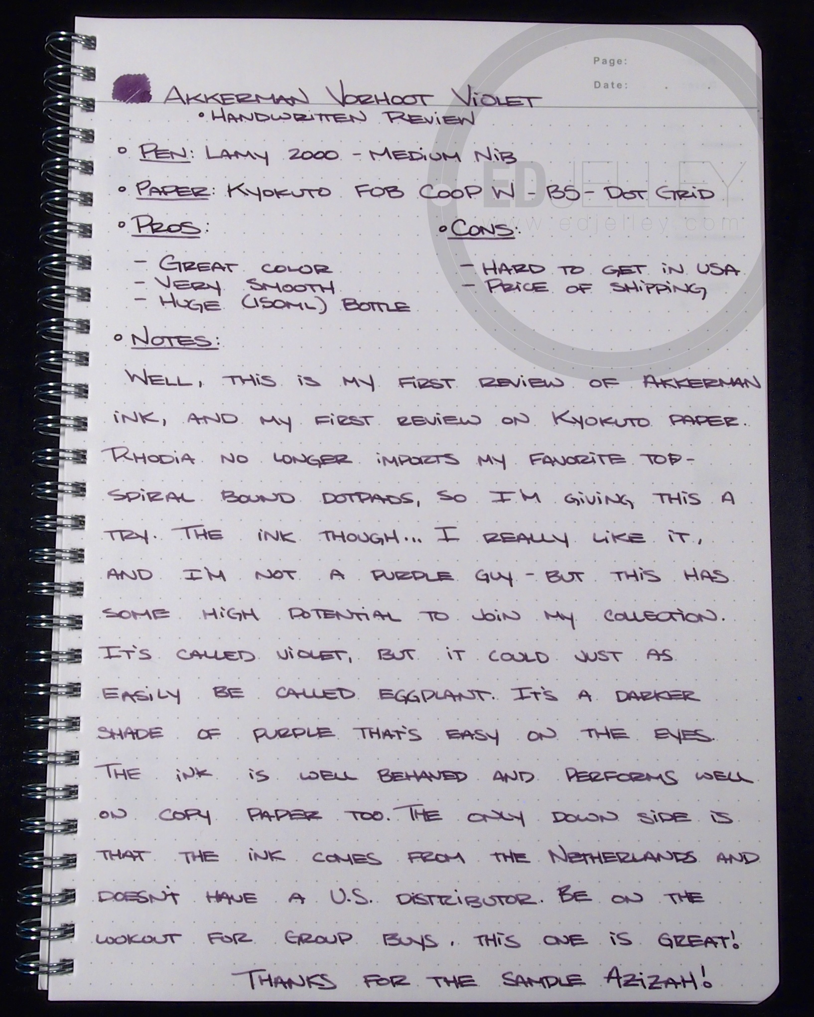
Handwritten Review
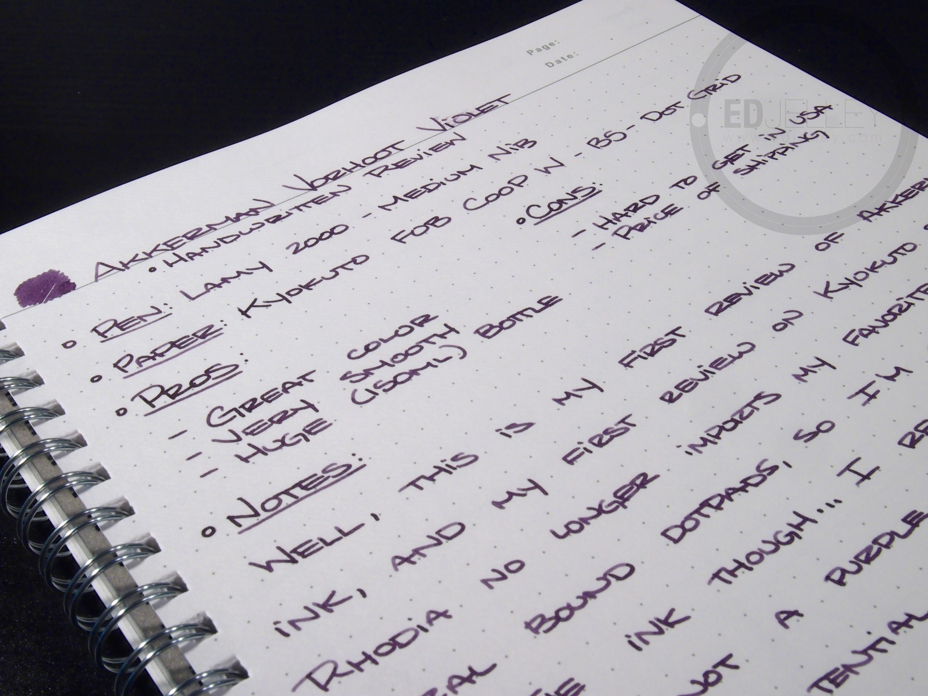
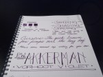
Pen: Lamy 2000 – Binderized Medium Nib
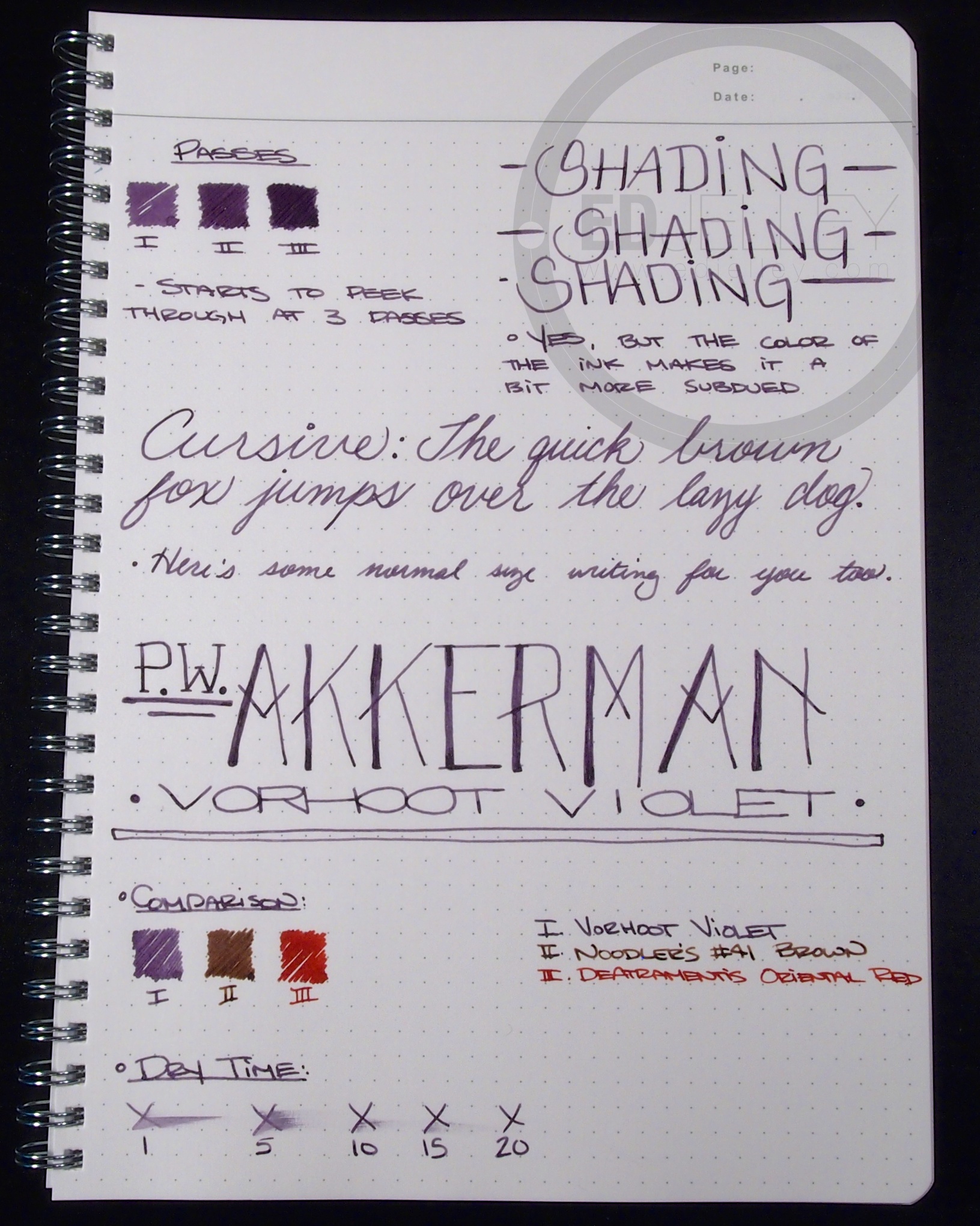
Ink: P.W. Akkerman Vorhoot Violet
Paper: Kyokuto F.O.B. COOP Dot Grid – B5 size
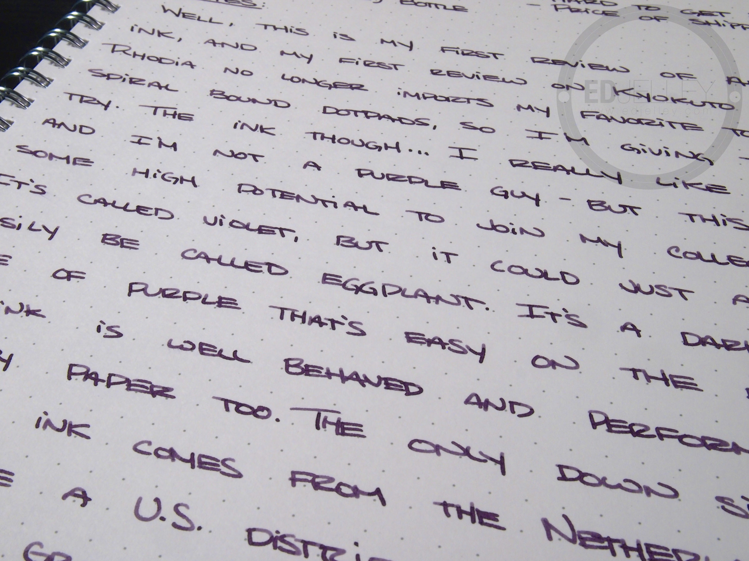
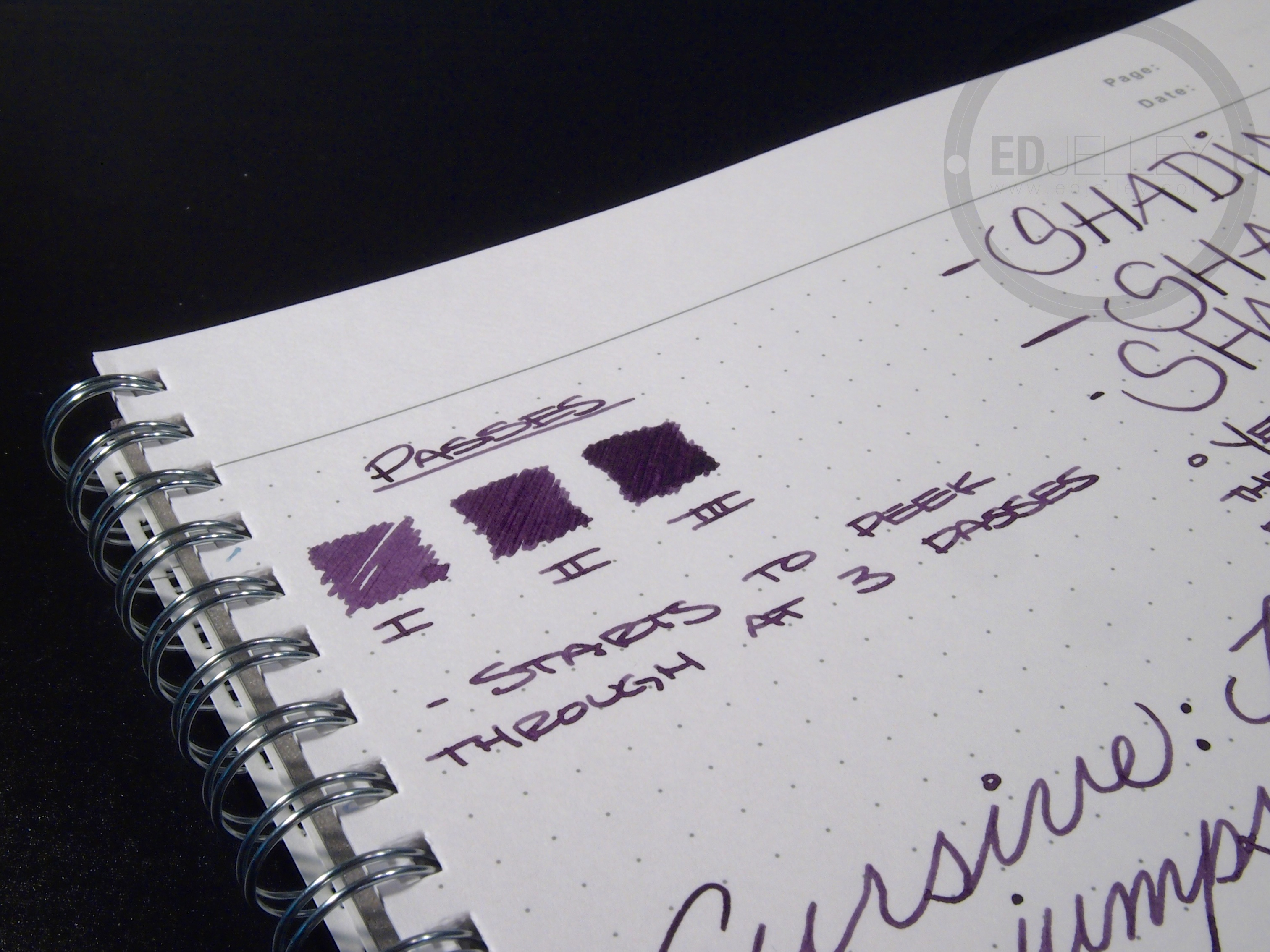
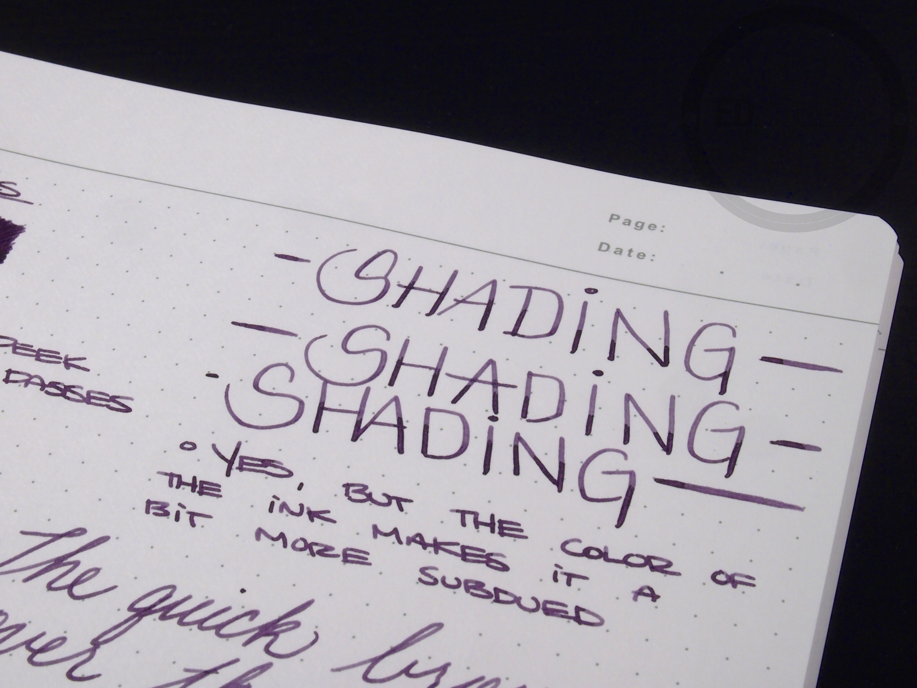
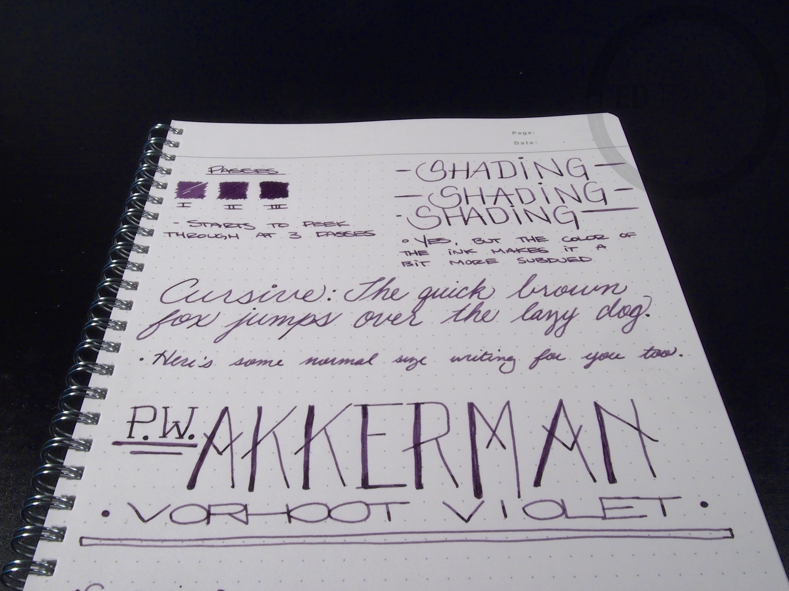
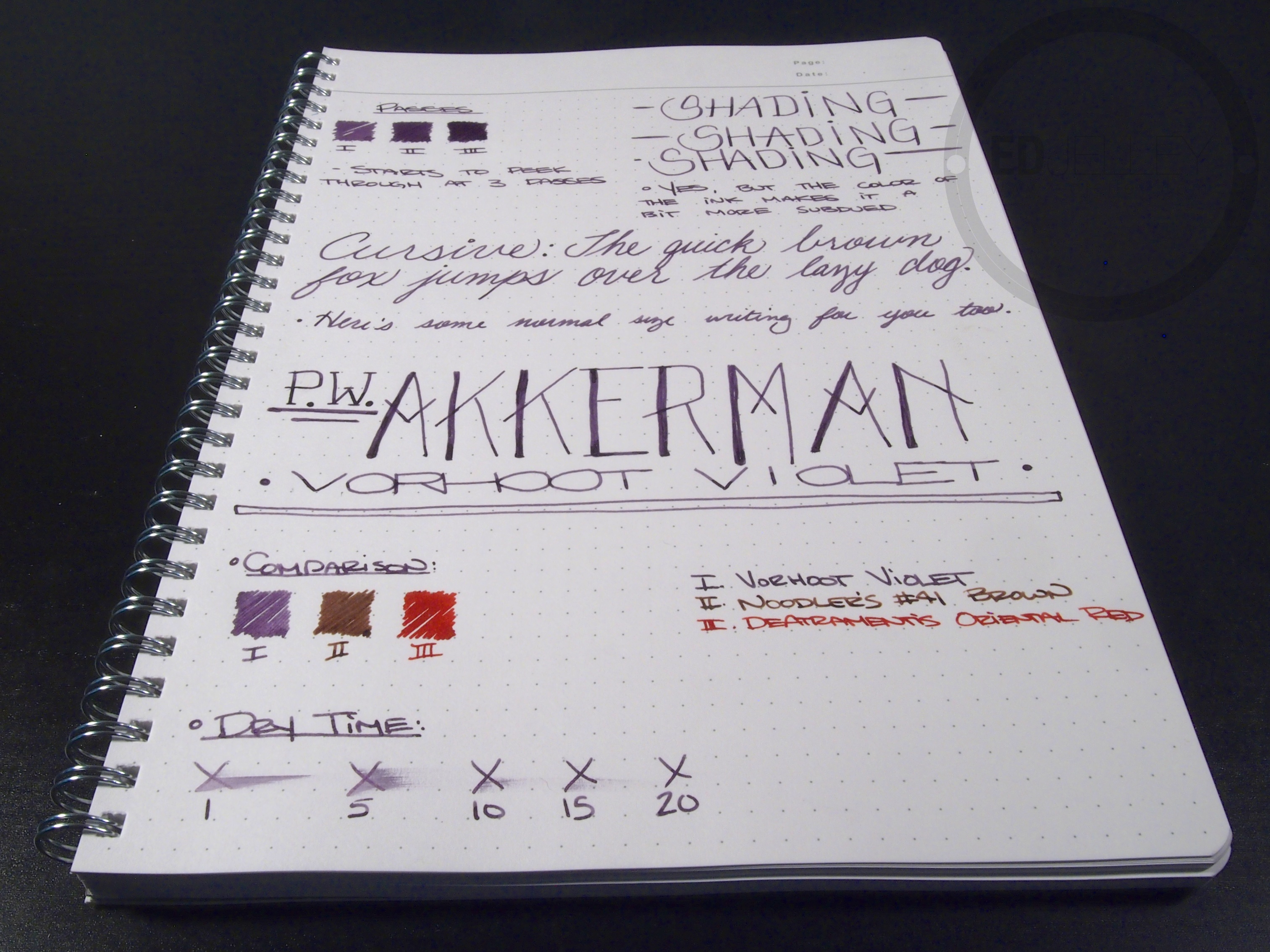
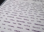
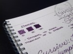
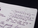
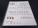
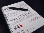
Notes: Well, this is my first review of Akkerman ink, and my first review on the new go-to ink review paper. The B5 is slightly larger than the Rhodia No. 16 pad I had previously been using. Exaclair no longer imports the spiral bound dot grid pads, which is quite upsetting. I hate to tear reviews out of a notepad just to photograph them. This paper is great, it’s bright, it’s dot grid, and it’s spiral bound. Look for a formal review in the near future. Back to the ink…I am pleasantly surprised with this ink, and I’m enjoying it quite a bit. I’m not a purple ink kind of guy, but Akkerman Vorhoot Violet has the potential to join my collection. It’s called violet, but when I think of violet, I think lighter purple. This could definitely be an ‘eggplant’ just as easily. It’s a darker shade of purple that’s easy on the eyes. On cream colored paper, the ink appears much darker. Vorhoot Violet is well behaved in my Lamy 2000, and performs well on both premium and run-of-the-mill copy paper. The only downside to this ink is it’s high price (due to shipping) and it’s location. The ink company is from the Netherlands, and is currently without a U.S. distributor. Be on the lookout on FPN for group buys, as they do pop up from time to time. This is a great ink, and anyone who likes purple (or doesn’t) should give it a try.
Huge thanks to Azizah over at Gourmet Pens for sending me the sample!
Thanks for reading and enjoy the pictures!
Pros:
- Great color
- Very smooth
- Huge (150ml) bottle makes the shipping cost easier to justify
Cons:
- No U.S. distributor…yet
- Price of shipping
Gallery:

Related Reading:

This ink shade is great! Glad the notebook is working out for you too. I have the exact same one sitting on my desk but was waiting to finish my latest Rhodia to make the switch. Paper seems excellent and the size is perfect for me.
Me too, it’s a good replacement. I think I’m liking the bigger size than my standard too. So much more room for activities.
This ink reminds me of J. Herbin’s Poussiere de Lune, and Caran d’Ache’s Storm (although that’s discontinued now…). Lovely review as always 🙂
Thanks, as always!
Also, extra thanks this time for the sample! I need to try out their other inks now. I think I have some serious shipping from the EU to pay for in my near future haha.