
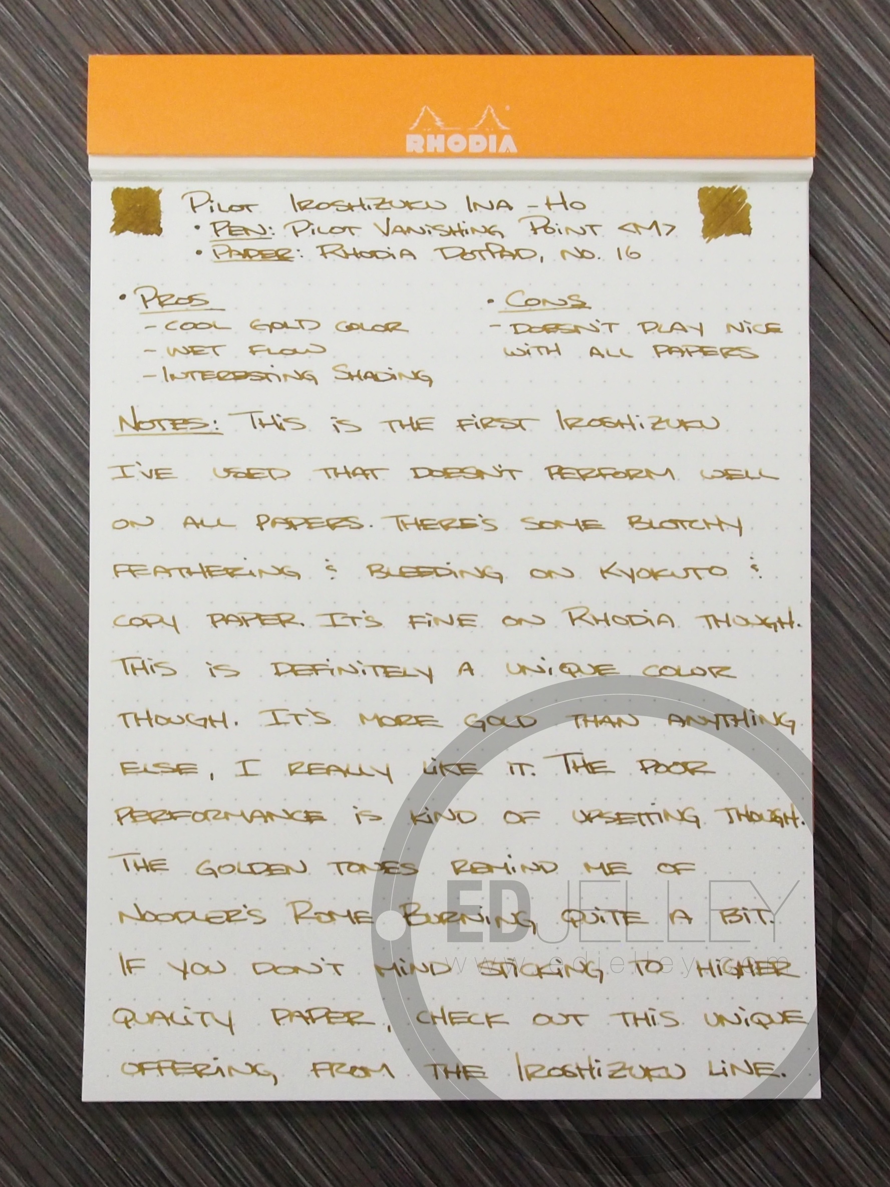
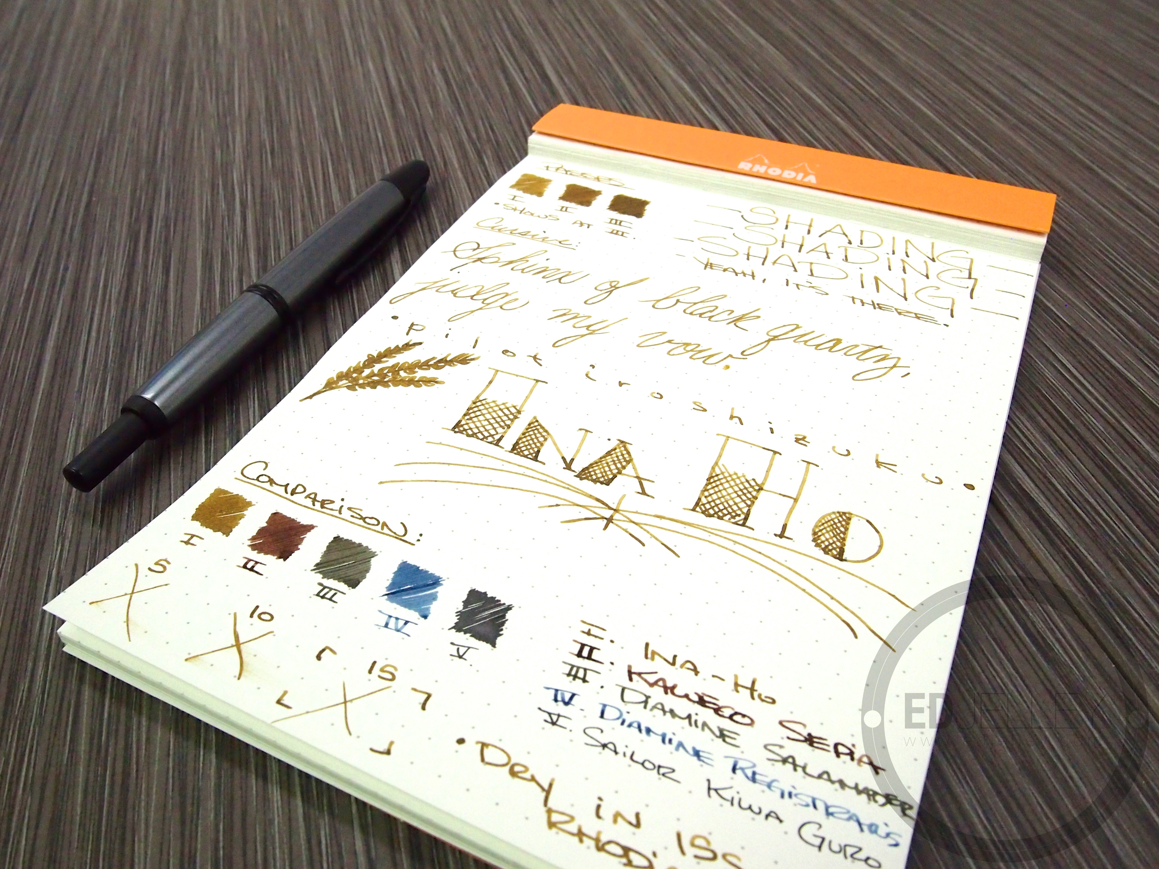
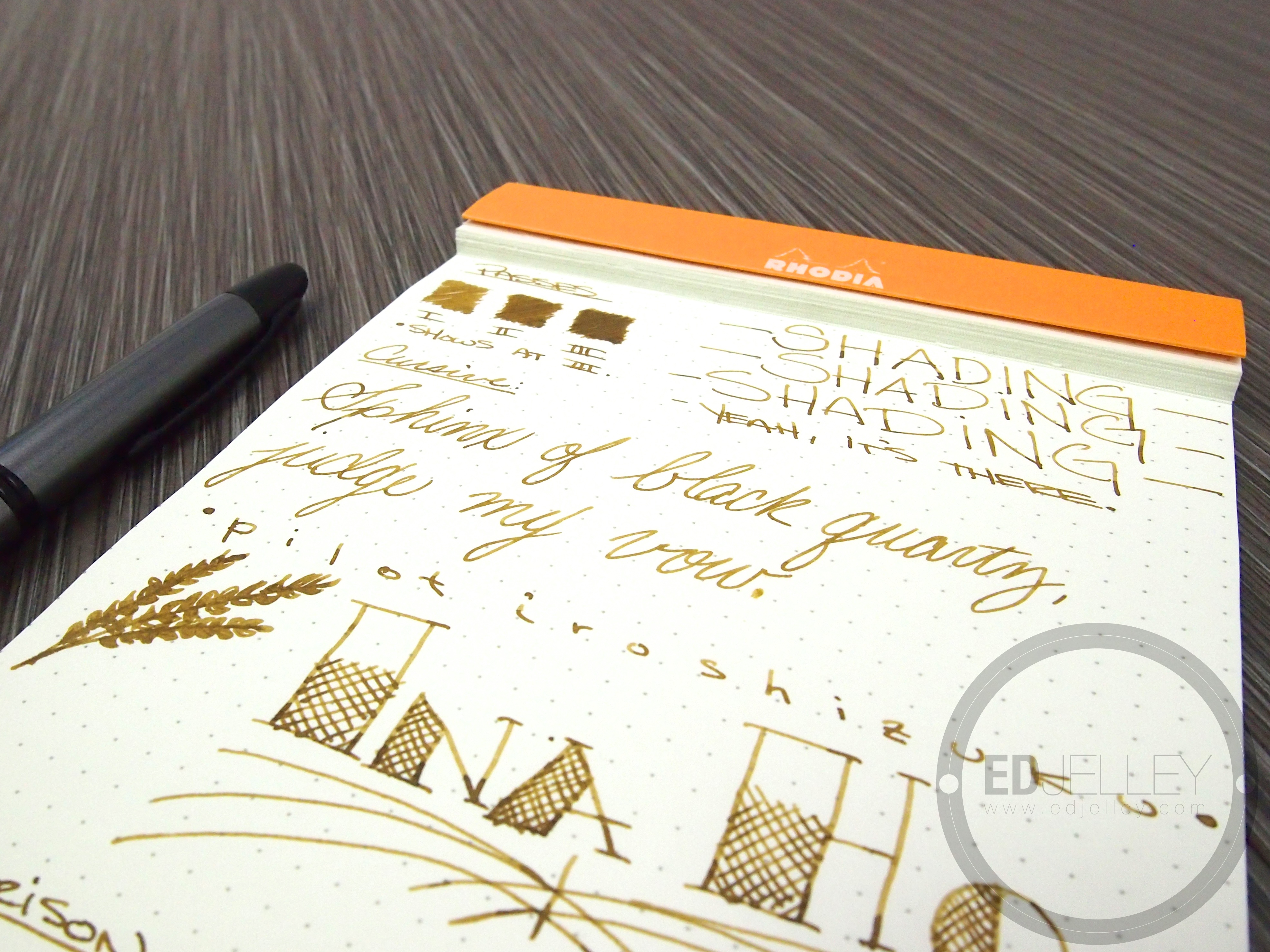
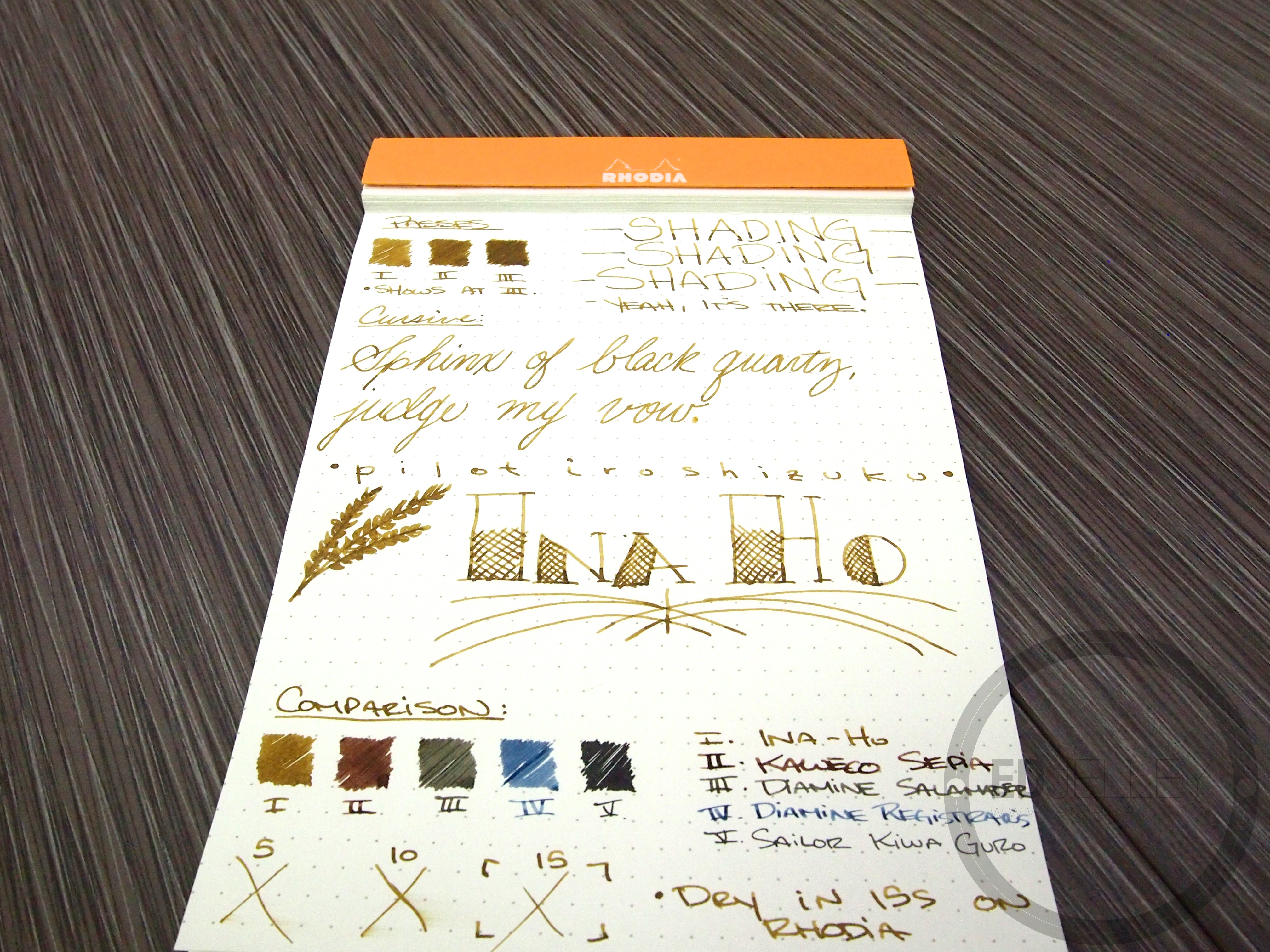
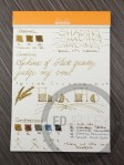
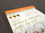
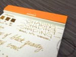
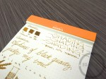
Pilot Iroshizuku: Ina-ho
Pen: Pilot Vanishing Point // Gun Metal & Matte Black // Medium nib
Ink: Pilot Iroshizuku fuyu-gaki
Paper: Rhodia dotPad, No. 16
Notes:
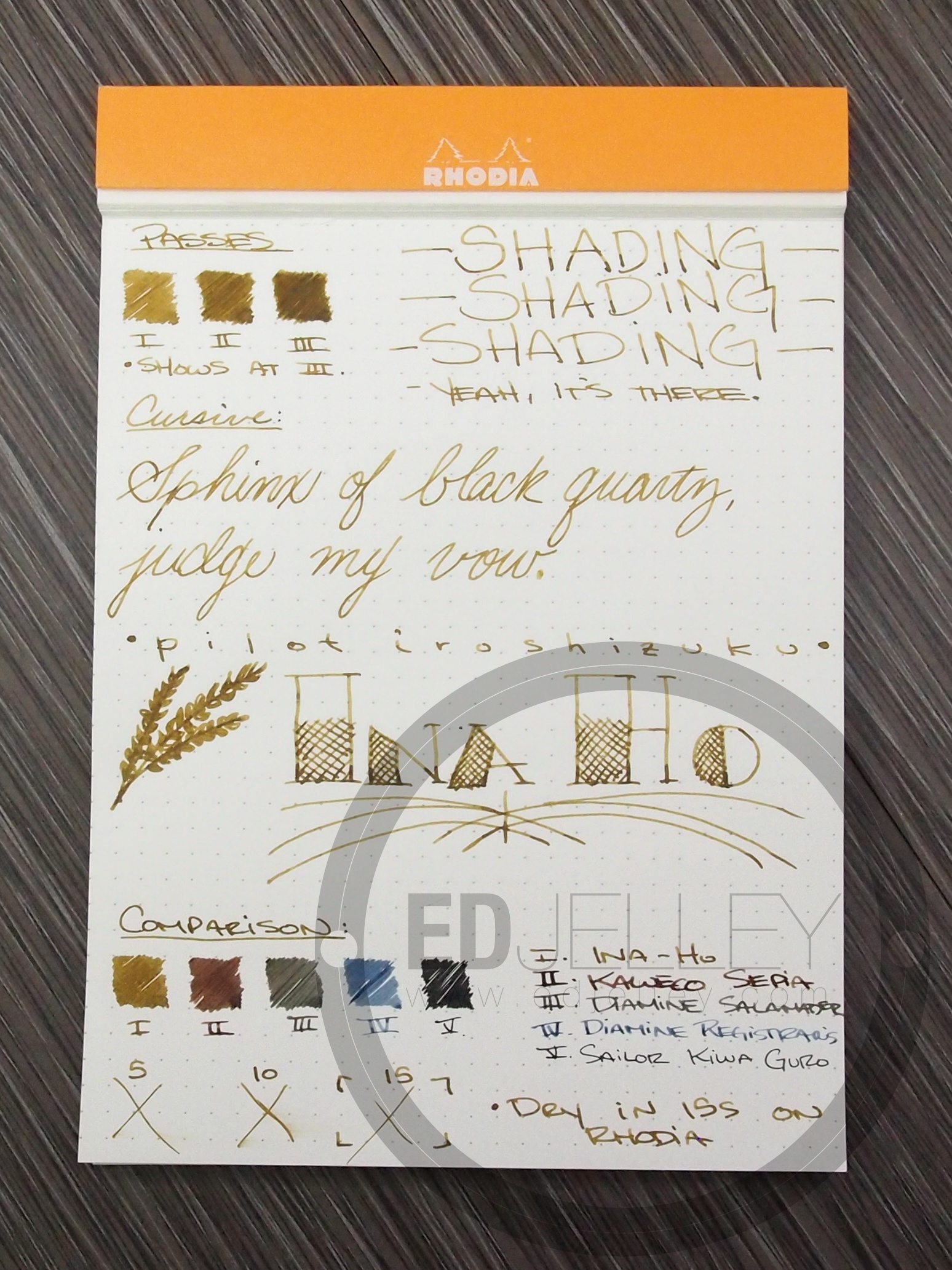
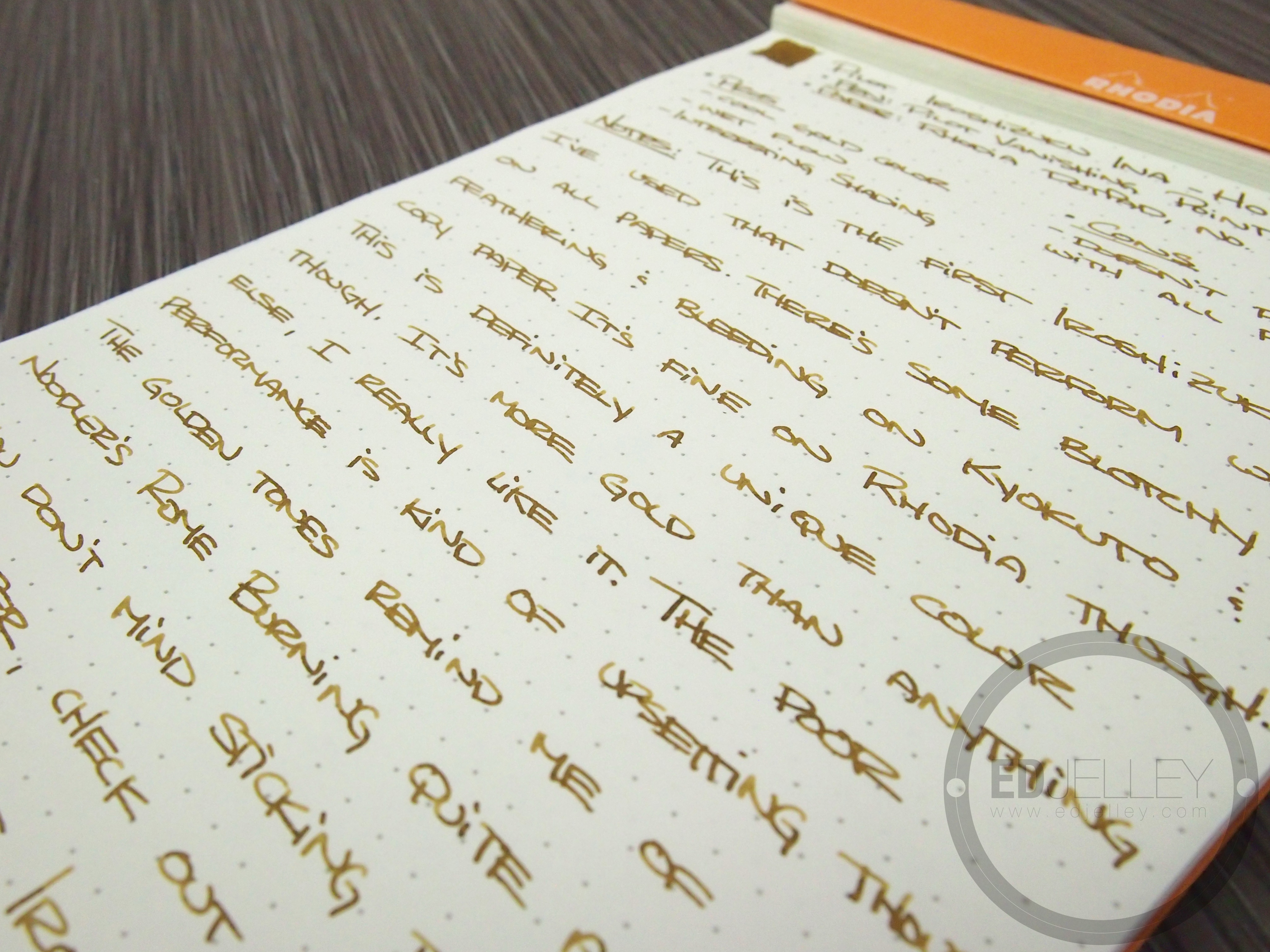
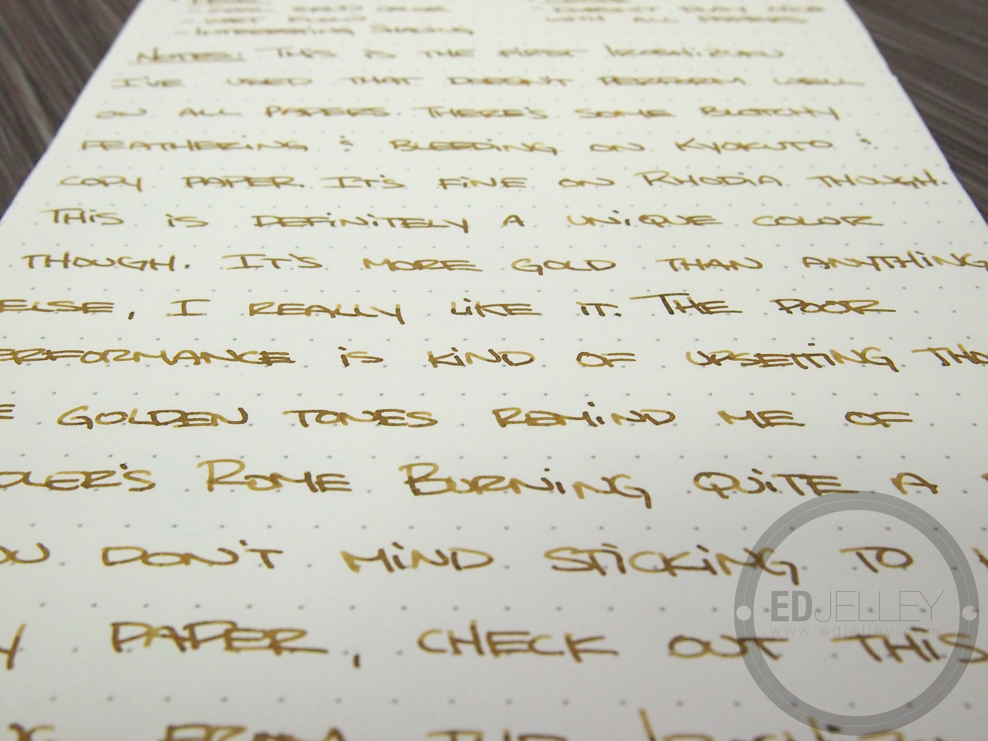
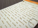
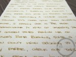
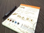
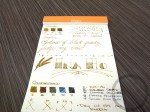
This is the first ink from Iroshizuku I’ve used that doesn’t perform well on all papers. There’s some blotchy feathering and bleeding on my standard ink review paper (Kyokuto FOB COOP) and it gets even worse on regular copy paper. It does play nice with Rhodia though. Other than the performance of the ink, it’s a really interesting color. Ina-ho means “rice ear”, it’s a nice shade of medium gold. It manages to look gold rather than yellow and there’s some interesting texturing where the ink and paper meet. I really like the color, but its performance is somewhat prohibitive. The gold tones remind me of Noodler’s Rome Burning quite a bit, but hopefully this ink cleans out of the pen a little easier. If you don’t mind sticking to Rhodia, check this one out. It’s a really enjoyable color as long as the paper quality is good. Overall, I was slightly underwhelmed, considering the rest of the Iroshizuku line performs wonderfully.
Also, thanks AGAIN to Azizah over at Gourmet Pens for sending me a sample!
Thanks for reading, enjoy!
Pros:
- Unique gold color
- Wet flow
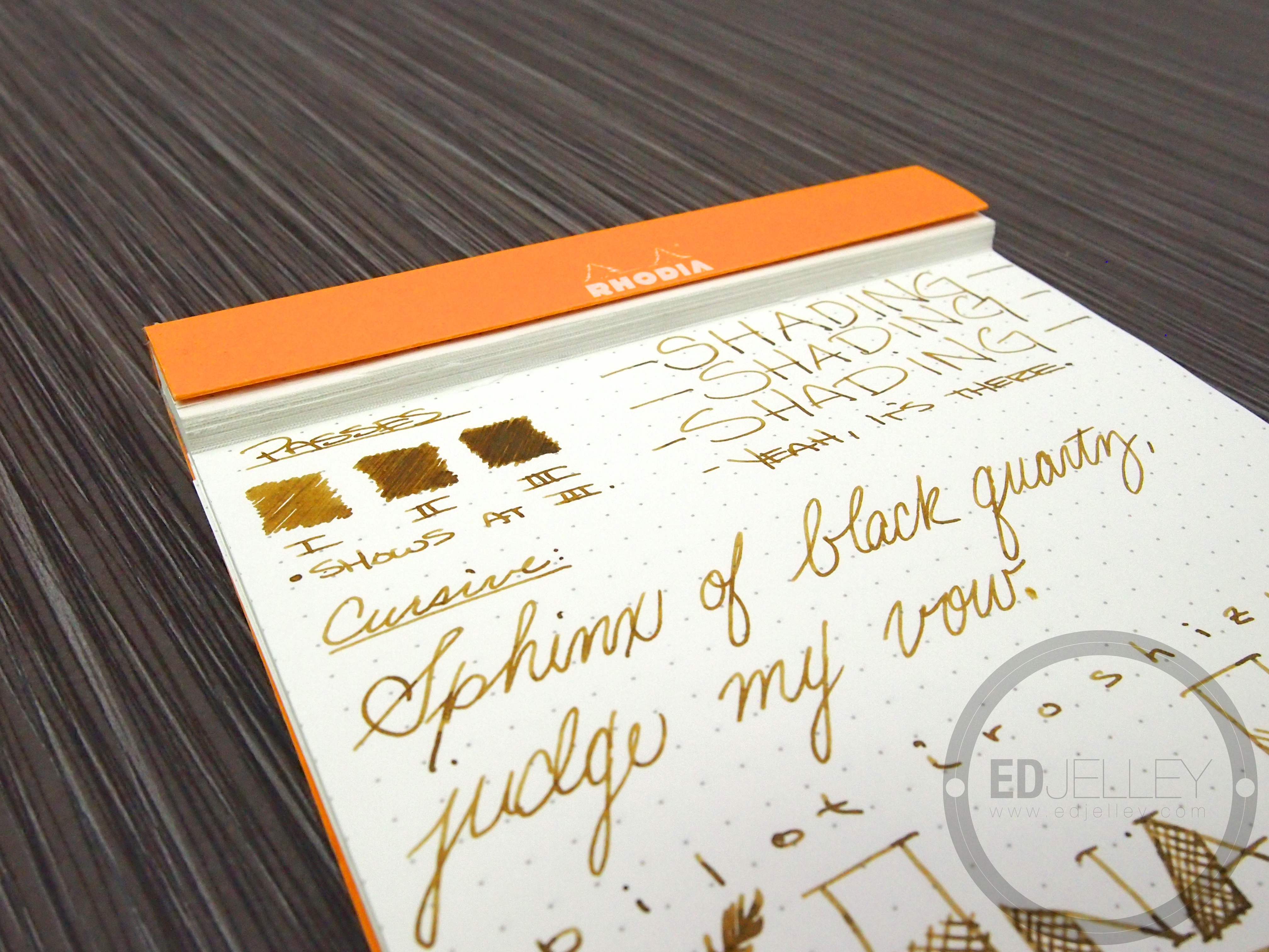
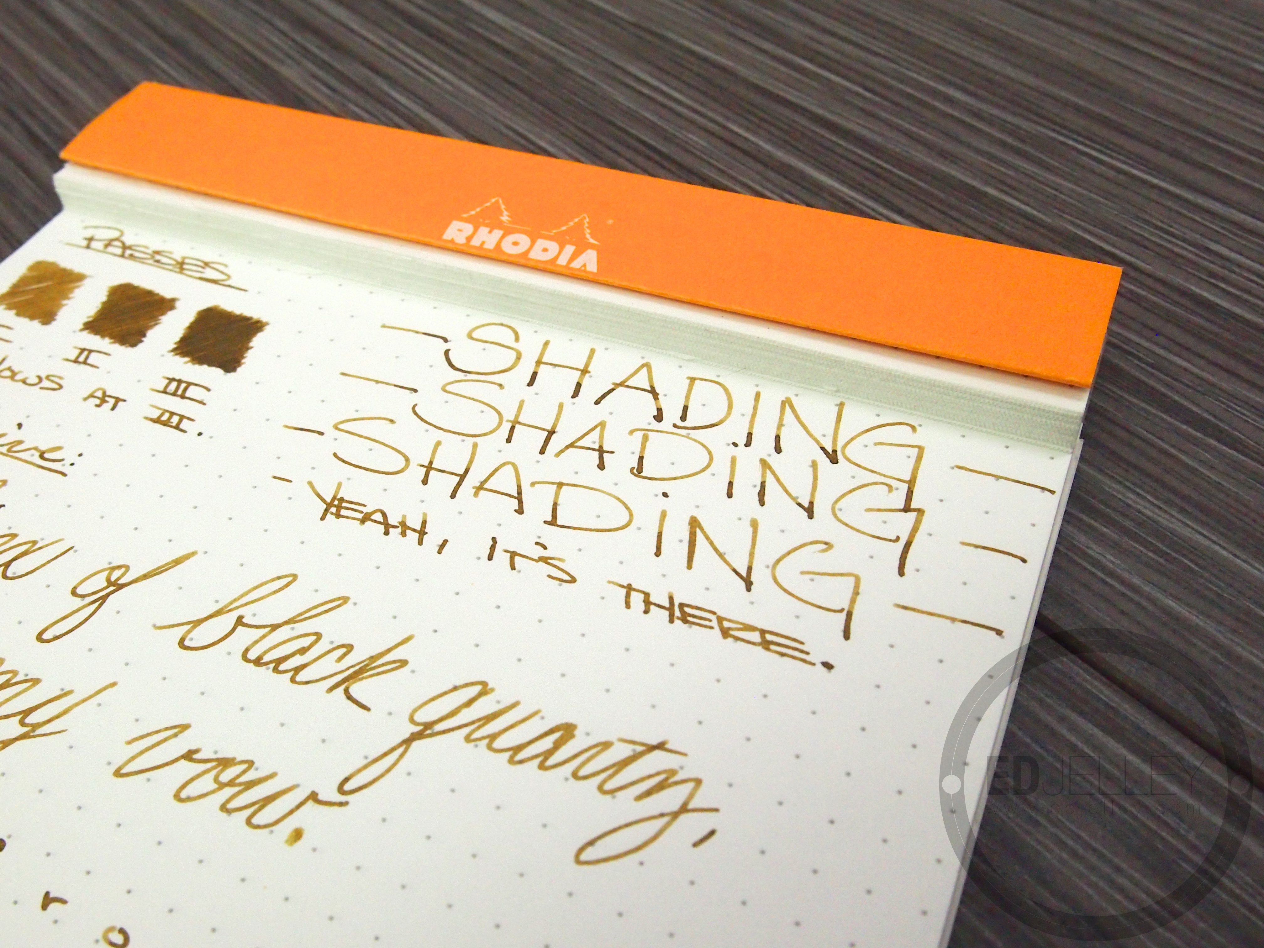
- Interesting shading
Cons:
- Doesn’t play nice on all kinds of paper

Gallery:


Related Reading:

Amazing color! I also like the fact that the Pilot Vanishing Point is exactly the color combination I’d get for myself. I was thinking B but now that I’m seeing your M I’m having second thoughts.
The nib was adjusted by Richard Binder, flow is wetter than normal. I’d check some more resources before making a decision based on my sample. Thanks for reading!
I just recently bought this ink because I was looking for a gold. I’ve been using it in a Pilot Custom 74 and it is lovely. Thanks for the review
Thank you for reading!
I just wish it didn’t do that weird blotchy feathering on some papers.
I think Ina-ho, definetly should be compared to Diamine Golden Brown. Ina-ho it’s an amazing color.