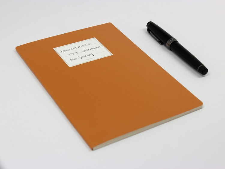
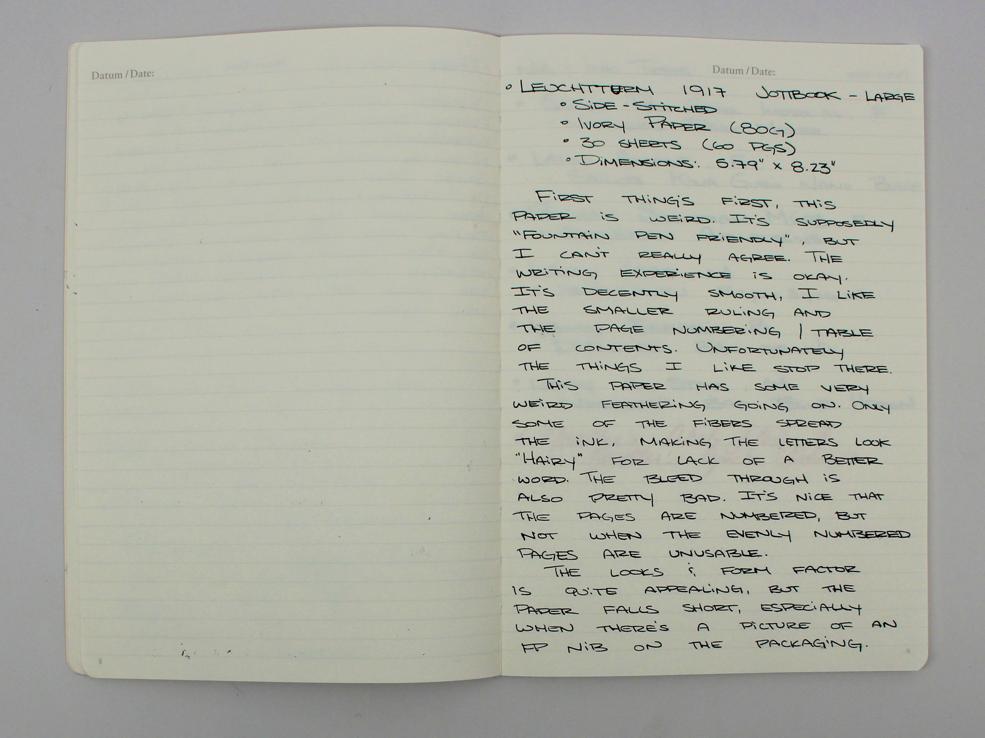
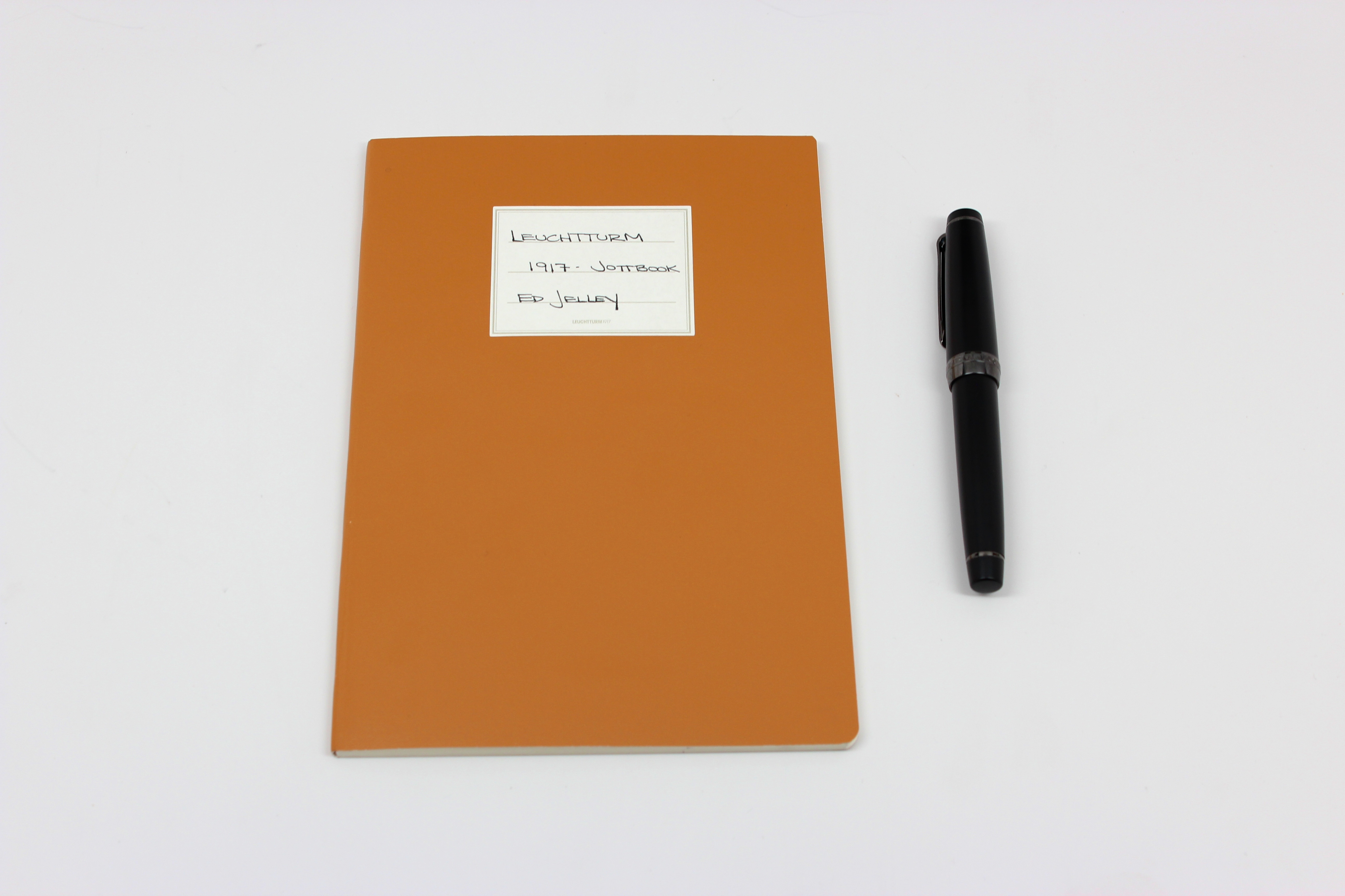
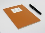
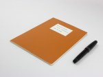
Leuchtturm 1917 – Jottbook
-Handwritten Review-

Specs:
- 5.79″ x 8.23″ (almost A5) Side-Stitched Pad
- 80g ivory paper
- Micro-perforated for easy removal
- 30 sheets (60 pages)
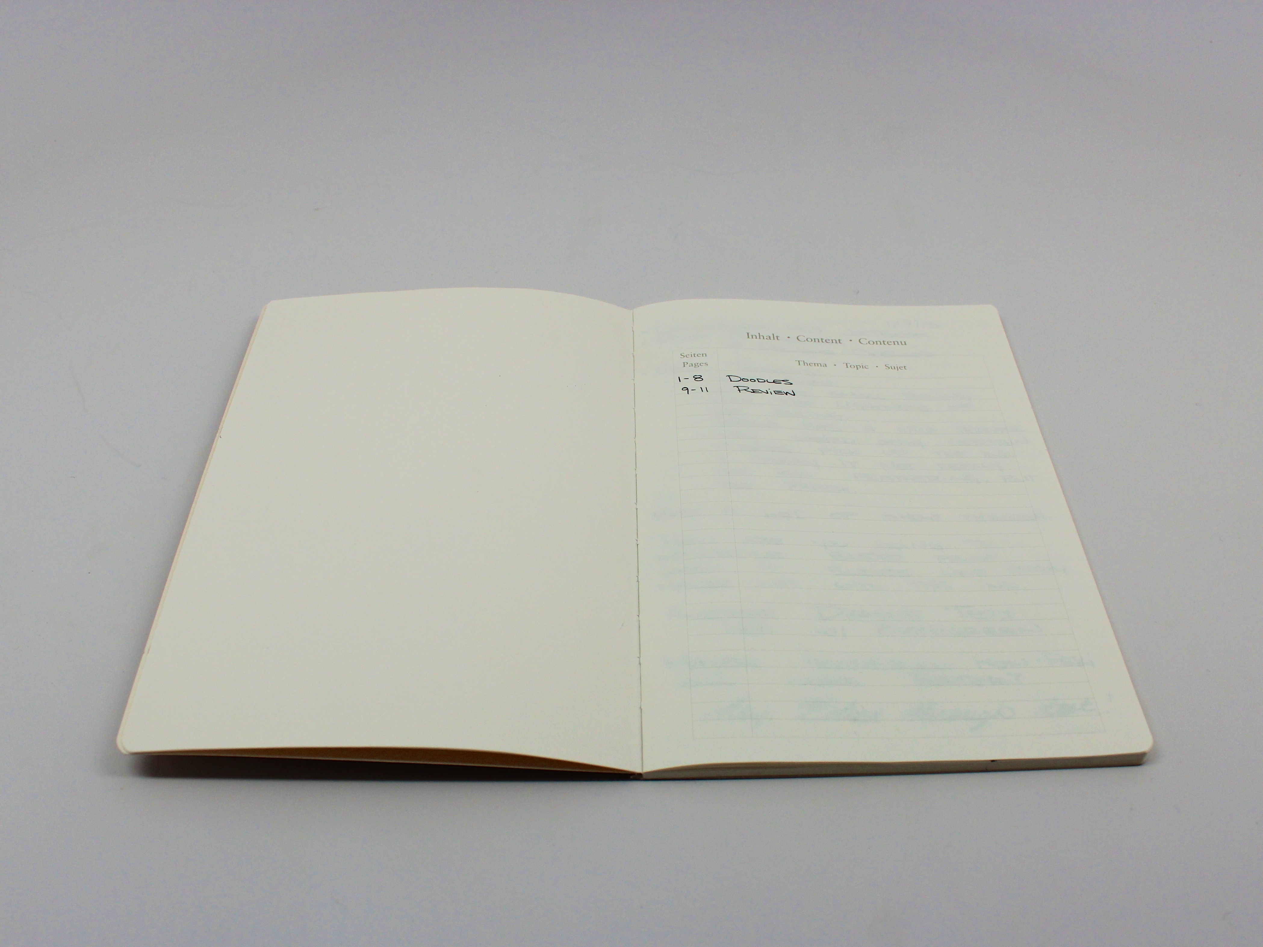
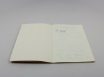
- Pages are numbered, table of contents, included stickers for labeling
- ~$6.00 USD
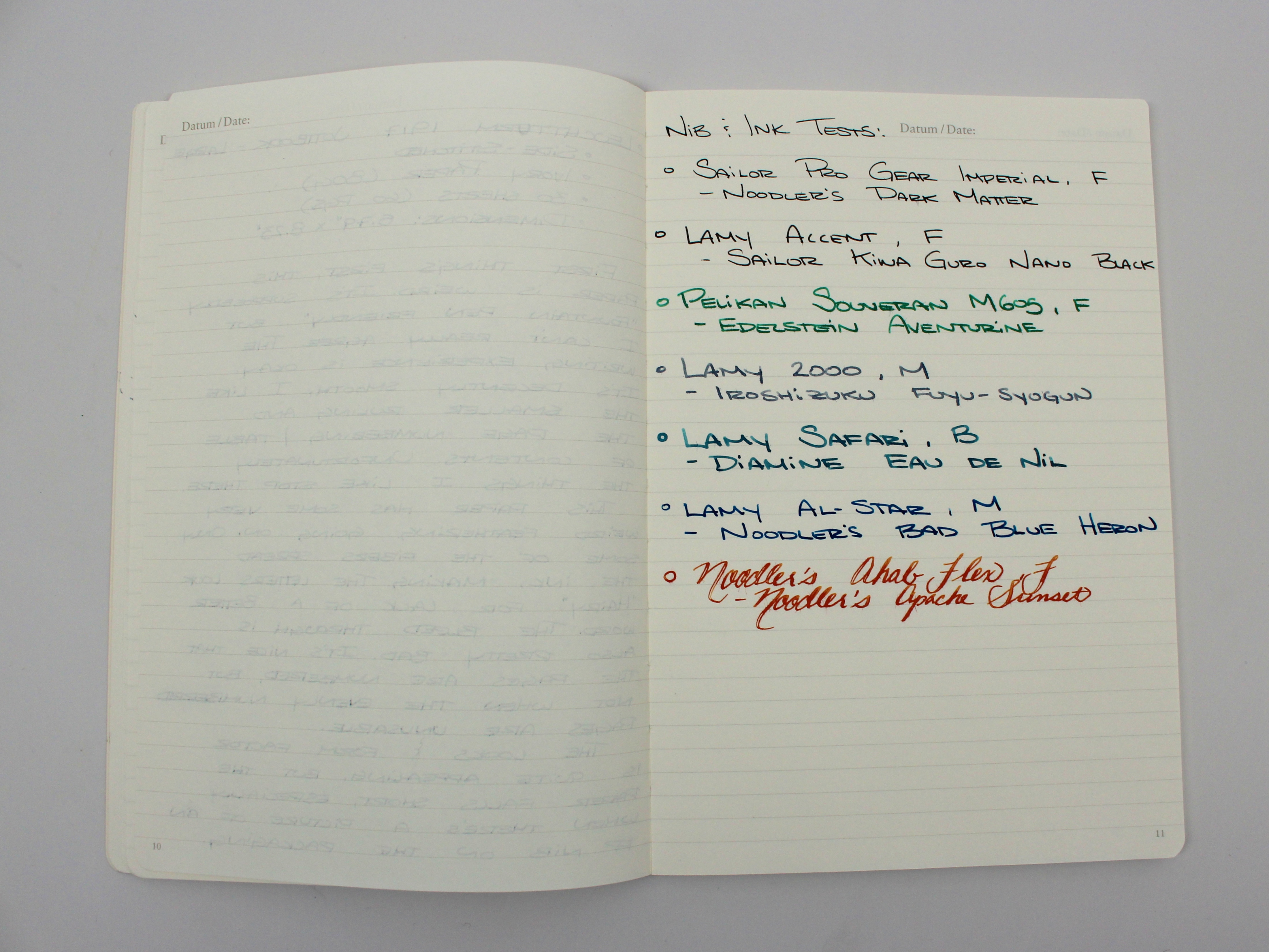
Review Supplies:
- Sailor Professional Gear Imperial Black Edition – Fine Nib
- Noodler’s Dark Matter
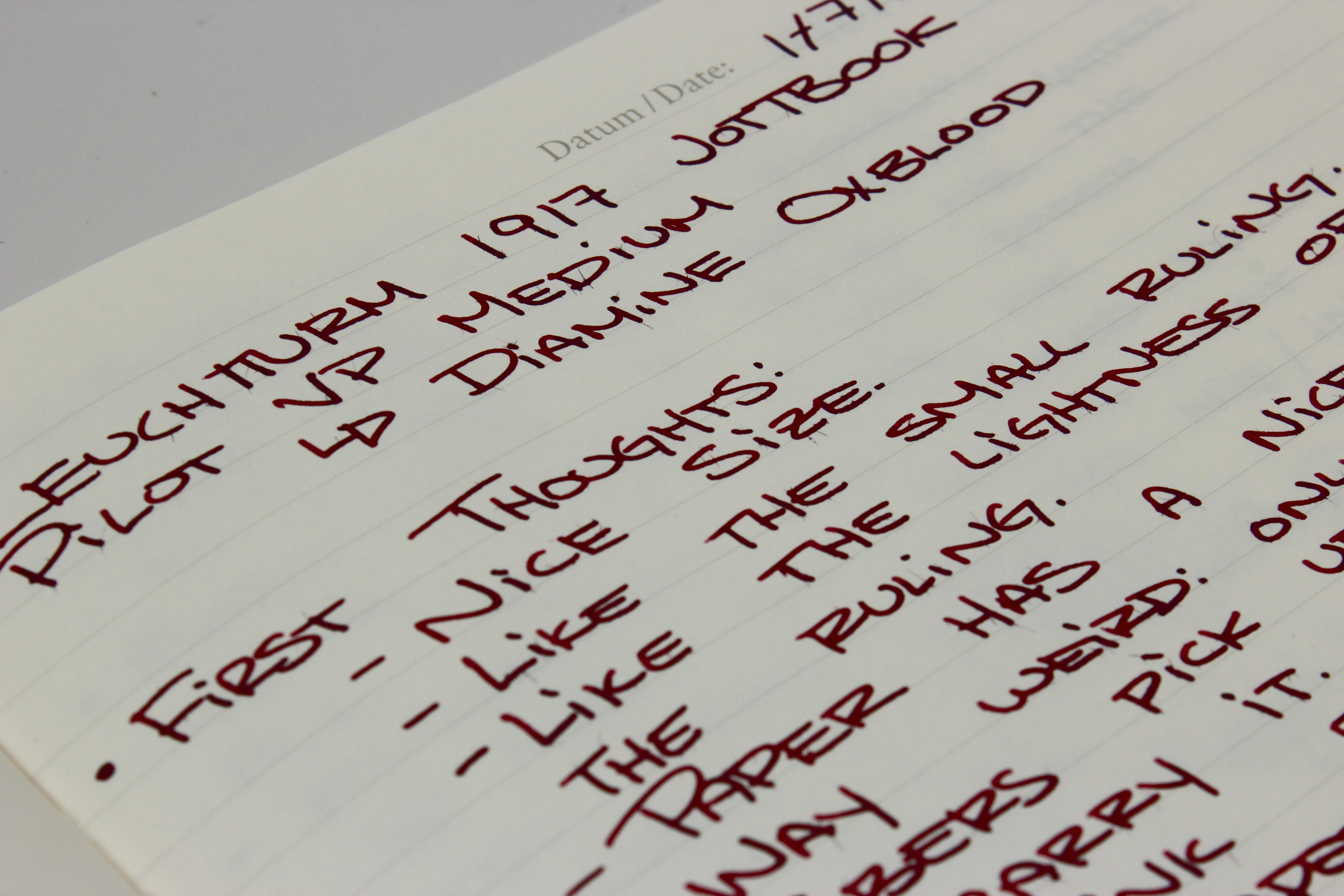
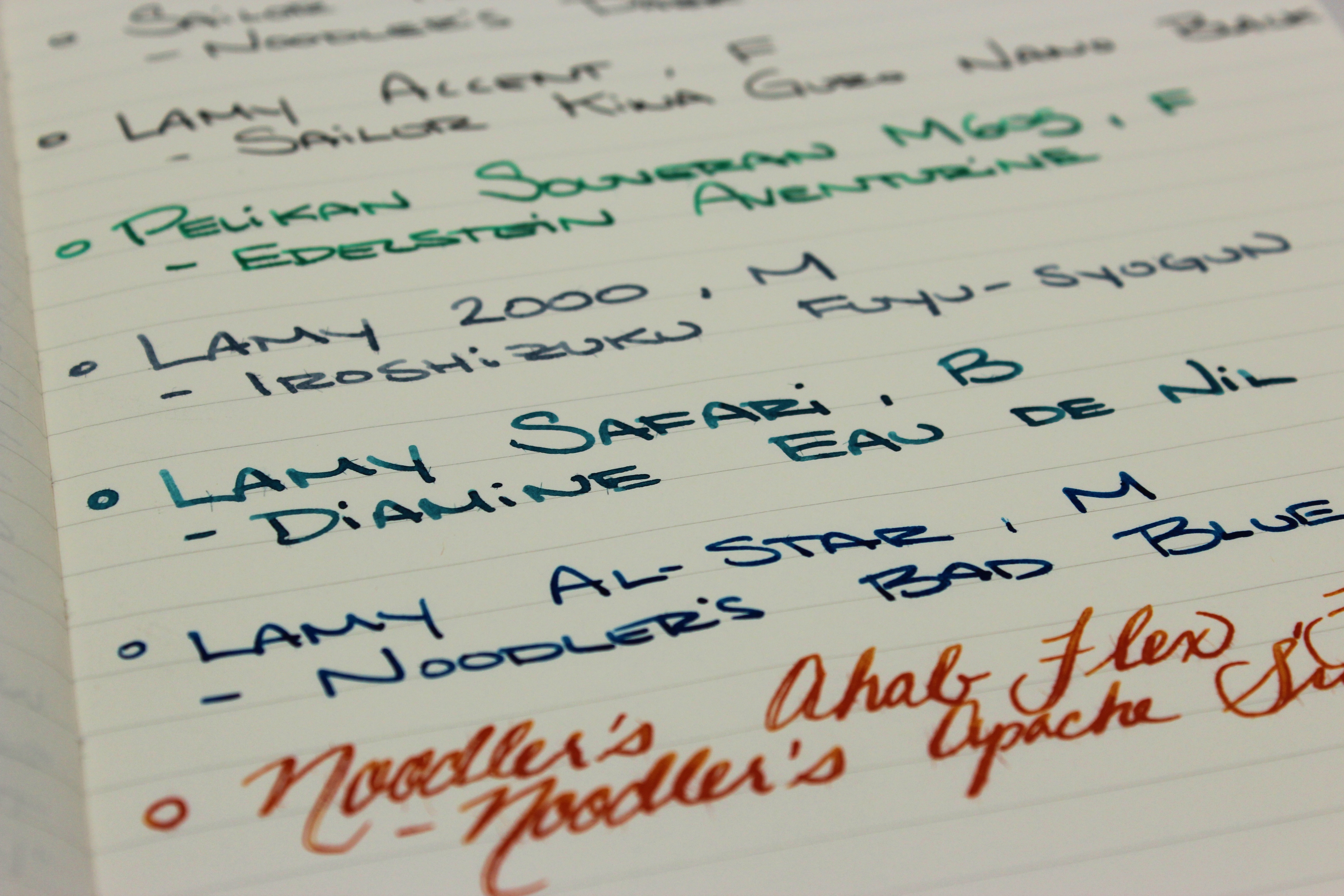
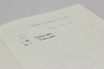
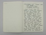
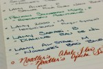
Notes: This paper is quite unique. I don’t think it behaves like any other paper I’ve tried before. There’s an odd amount of feathering, but it’s like only certain fibers in the paper pick up the ink. This notebook is listed as being fountain pen friendly, but there’s a fair amount of show through, a lot of feathering, and even some bleed through. I understand the marketability of a fountain pen friendly paper, but I just wish it was truly fountain pen friendly. Don’t get me wrong, some ink and nib combinations work great, but most of the time there were unwanted results. Check the gallery at the end of the post for some more close up shots of the feathering too!
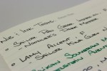
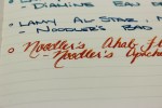
 Handwritten Review Reads:
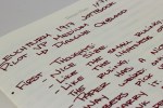
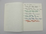
First thing’s first, this paper is weird. It’s supposedly “fountain pen friendly”, but I can’t really agree. The writing experience is okay. It’s decently smooth. I like the narrower ruling, the pager numbering and table of contents. Unfortunately the things I like stop there. This paper has some very weird feathering going on. Only some of the fibers spread the ink, making letters look “hairy” (for lack of a better word). The bleed through is also pretty bad. It’s nice that the pages are numbered, but not when the evenly numbered pages are unusable [due to bleed through]. I enjoy the look and form factor of the Jottbook, but the paper inside falls short, especially because there is a picture of a fountain pen nib on the packaging.

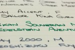

Man, I LOVE my Leuchtturm notebook. I’m not sure why, I just love how my fountain pens feel on that paper. I really do not like the feel of the more “coated” papers. Just personal preference. The paper is definitely not suited for bold nibs or Italics or even some mediums.
The feel of the paper is quite nice, I really like how my Sailor Pro Gear feels on it, but I just can’t get past the bleeding and feathering. Of course, some ink/nib combos are worse than others.
I really like the aesthetics of the notebook, but it seems wasteful to me to not be able to make use of the front and back of a sheet.
Which notebook do you have?
Hi Ed, this is a very thorough review you have here. I follow your blog and reviews pretty regularly, but this may be the first time I’ve actually left a comment. I use Leuchtturm1917 regularly. Typically, I use the 8.5 x 5.5 hardcover grid version. I use it for journaling, mostly, and I go through them pretty quickly. I have not had any problems with this paper, but I tend to prefer dryer writing pens. Even my occasional “wet writer” does not seem to have ill effects. I am not very particular about “showthrough”, so even though I can see faint traces of what is on the reverse, it doesn’t bother me. I don’t have bleedthrough problems. There is slight feathering, but it’s random and it’s pretty faint. That being said, I have not tried the Jottbook. I really like the look of the notebook you reviewed, and will have to snag one when it’s time to replace my current journal.
kp,
Thanks for reading! I totally get where this paper would perform better with a dry writer. I like the way the paper feels and the notebooks look nice too. Perhaps the paper is different in the two notebooks? I’m going to look into it some more.
I would love to hear how they compare once you get the Jottbook!
I certainly will keep you posted!
I’ve had this review open for awhile and haven’t yet had a chance to read it until today! I enjoyed your review, of course. I have a fairly old Leuchtturm 1917 notebook and have similar issues – bleed through and “hairiness” but for some strange reason, I really like it. I guess because once I’ve written on the paper, it crinkles and I’m crazy about that sound haha. … Yes, I might be insane.
I LOVE this camel colour though!! Must get me one!
Thank as always! The more I use it, the more I like it. While I would never use one for class notes, doodles seem right at home in here. I like the color a lot, and the stickers that come with it for labeling are a nice touch.
I have a somewhat similar experience with the jottbook. Even with a Sailor EF, the paper behaves somewhat inconsistently. A Leuchtturm medium notebook I bought at the same time doesn’t have this problem at all, and seems to use different paper (Ink-proof paper (80 g/sq m) versus 100 g/qm paper for the A4 jottbook). I don’t know how this was two years ago, but at least now the jottbook isn’t advertised as ink-proof.
Interesting! I’ll have to try out one of their full sized notebooks, people usually say great things about them. Good to know!