Field Notes
Drink Local Edition
Fall 2013
-Handwritten Review-
Specs From Field Notes:
-
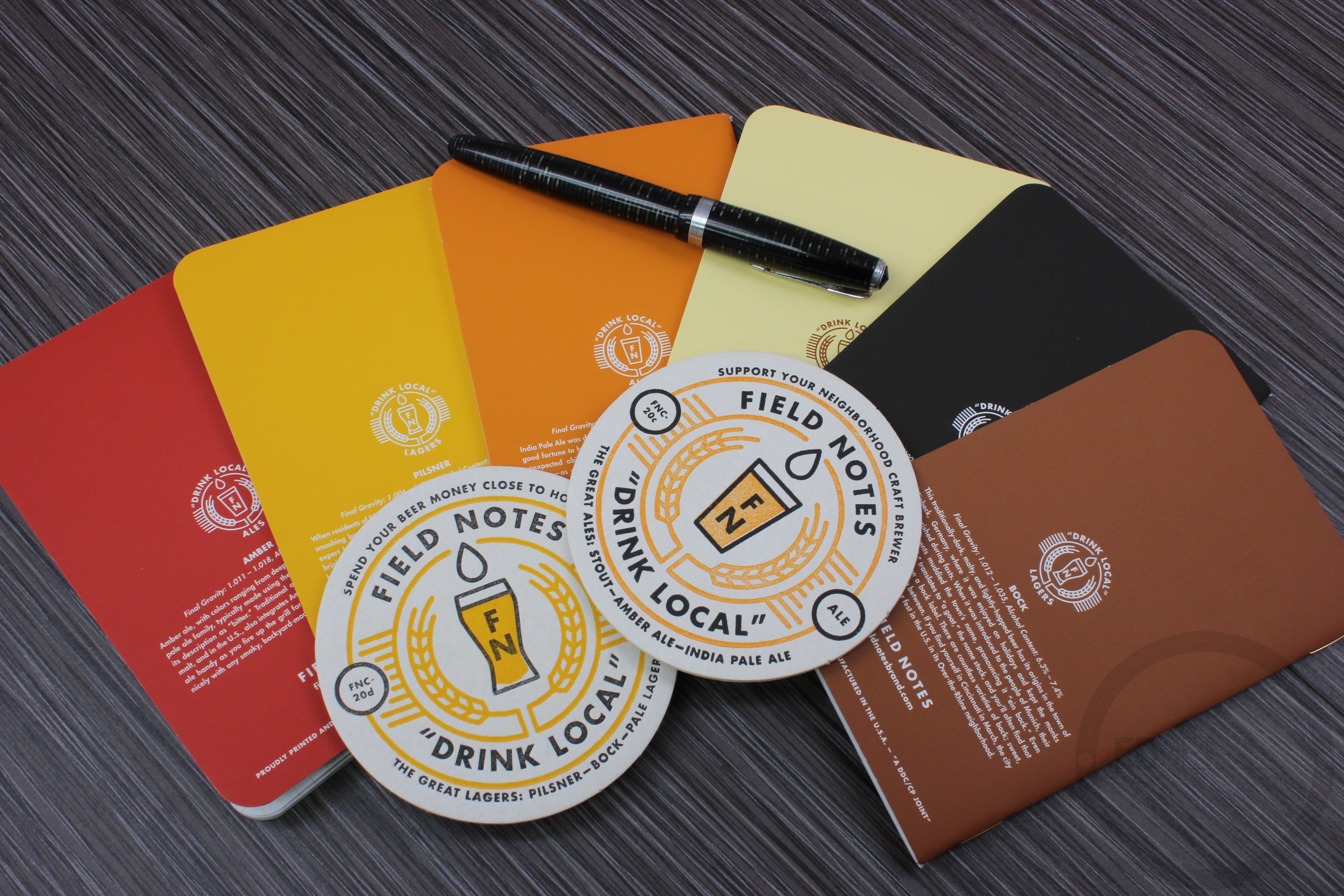
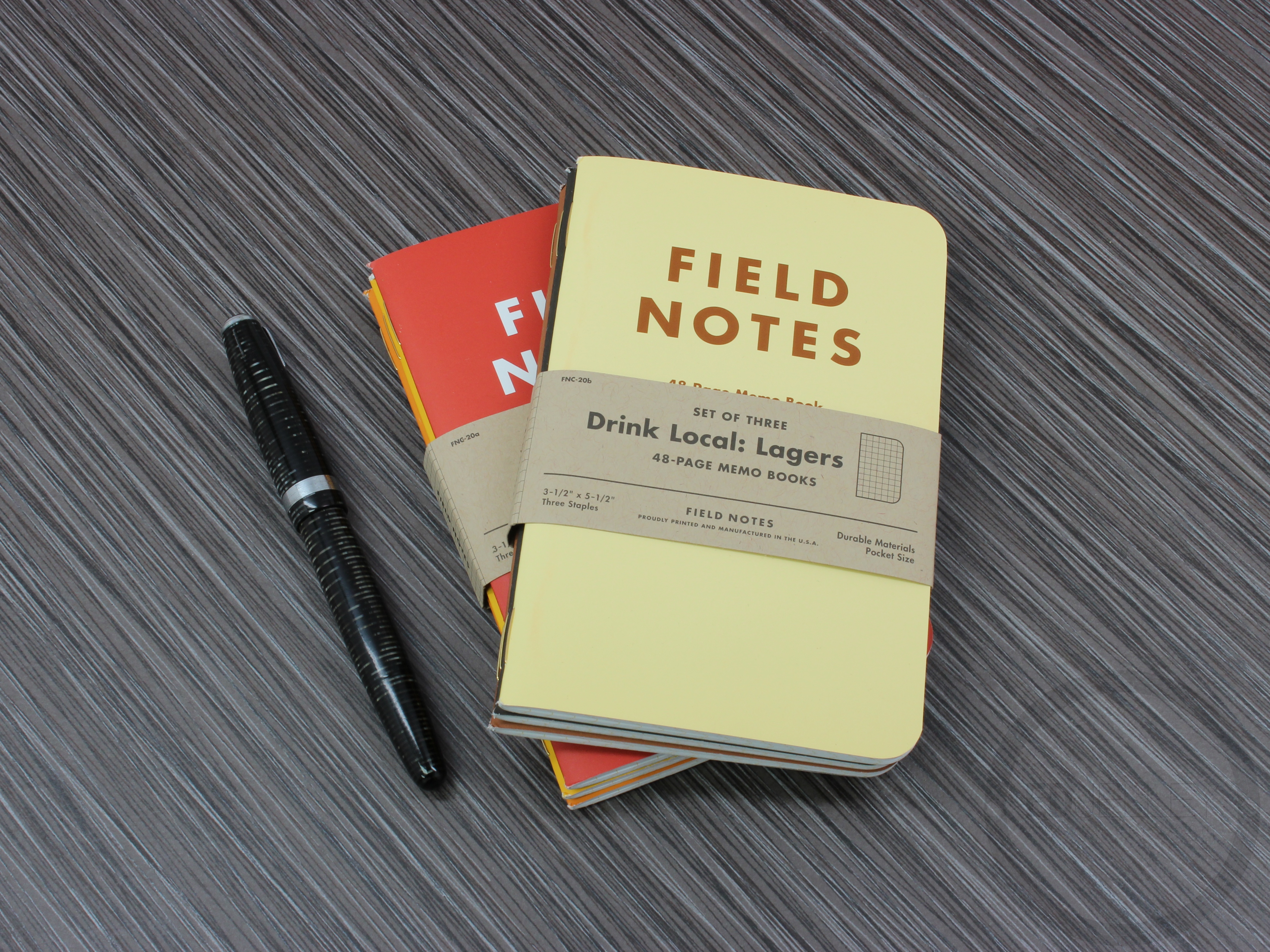
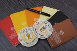
Printed 9/13, Edition size:
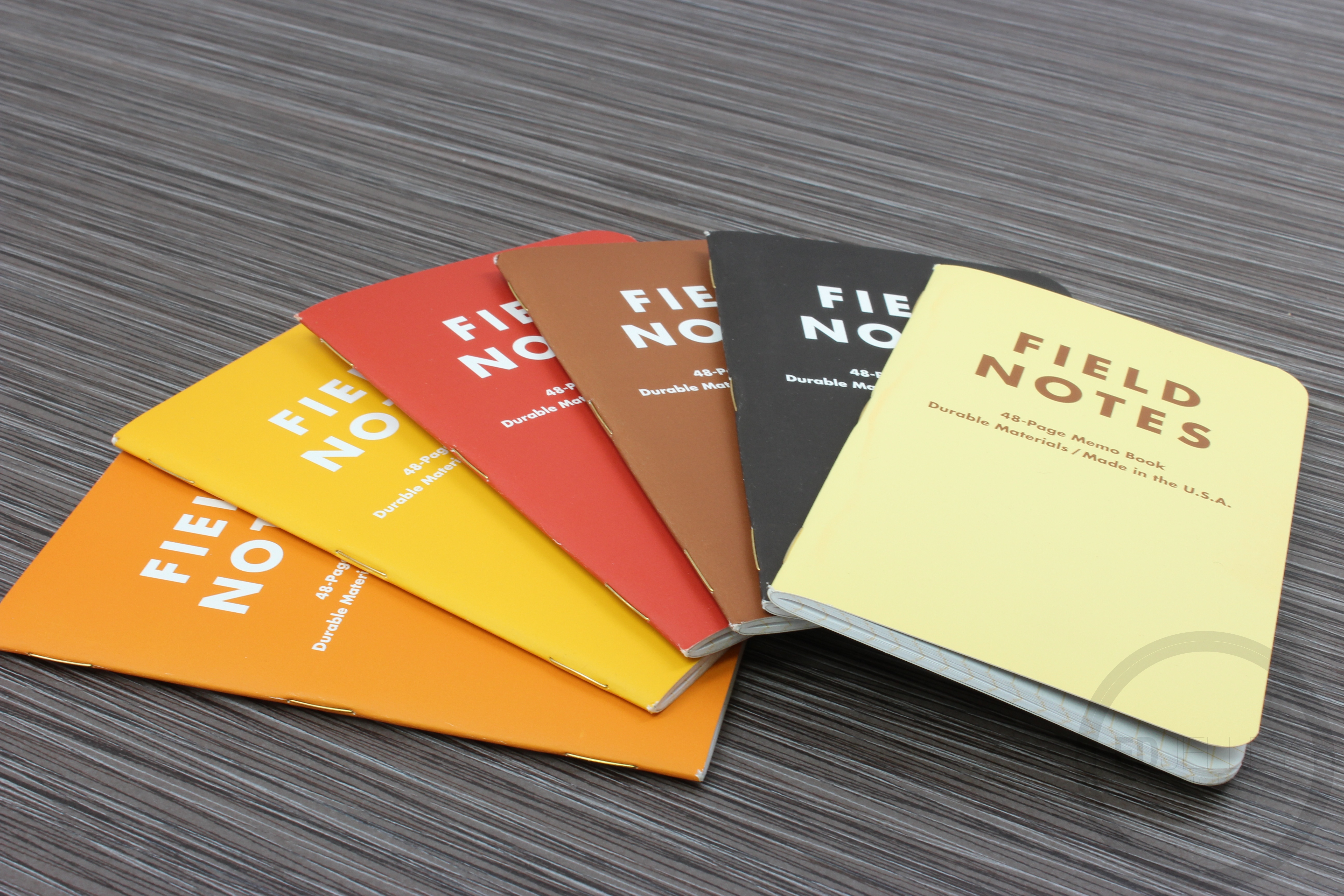
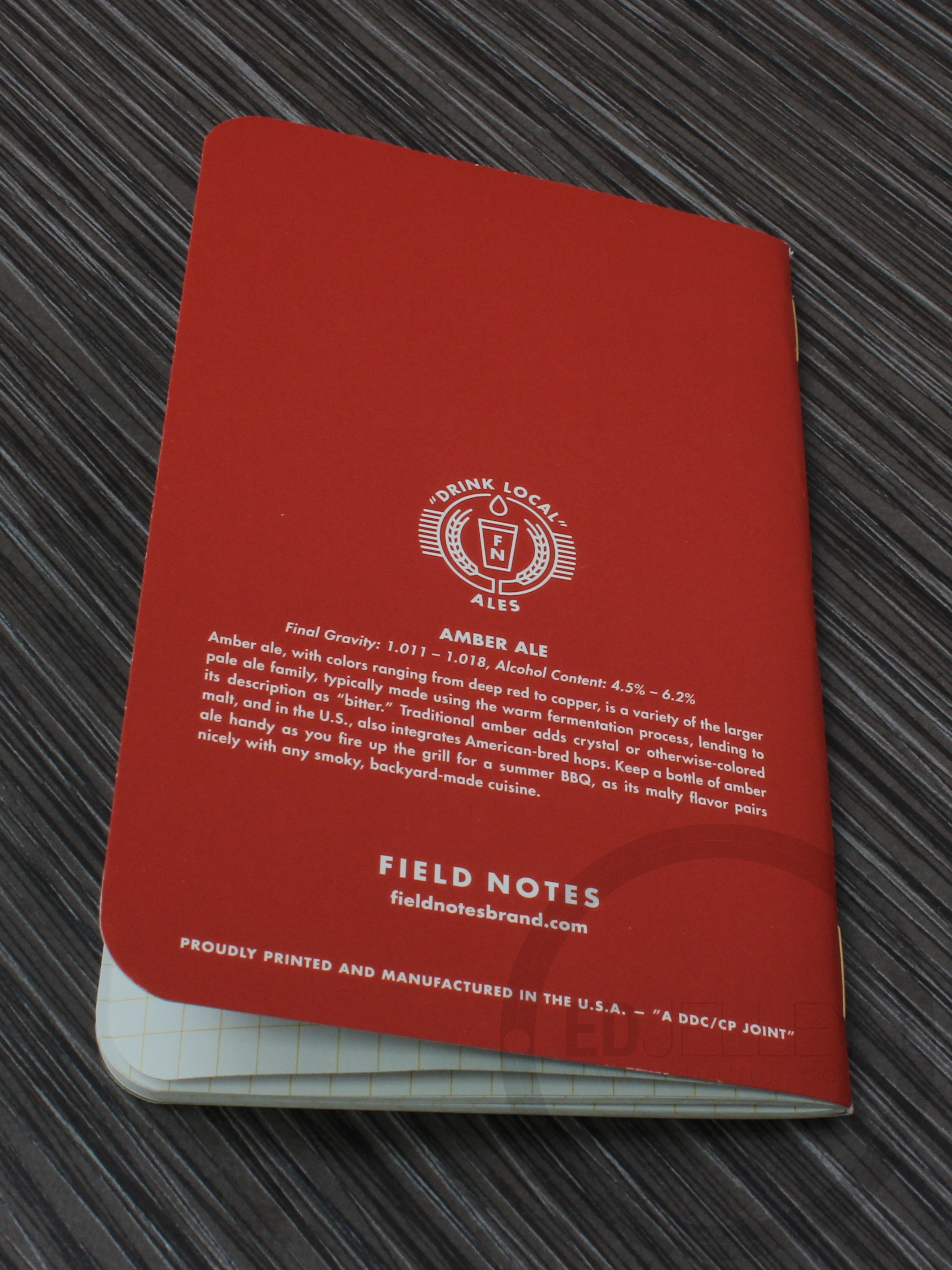
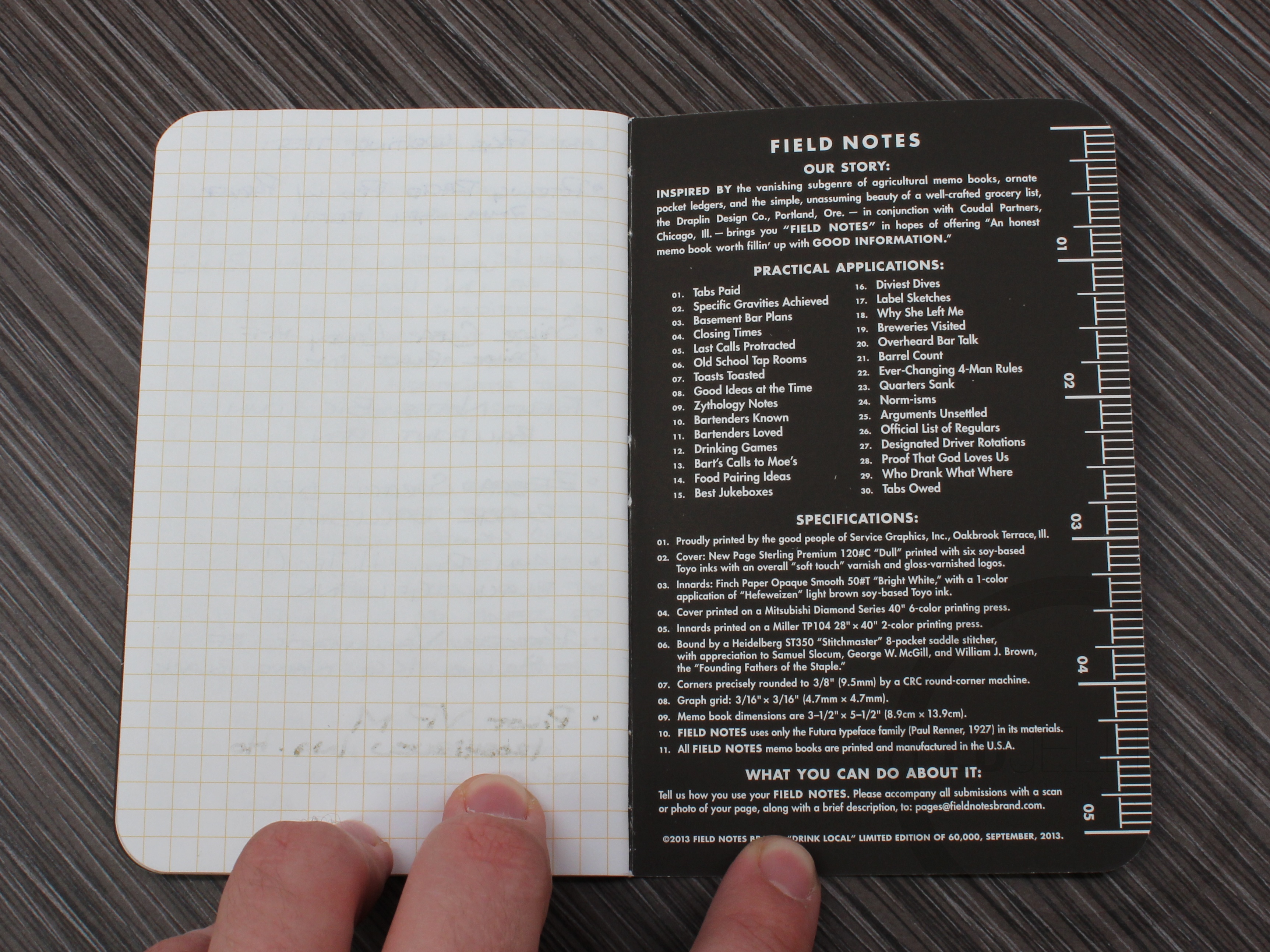
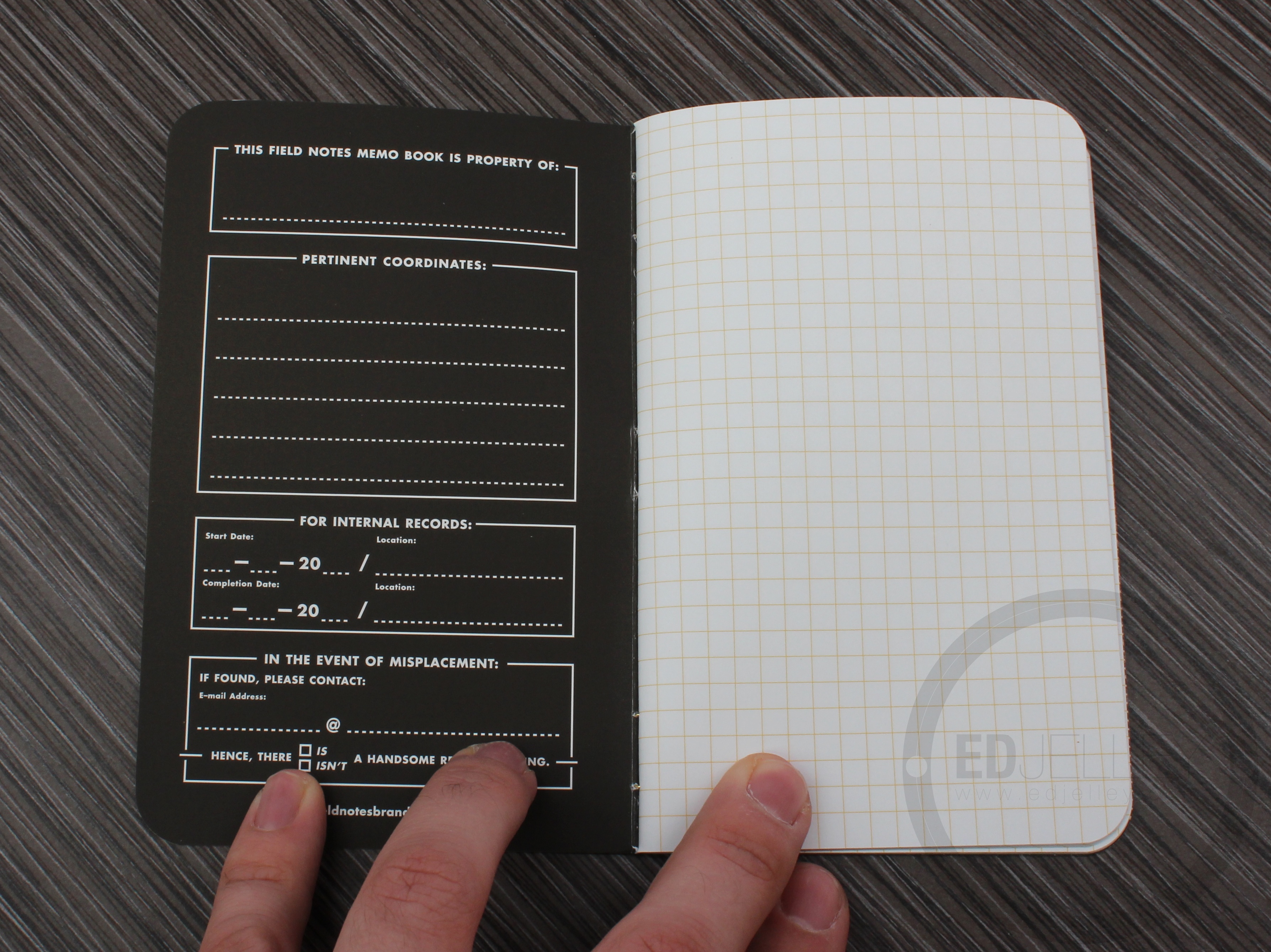
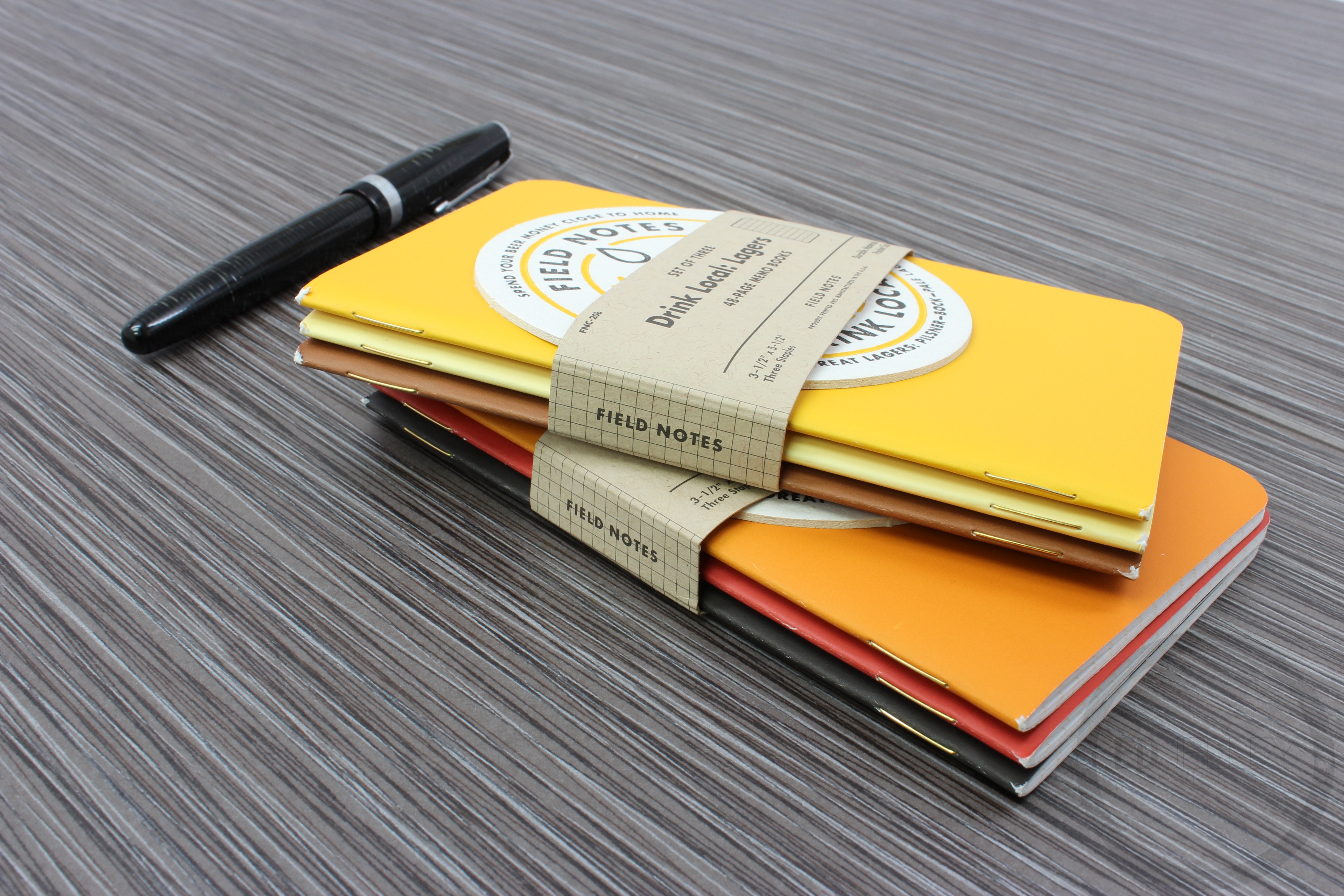
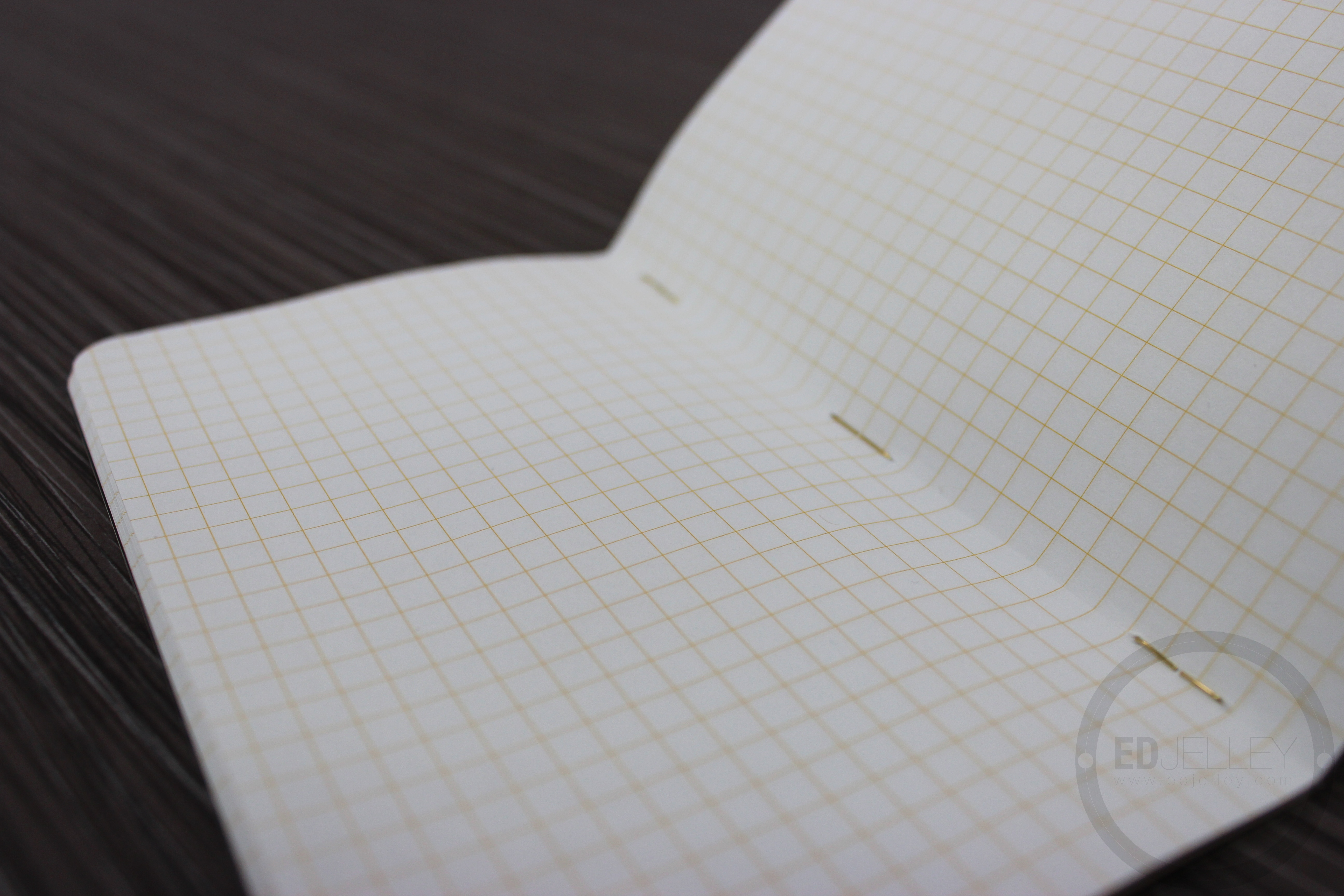
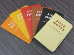
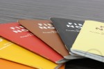
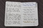
30,000 “Ales” books, 30,000 “Lagers” booksDrink Up! “Drink Local” Ales and Lagers editions feature heavyweight New Page Sterling Premium 120# covers with a “soft touch” varnish. Each book represents a different brew, with a brief history of each style on the back cover. Inside is Finch Opaque Smooth 50# text paper with a “Hefeweizen” yellow-orange graph grid, all bound together with bright gold staples. 3-Packs include a letterpress-printed coaster. - Dimensions: 3.5″ x 5.5″
Review Supplies:
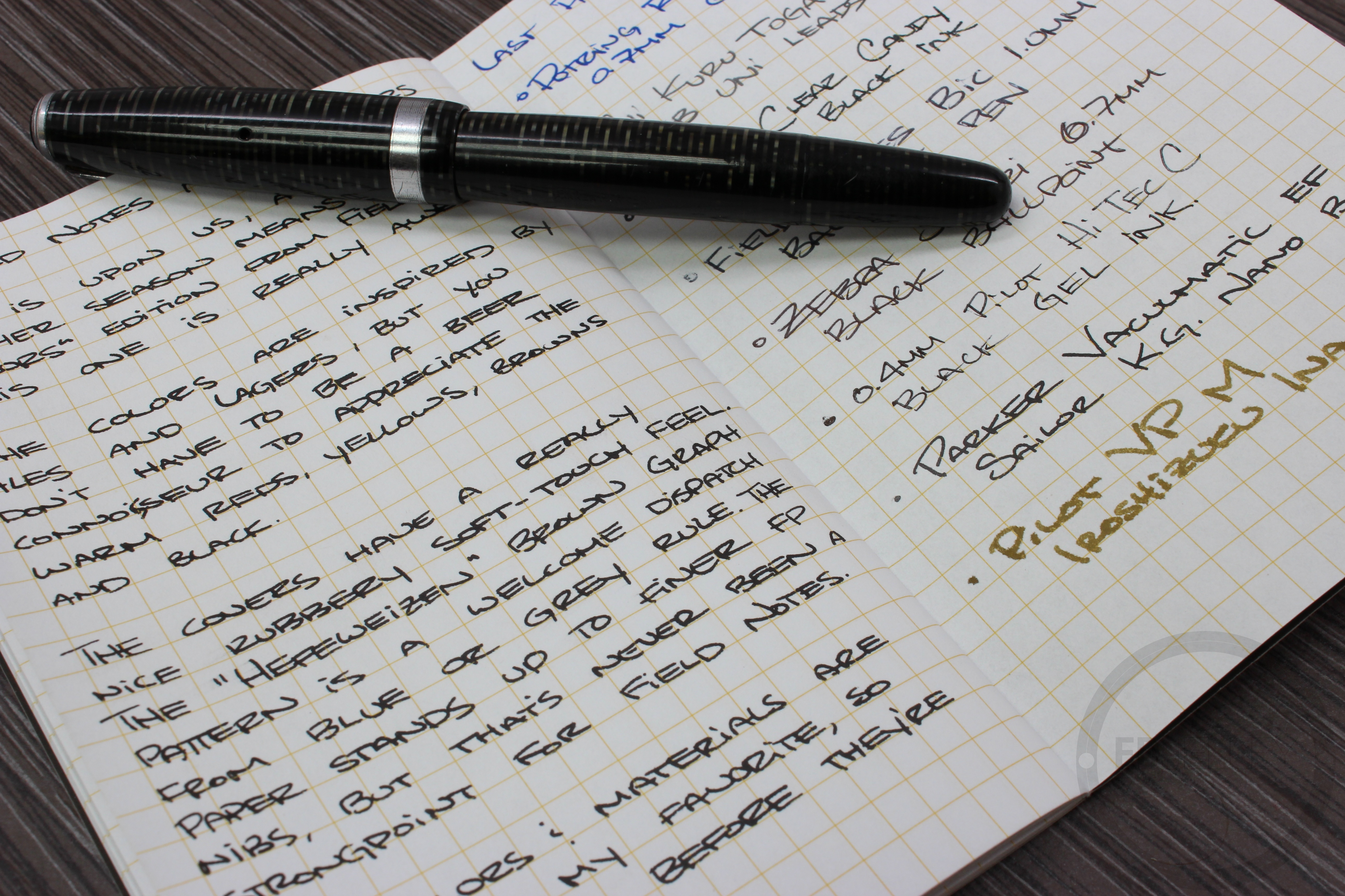
- 1940s Parker Vacumatic
- Sailor Kiwa Guro Nano Black Ink
- Various other ink / nib tests
Notes:
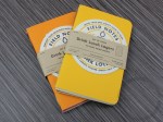
Fall is upon us (FINALLY.) and another season means a few “COLORS” edition from Field Notes. This one is called the Drink Local Edition, and it’s really, really impressive.
The colors are inspired by various ales and lagers, but you definitely do not have to be a beer connoisseur to appreciate the fall-themed hues of these little notebooks. The red, brown, yellows, and black are all great for the season.
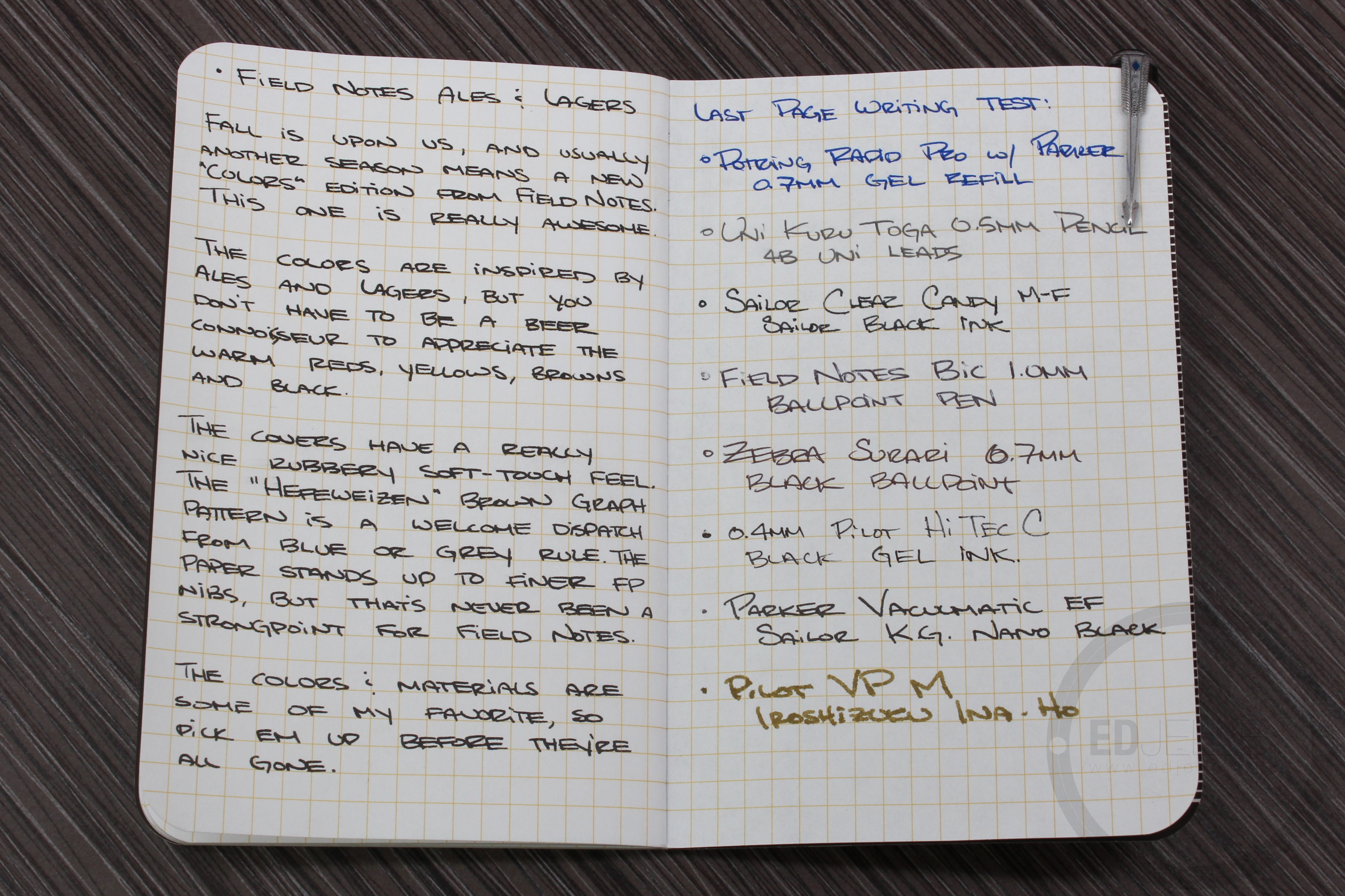
The covers have a really nice rubbery soft-touch feel (similar to the R by Rhodia pads). The “Hefeweizen” yellow grid lines are a nice departure from standard grey or blue rule. The paper in Field Notes notebooks usually aren’t the most fountain pen friendly, but if you use a well behaved ink in a finer nib, you shouldn’t have any problems. I don’t mind a little show or bleed through, it makes the notebooks feel like they were used, not sitting under museum glass. It’s the small details like the gold staples, and the included coasters that make the limited edition Field Notes extra special.
The colors and materials are some of my favorite that Field Notes have released. Hurry up and grab some of these limited edition books before they’re all gone!


Gallery:


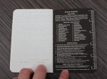


Ed, did you read the list of “Practical Applications” (inside back cover)? They’re hilarious! I think my favorite is “Diviest Dives” (boy did I frequent some skeevy rathskellars in my day). A lot of thought and sly humor went into the creation of these notebooks. Those yellow grid lines are the color of wheat beer. I can see these catching on in a big city like Chicago with a storied bar culture. Pen and ale, now we’re talking!
I did!
They’re all pretty funny, I like the ones on the County Fair edition too.