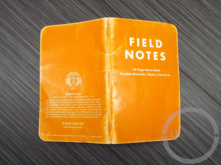
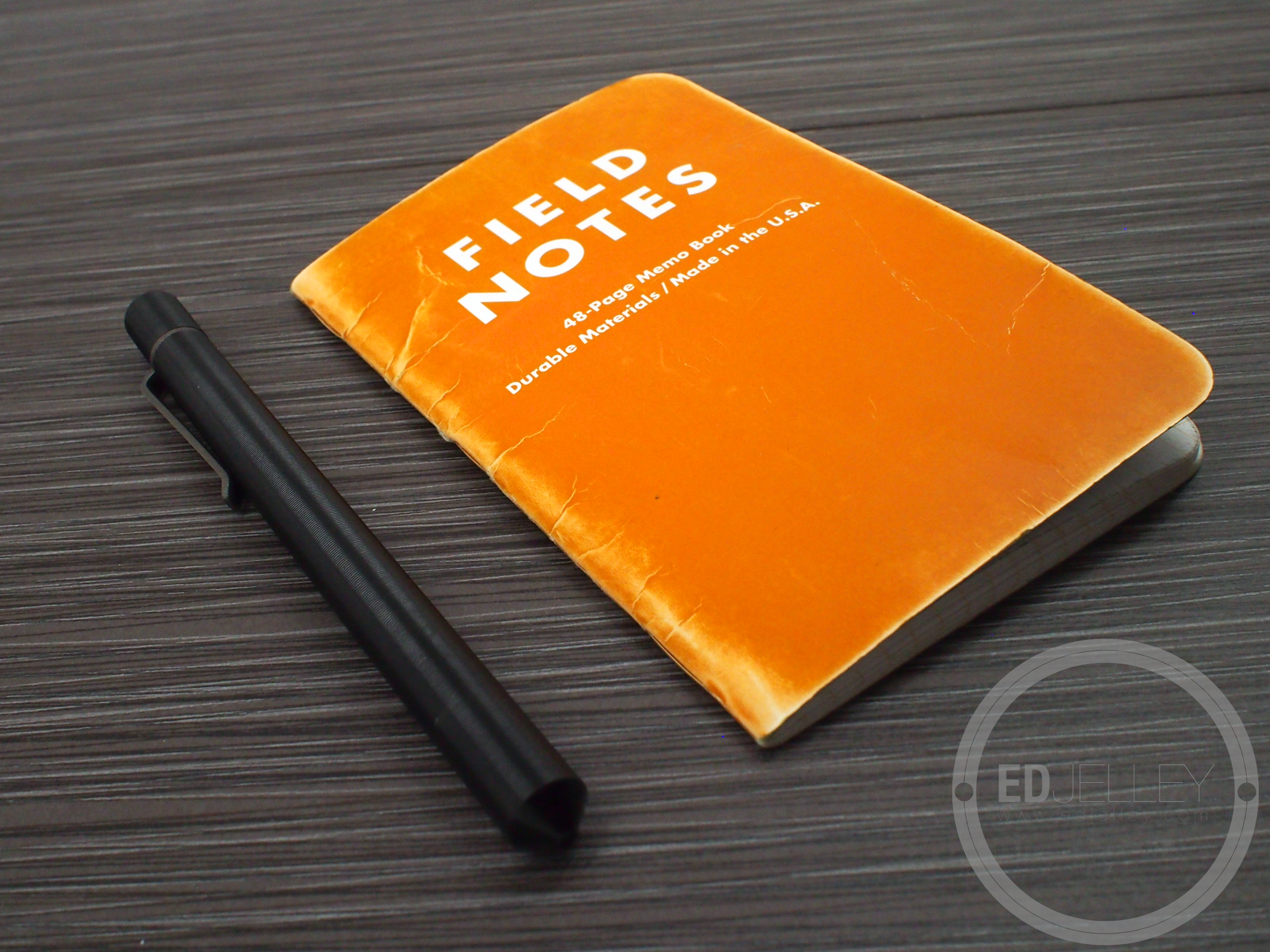
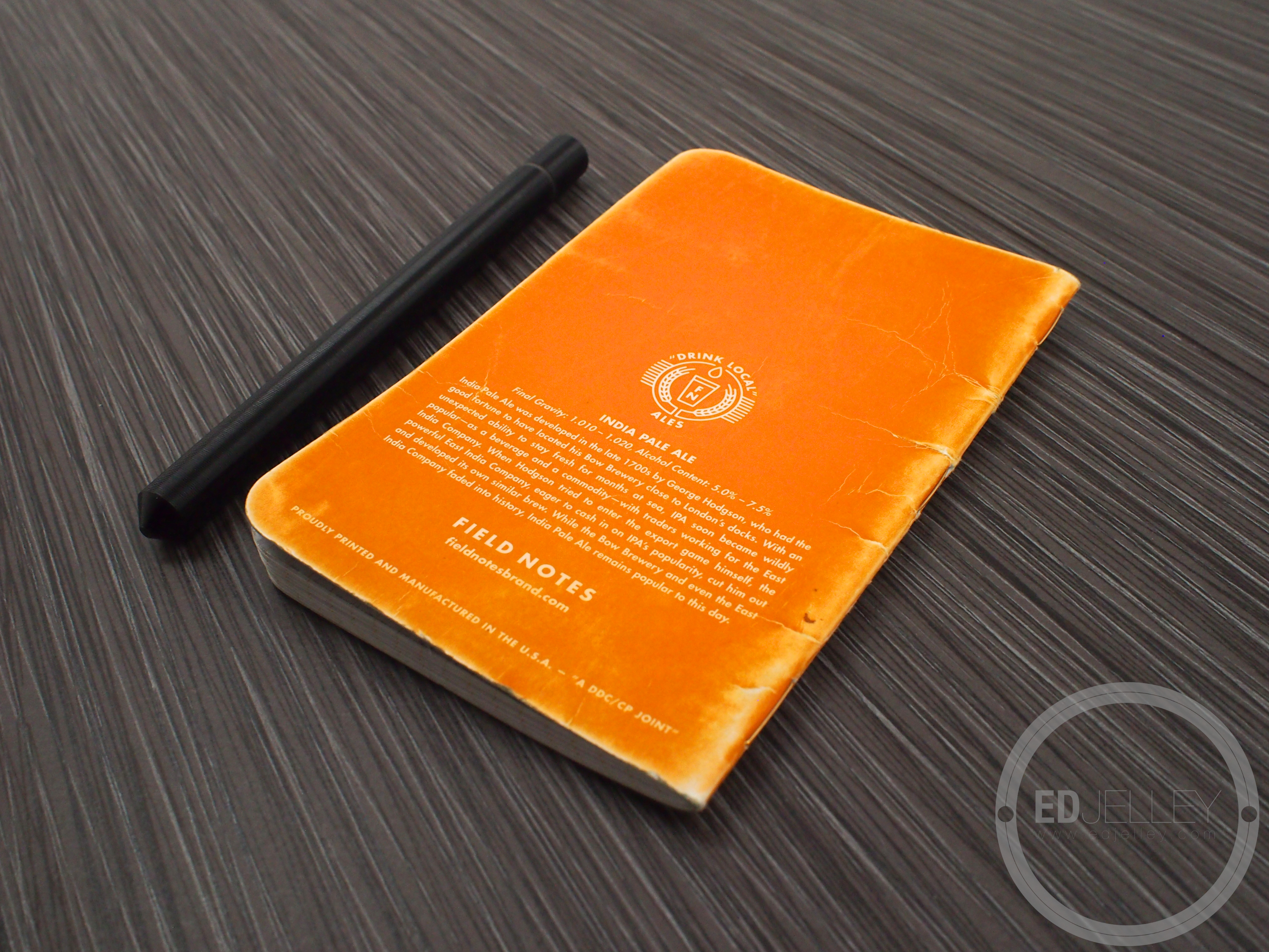
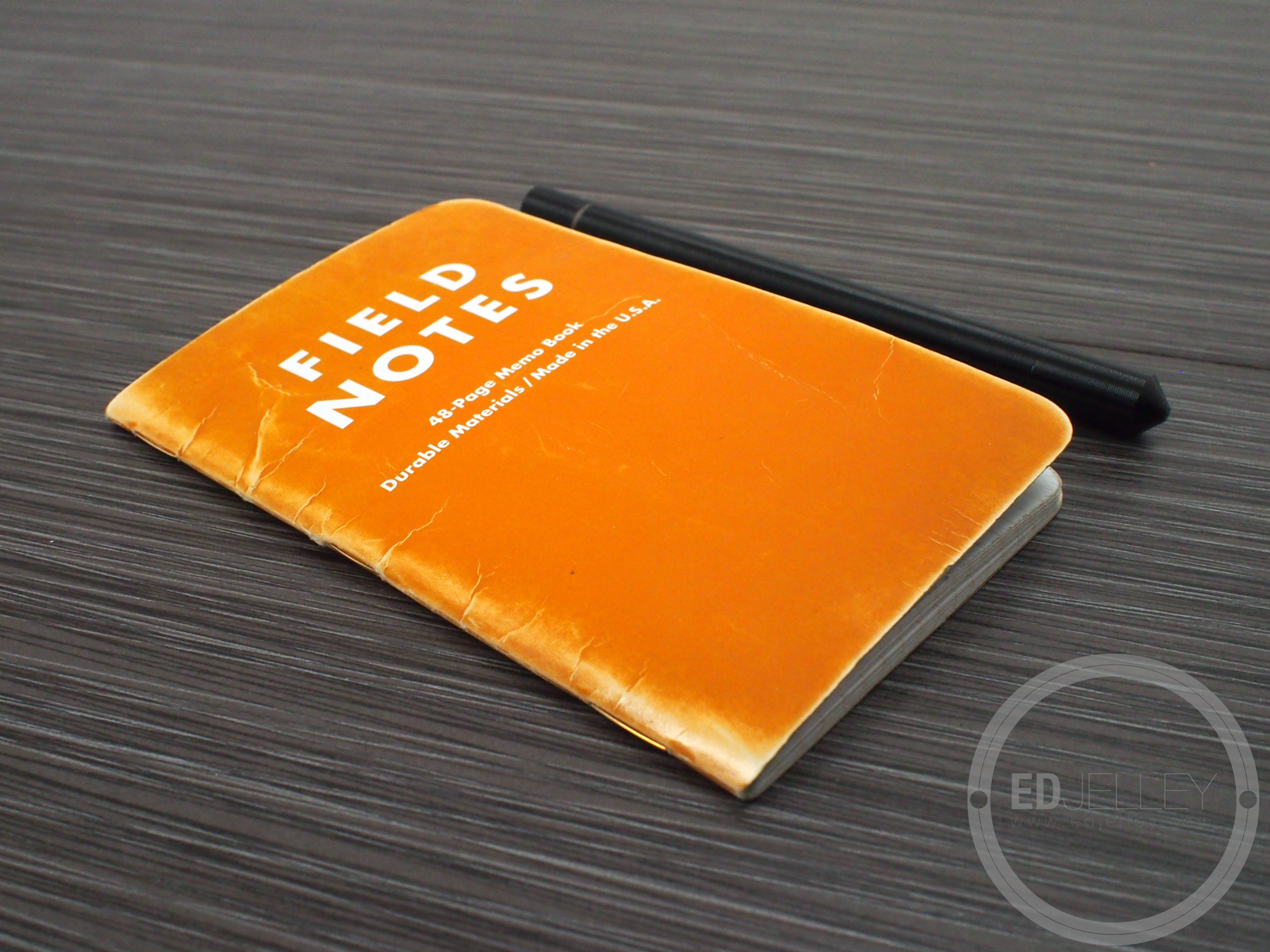
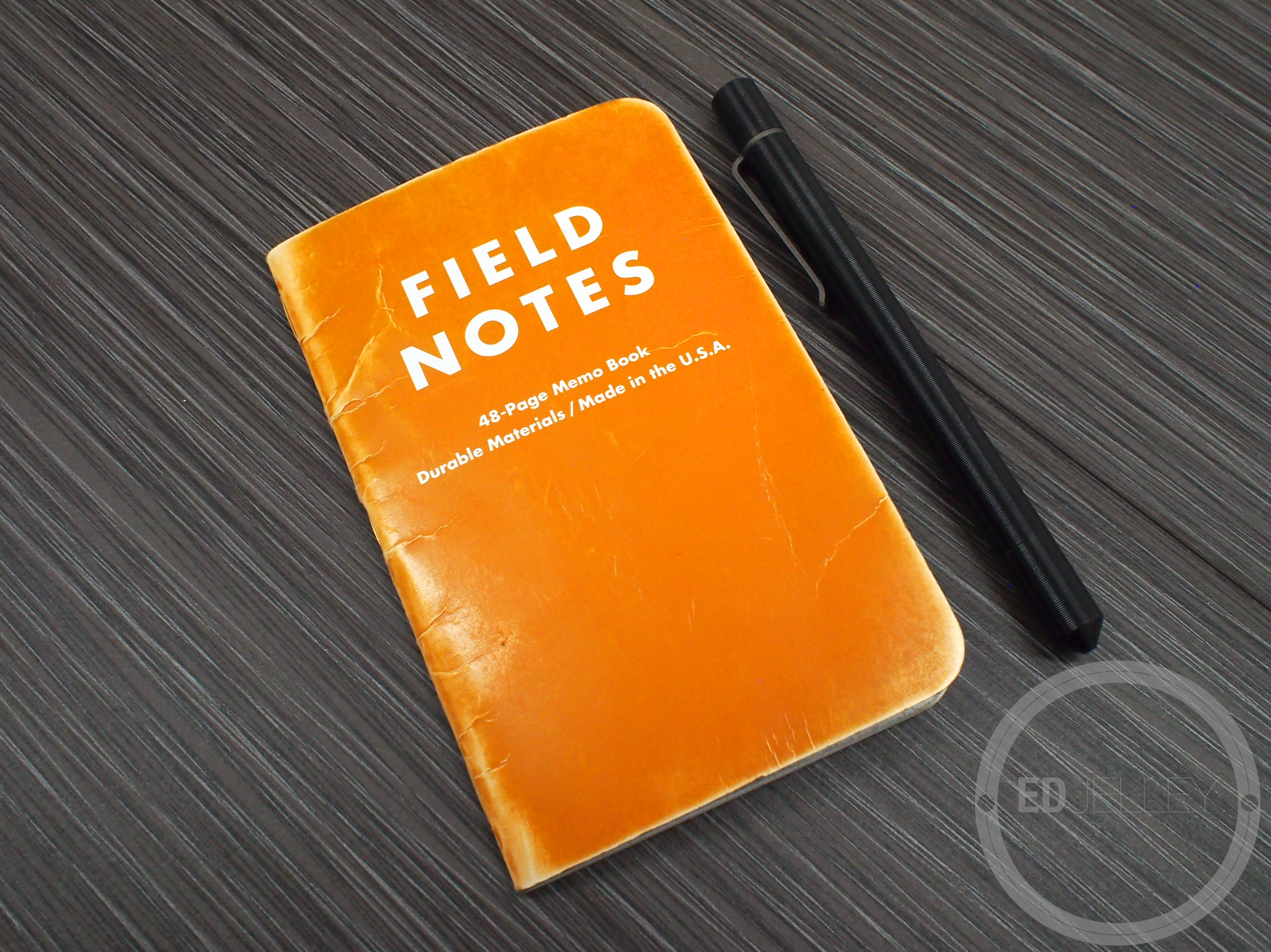
This isn’t so much a review, as it is me drooling over how awesome my Field Notes Drink Local Colors Edition – IPA looks. It’s amazing. Absolutely, 100% awesome. This notebook has worn in so well, I wish I had a hundred of them. I’ve been carrying the book for about a month so far, it lives in the front pocket of my jeans. The book is almost done (Brad Dowdy would be proud), and I can’t wait to use the red one to see if it does the same thing (I really hope it does). The first half of the book is sectioned out into 3 boxes per page, and I’ve been using that as a journal. I was inspired by the Word. Standard Memorandum – which I think is a hair too small for me. the back half of the book is reserved for notes and other miscellany. I hope you enjoy the pictures as much as I’m enjoying this book. The way the finish wore around the corners is nothing short of beautiful. I think I now officially like the color orange…


Thanks for reading / looking. I would love to see your thrashed Field Notes, either email them to me through the contact page, or put a link in the comments!
Related Reading:
- Field Notes Colors: Fall 2013
- Doxie Flip Scanner
- Field Notes County Fair Edition
- Pocket Notebooks: What does fountain pen friendly mean to you?

We (field nuts) spend so much time lusting over the old school stuff like ravens and firespotter we forget the beautiful colors featured in the particular edition. Nice post. Great looking book!
Thanks!
I can’t quite justify spending the crazy money that the old ones fetch. I liked this edition so much, I’m thinking about getting another round before they’re impossible to find.
Very nice review here. I, too, like those indications of “use”. What character!
Thanks!
Can’t wait to see if the other ones do the same thing.
Hi Ed!
I’m looking for some help understand the lure of field notes. From the reviews I read the paper ain’t the best and $10 for 3 wee notebooks seems expensive!
I’m from Scotland and I can get the little Rhodia cahiers for less than £1 and they come in orange! Haha. I’ve checked the US cost and you can get 5 of them for the same price as the fieldnotes. Surely the better paper make them the easy choice?
Is it the branding? Or the special editions? What am I missing? I must admit that I’ve never held one because they aren’t readily available over here.
Hey!
It’s really not the best paper out there. There’s definitely better for fountain pens in the pocket notebook format. I think the lure is that they’re made in the USA, they come out with awesome special editions quarterly, and they’re becoming pretty highly collectable. It’s definitely the branding and special editions.
Some are much better than others – the last special edition (Cold Horizon) was pretty terrible – I hated the paper. The one in this post is awesome and the paper is decent. My only complaint with those Rhodias is the long dry time. Check out this post I did on pocket notebooks and fountain pen friendliness – much more in depth look there.
https://edjelley.com/2014/01/12/pocket-notebooks-what-does-fountain-pen-friendly-really-mean/
Beautiful photos!
(relevant: http://www.itsworn.com/ you might know this site already but… SUCH EYE CANDY)
Thanks!
I’m a big fan of itsworn.com – such awesome stuff.
I’m really hoping the red one from the pack does the same thing as the orange did.
I enjoyed your paean to a well used Field Note.
I pretty much have to like the color orange since I make much of my living growing and selling pumpkins. It is always good to hear of a new appreciation of the possiblity that oragne has the potential of being subtle, particularly when combined with the world of pocket notebooks.
I sent you a couple of photos……
I didn’t get the photos, I’d love to see them. Send an email to ed@edjelley.com
Really interesting back story! Always fun going pumpkin picking, and it’s hands down my favorite type of pie. This particular book is definitely close to pumpkin orange too.
Thanks for the comment!
Im interested in more about how you use them. How you organize it, ect.
I’ll do a write up when I start my next book, thanks for the idea!
Really cool! I just starting carrying a Field Notes book to use as a daily planner/ memo book. Incidentally, I am also using the IPA edition. It is building some character.
Nice! I think I’m going to use the reddish one next.