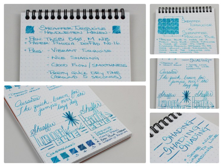
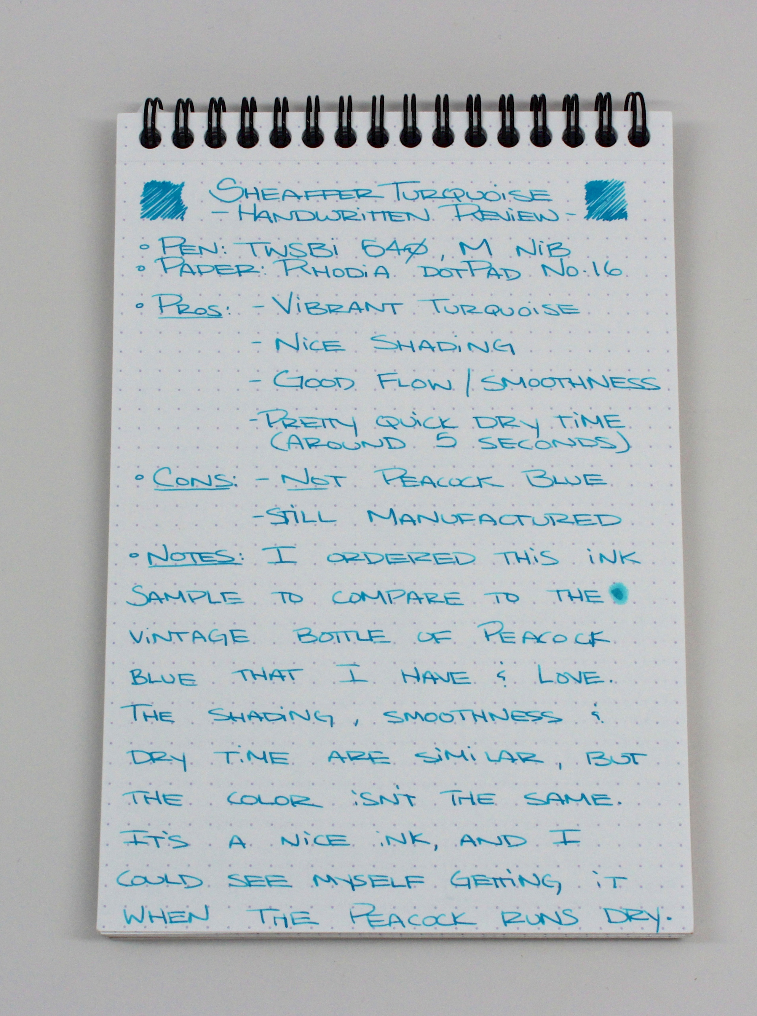
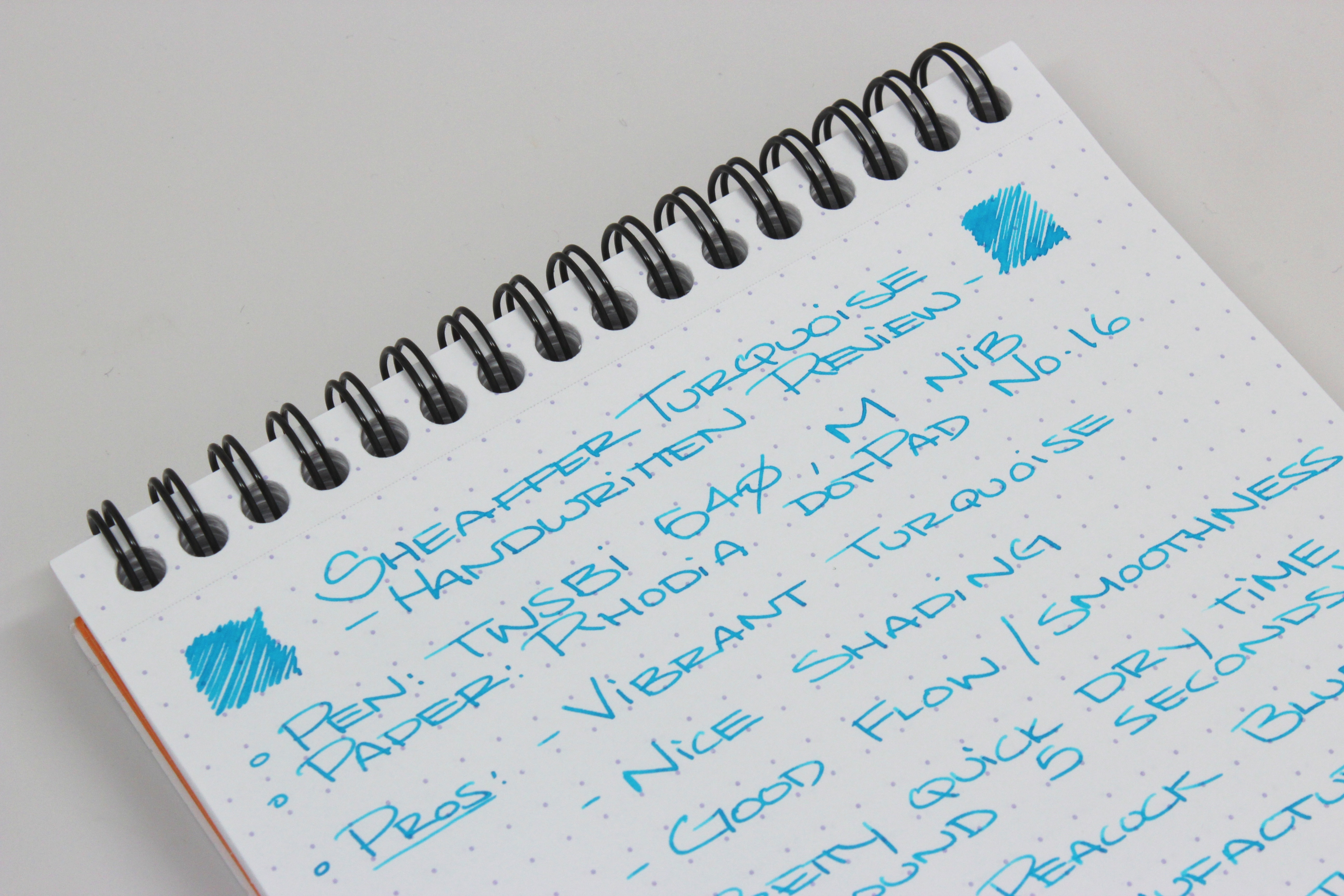
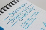
Pen: TWSBI Diamond 540 – Medium Nib
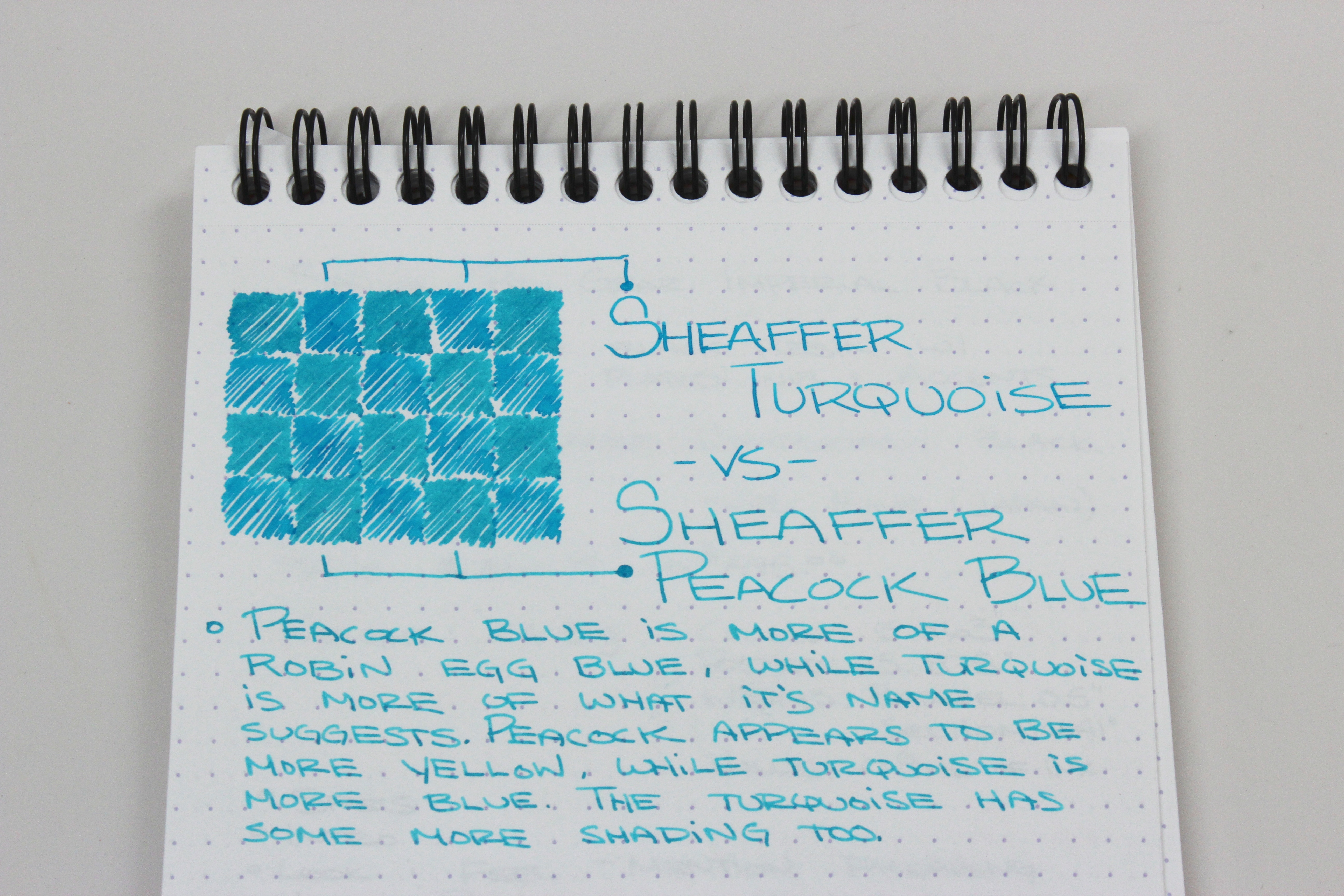
Ink: Sheaffer Turqouise, Sheaffer Peacock Blue
Paper: Rhodia dotPad, No. 16 – Top Spiral Bound
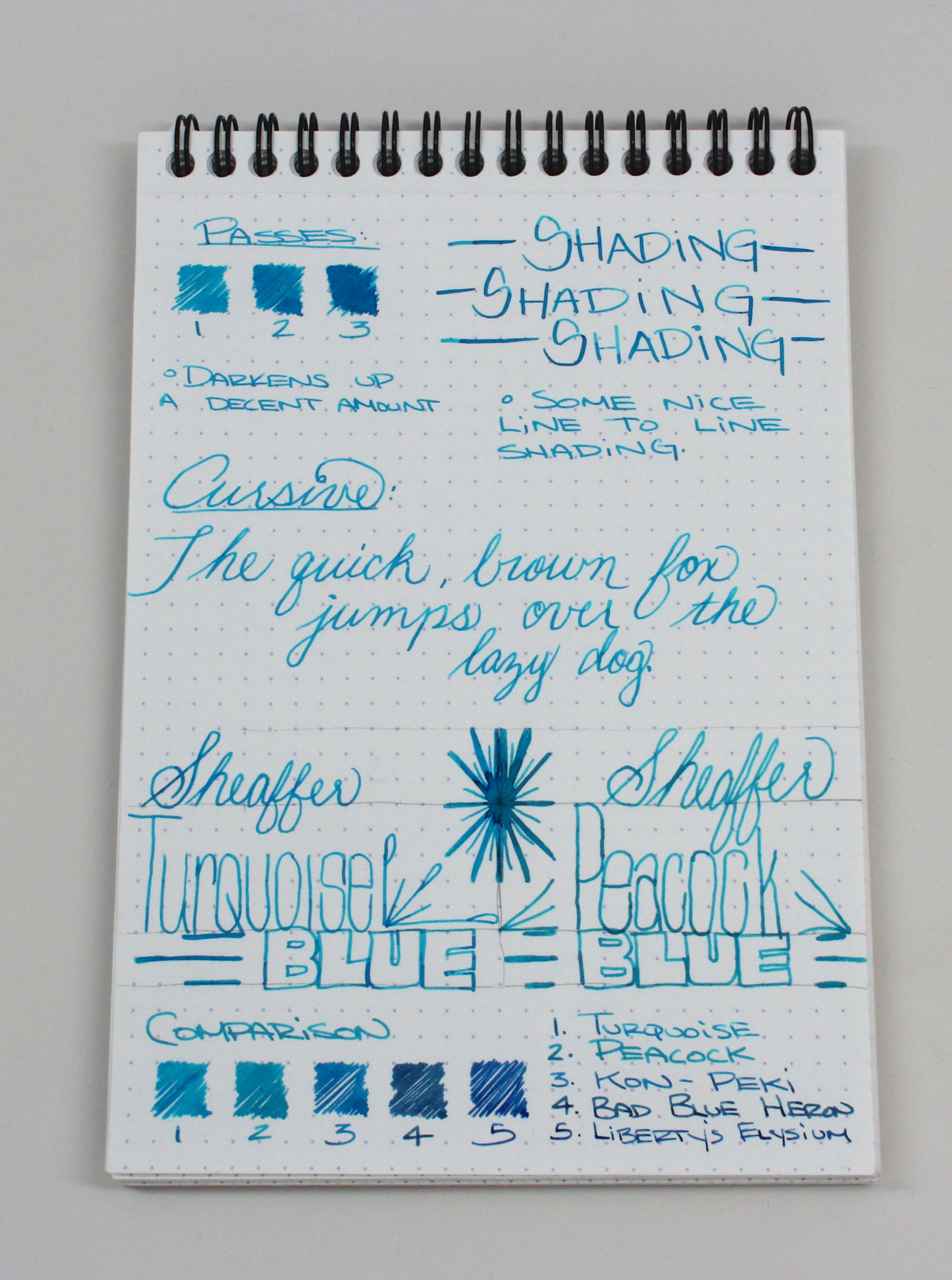
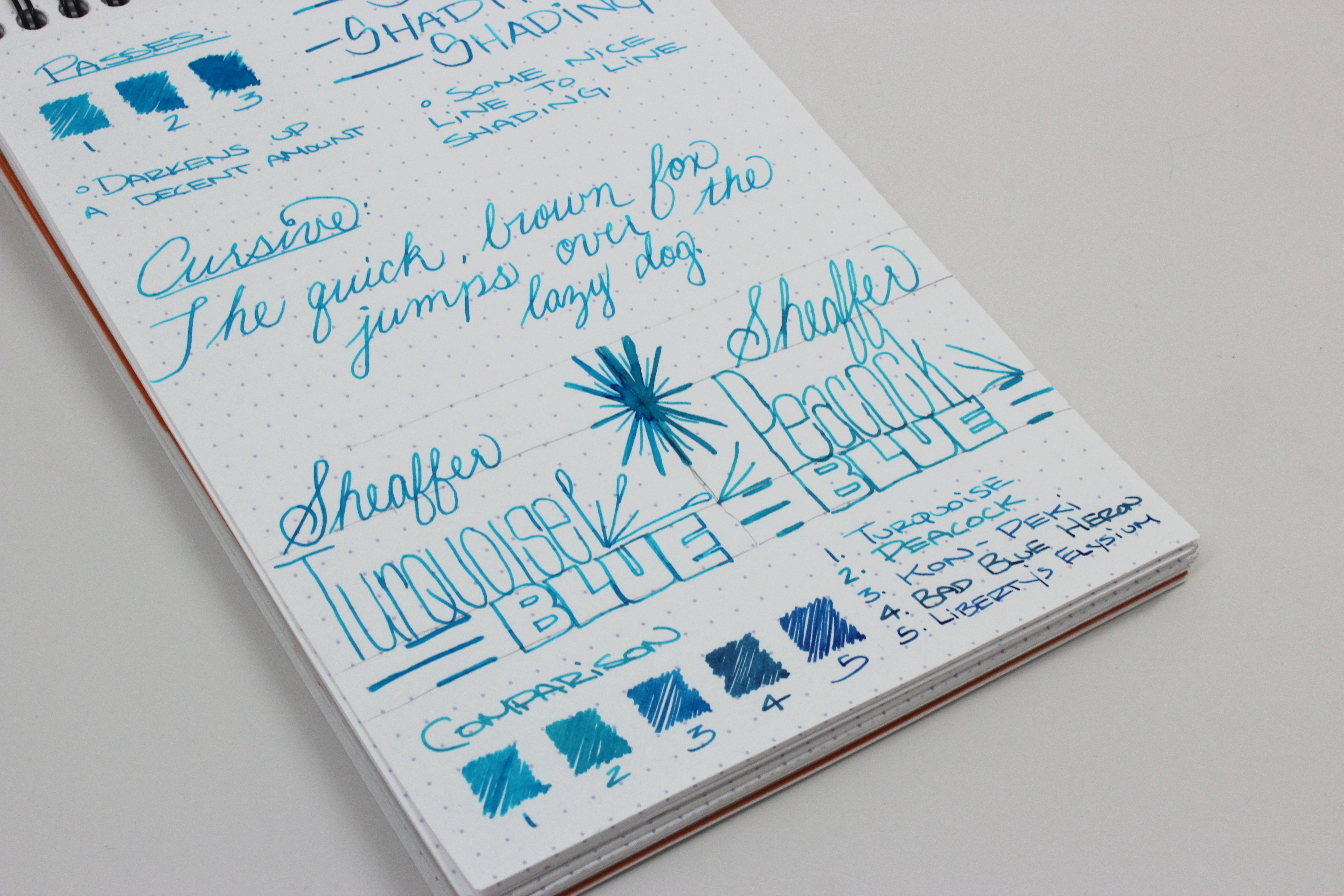
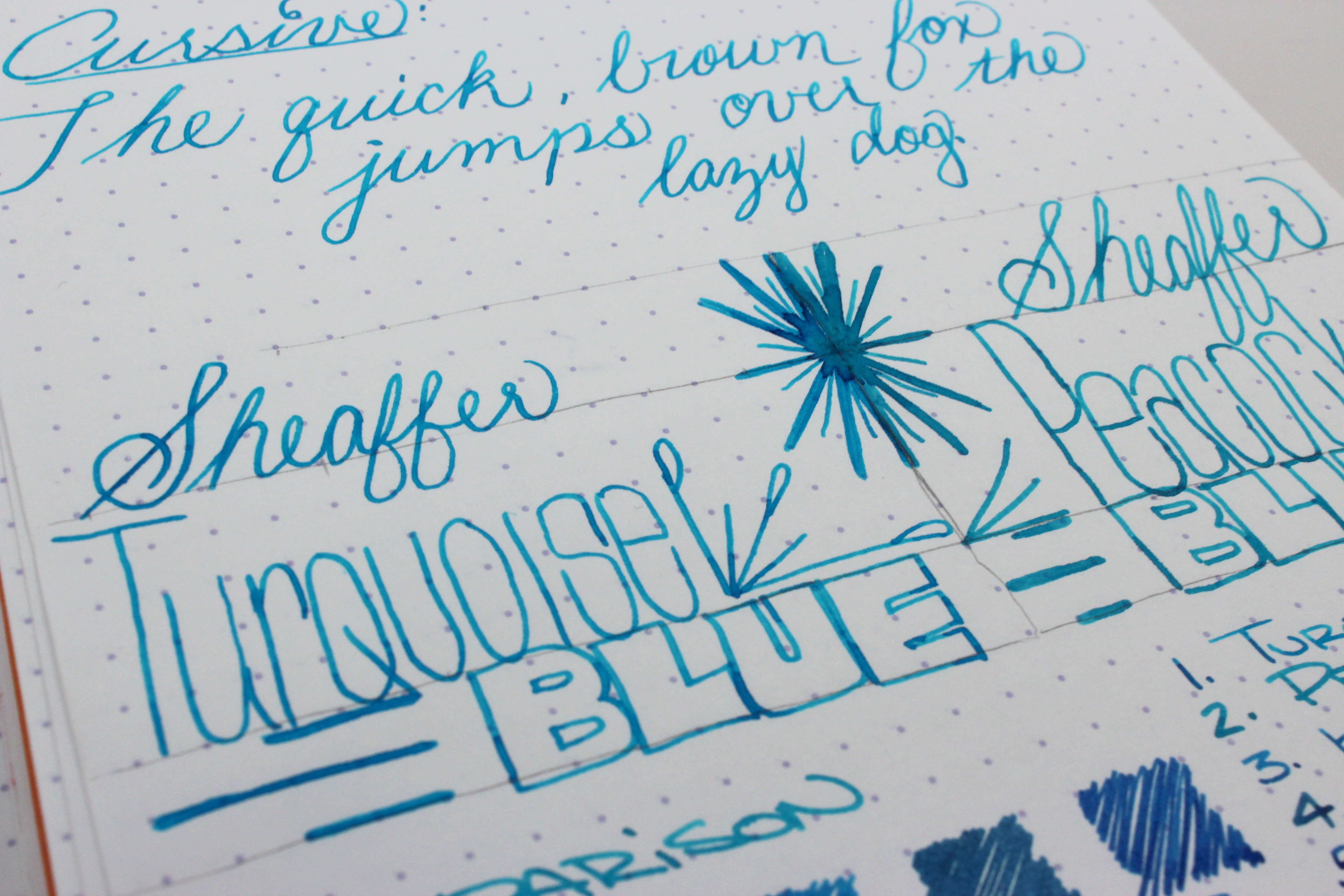
Notes: I ordered this sample of Sheaffer Turquoise because I wanted to compare to the bottle of vintage Peacock Blue that I have. They’re pretty close, but the Peacock Blue has a little bit more green in it, and doesn’t shade as much as the Turquoise. The Turquoise performed very nicely, had great shading, and wrote nice and smooth. The color was pleasing as well. I used all of the blues I had inked up in the comparison section to give a better idea of what the shade was. While I don’t think it’s a direct replacement for the discontinued Peacock Blue, it’s pretty darn close.


Conway Stewart’s Turquoise is a great match for Peacock but it’s got NO lubrication. I use it constantly because the color is great but I always say to myself after a fill. Why? Why do I keep using this? It makes the best pens scratchy.
Luckily I stil have a decent amount of the Peacock Blue left, so I’m not in panic mode as far as replacement yet!
It could be worth a shot mixing in a little bit of green and black to the Turquoise to see what happens.
I, too, loved the Sheaffer Peacock Blue. I still have a couple of cartridges left. I recently bought some Diamine Turquoise; but it’s not the same either. Thanks for the reviews.
Thanks for reading them, glad you’re enjoying the site!
DOn’t hate me.. But I couldn’t read this colour on my phone.. I had to wait until I got home and used a big screen. It is too light for my old eyes…. 😦 Pretty but not at all handy.
No hate! I can definitely see how this ink could be tough to read. I feel like it may be easier to read in person though.
Still one of my favorites!
I really enjoy all of my Sheaffer inks. When Boise Blue Art Supply closed up, I boought all of their remaining Sheaffer carts for a song (somep peacock, some gold, mostly red, green and blue-black) but I’ve burned through them all and have been acquiring bottles. The newer turquoise and green are hard to tell apart: too much green in the turqoise, too much blue in the green. In my eyes, anyway. I usually add a squirt of Noodler’s yellow to the green.
Nice find! The new Turquoise just isn’t the same as Peacock Blue. Something about it is just more pleasing to look at (to me at least). Thanks for reading!
This is among my favorite inks. It’s definitely my #1 favorite turquoise. Because I enjoy it so much, it is the benchmark against which I compare all other turquoise inks. Nice review!