Visconti Homo Sapiens Elegance
Fountain Pen Review
- Review Ink: Kobe #7 Blue Ink
- Review Paper: Rhodia Ice Pad
Specs:
- Description: A version of the well-known Homo Sapiens made from black resin
- Nib: 23k palladium “Dream Touch” nib. Medium nib reviewed.
- Filling Mechanism: Visconti converter system
- Weight: 43g overall (23g body, 21g cap)
- Measurements: 5.7″ capped, 5.2″ uncapped, 6.7″ posted
- Color Options: Black resin
 Intro/About:
Goldspot sent this loaner pen over for review. Let’s start off by letting it be known that I didn’t drop $650 of my own cash on this pen. It’s on loan, and will be sent back. It’s kind of tough to come out the gate and say it, but I’m glad this pen is a loaner. $595 is a TON of money for a lot of people, and I think a $595 should be a perfect pen. Is the Homo Sapiens Elegance a perfect pen? Let’s dig in and find out.
 Appearance & Packaging:
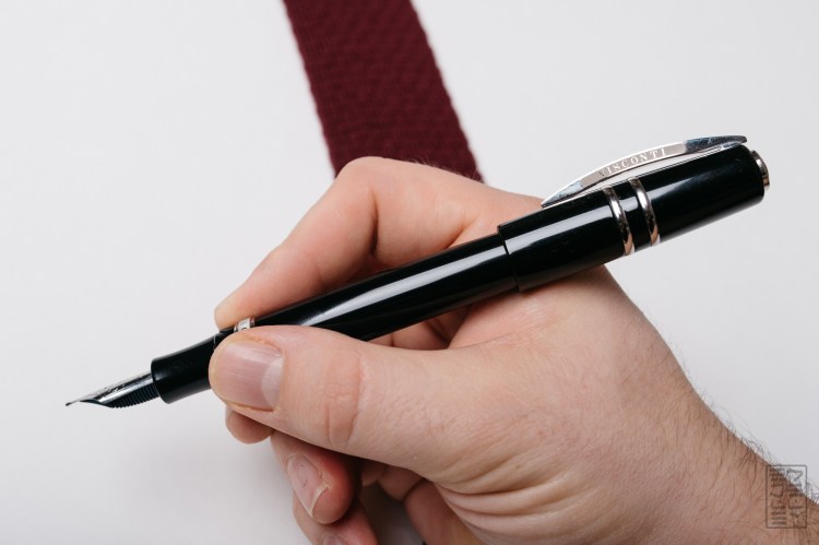
The HSE (Homo Sapiens Elegance – I’m going to use HSE from here on out) is an oversized black and silver pen. It’s adorned with two rings on the cap, a relatively thick cap band, a curved clip, and the signature Visconti coin inlaid in the top of the cap. The ornate finial on top protrudes just a bit past the resin cap. This version of the HSE is the “maxi” version, so it’s a rather large pen. Although this pen is capable of posting, doing so makes the pen really, really long. It also puts some serious weight towards the back of the pen.
The HSE is a cool looking pen. I used to have a Homo Sapiens Bronze Age in my collection, and I definitely dig the shape and overall look of the Homo Sapiens line. The Maxi size is especially impressive, as the shape definitely suits the larger size quite well. The shape isn’t super traditional, and here it works. It’s like a softened cylinder that somehow just looks organic. Ancient almost (especially the lava version).
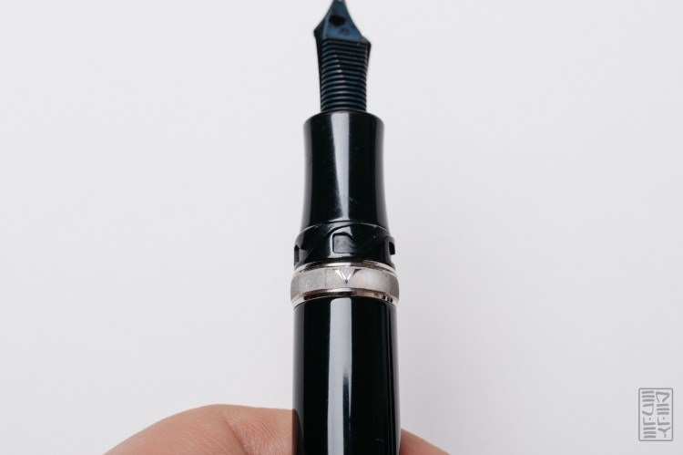 Although I quite like the silhouette of the pen, there are some things about the HSE that I just don’t understand on a $595 pen. There are several aspects about the appearance of this pen that I don’t think are acceptable on such a pricey piece. The most glaring one is the laser engraving on the center band and clip. Instead of nice, deep engraving, they opted for a weak, shallow laser engraving that isn’t uniform. I’ve seen nicer engraving and etching on a $40 pen, and here it just ruins the overall look of the pen. They market the Elegance as the “most affordable prestigious pen” by making a few compromises. I understand that Visconti has to differentiate it from the more expensive Homo Sapiens models, but low quality laser engraving is not the way. If brands like Pilot can pull it off on a pen that costs a fraction of the HSE, then there just isn’t an excuse. Other than the finishing details, it’s a great looking pen. It’s unfortunate that this lack of attention to detail can turn something that could have been perfect into something that leaves more to be desired.
 Box test: Would I feel like a cheap jerk if I was giving this as a gift to someone if this is the box it came in? Nope. The HSE comes in a leatherette box that leaves a nice impression. It’s lined with satin and looks great. One problem though. The pen is just pinched in there by a tension clip. There’s no band over the top of the pen and I opened mine to find it rattling around inside the box. Yikes. A $0.25 piece of ribbon to stop a $595 pen from bouncing around seems like a no brainer.
 Nib Performance & Filling System:
The 23kt palladium “Dreamtouch” nib is the shining star of this pen. I’m happy to report that it’s a buttery-smooth writer with just the right amount of flow and cushion. The nib on my old Homo Sapiens left something to be desired – it hard started on almost every line and skipped a whole lot. It was a very frustrating experience, which ultimately lead to me selling off the pen. I have heard other reports about nib QC being poor. I think that Visconti has taken notice, because this thing writes so, SO good right out of the box.
“Dreamtouch” does scream marketing jargon, but I think they’re actually right. This nib does live up to its name. The writing experience is nothing short of excellent. It may be one of the best nibs I’ve used, especially since it didn’t need any tuning or tweaking to get right. The Elegance line is marketed as the most affordable way to get your hands on a pen with this nib, and one of the top reasons to buy it – they’re definitely on to something.
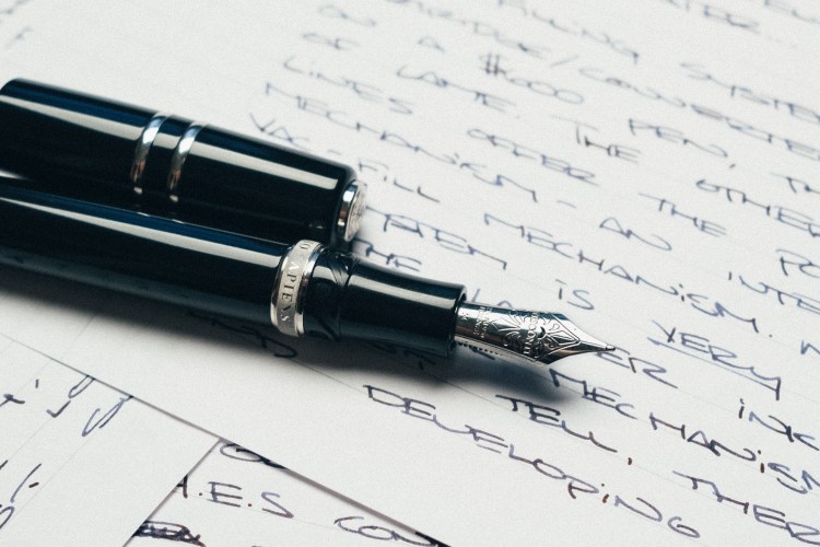 The filling system is a cartridge/converter system. Again, on a $595 pen, this is kind of lame to me. The other Homo Sapiens pens have a cool power filler system – an integrated vacuum plunger style with a huge ink capacity. Visconti does include their converter which is actually really nice. It’s really well made, with several metal parts and some nice knurling on the twisty part. I do miss the other mechanism that was on my Homo Sapiens Bronze Age. In case you can’t tell, this review is starting to have a recurring theme…I think we’ve almost reached a conclusion.
 Feel:
Feel:
In hand, the HSE is pretty big. It’s not uncomfortable to write with though. I find the pen to be really comfortable. At 23 grams, it’s got just enough heft without being too heavy. The grip is wide, but not too wide and it’s also really comfortable to hold on to. The gentle curve is just enough so that your fingers don’t hit the nib. I’ve found that during longer writing sessions, the pen is easy to use and kind of disappears into my hand. The step from the body to the grip is pretty aggressive though. This is due in part to the twist lock mechanism that Visconti uses on most of their pens. It’s supposed to keep the pen on super tight – requiring a push down and a twist in order to get the cap off. I think because of the resin material, there’s not enough friction, or the grooves aren’t cut deep enough, or something — the cap comes off super easily. It doesn’t securely lock down. Just a little bit of pressure pops the cap off, with or without the necessary push down. Again…a $595 pen with a main feature that just doesn’t work well. The cap is capable of posting on the back of the pen, but since it’s so long and heavy, I wouldn’t recommend it unless you are a giant.
Pros:
- Seriously great nib
- Comfy shape
- Unique design
Cons:
- Poor attention to detail
- C/C filling system
- Very Expensive
- Cap doesn’t securely close
 Conclusion:
While the HSE should be a super impressive pen, I think there are plenty of better options out there in the price range. At $595, there are just too many compromises made for me to justify the spending that much money on a pen. What would I recommend? Saving up the extra $100 and snagging the Visconti Homo Sapiens Bronze Age. If you’re going to drop a serious amount of money on a pen and want the Visconti experience (unique design, awesome nib, cool materials) just wait a little longer and grab the Bronze (or Steel, or Dark) version. You get the same nib, but a better filling system, deeply engraved details, and better finishing. That being said, the HSE is no slouch. It’s still a pleasure to write with – the excellent nib and comfortable body are still nice. Also, a $595 pen is definitely a luxury product. You don’t need to spend that much money to get a great writer. When buying a luxury product, personal opinion definitely plays a huge role in the purchase decision. Is the HSE a bad pen? Definitely not. Are there better options out there for the same price (or slightly more for way more perks)? Yes.
Gallery:


Thanks for the great review!
I’ve wanted to get my hands on a Homo Sapiens Oversize Dark Age for a while, but strangely I’ve always been put off because I prefer cartridge/converter fillers… go figure. Now they seem to have covered the bases for me, they (might) have got their nib quality control right — seriously, crap QC on such premium pens for so long? — and the filling system is good for me… but, the cap. Really? Everything else is perfect… but a cap that can pop off in your bag or pocket — on a $600 pen? Visconti really need to get their act together.
Thank you so much for your pen reviews. They are getting more and more real stories than reviews, and I like me to recommend your blog, when somebody has a question about pens.
Great review. The pen looks even better with the Omega Speedmaster 🙂