Field Notes
Fall 2016 Colors Edition
“Lunacy”
Specs From Field Notes:
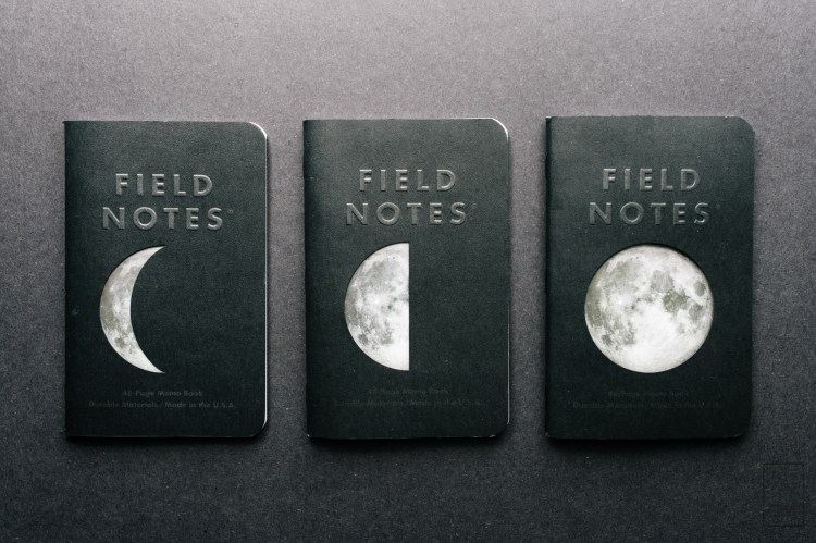
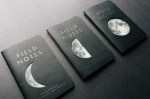
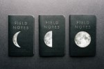
This is the aptly-titled “Lunacy” Edition. There’s lots to love about this release. The embossed covers are made from Neenah’s Classic Crest “Epic Black Stipple” which features a gorgeous, almost leathery finish. For the first time ever, we’ve die-cut the covers, using individual dies for each of the three books. One reveals a full moon, one a half moon, and one a crescent.
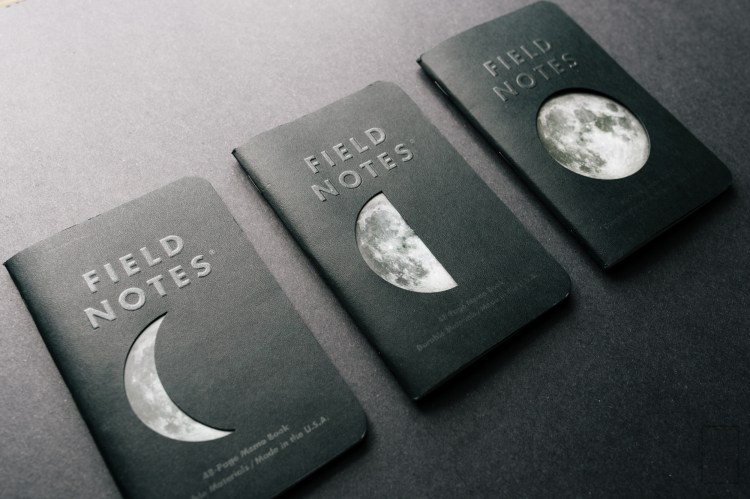
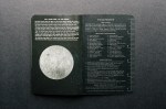
The moon that’s visible through the die-cut is printed in 4-color on a glossy flyleaf which also includes facts and folklore about earth’s constant companion, as well as a lovely shot of the dark side of the moon in the back of the books. The Field Notes logo is embossed with a subtle hit of varnish, and the back cover features an embossed full moon. The books are bound with black staples (of course), and the 48 body pages feature a reticle pattern on light grey “Moondust” pages.
Notes:
 This is a pretty serious Colors edition. There’s just so much going on, and the name, “Lunacy”, fits the edition in more ways than one. In case you couldn’t tell, these books are themed around the moon. They feature die cut panels, specially printed inserts, and embossing on both the front and the back. It’s an impressive looking edition, read on to find out more about these unique little pocket notebooks!


In my opinion, these are one of the coolest looking Field Notes editions to date. I love the black textured covers, black staples, and attention to detail throughout the books. They’re right up there with the Night Sky edition from a few years back, and I’m happy to see FN back to a space-themed book.
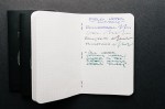
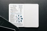
 The paper inside is a “moondust” grey with some texture to it. The paper is almost fuzzy, and would work great with a pencil. The ruling is a reticle pattern, which was on the previous Night Sky edition. It’s nice and unobtrusive, it gives order to the page without getting in the way. I definitely like it. Also worth noting, the cameras that took photos in space and on the surface of the moon had a reticle pattern so that distance between objects could be calculated based on the photos. It’s a cool little detail.
 The paper performs pretty well. The texture is noticeable when using a fountain pen, and least noticeable when using a ballpoint. It’s not my favorite paper out of the Colors editions, but it holds up well to fountain pen ink with no bleed through and minimal show through from this medium flow, medium-nibbed Lamy 2000.
 I really like this edition. They’re well done, tasteful, and have enough going on to where they’re interesting without being overwhelming. I stocked up on a few packs (which I always do, I don’t know why) and I’m looking forward to getting through the pack that I opened. This edition was recently released, and there’s still a bunch available over at Field Notes.
Thanks for reading!
Gallery:


I bought a pack of these and I love them… I think I’m going to have to buy a 2nd pack as I don’t want to ruin them by writing in them! 😀
as long as they are fountain pen friendly, they worth having.