
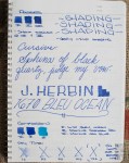
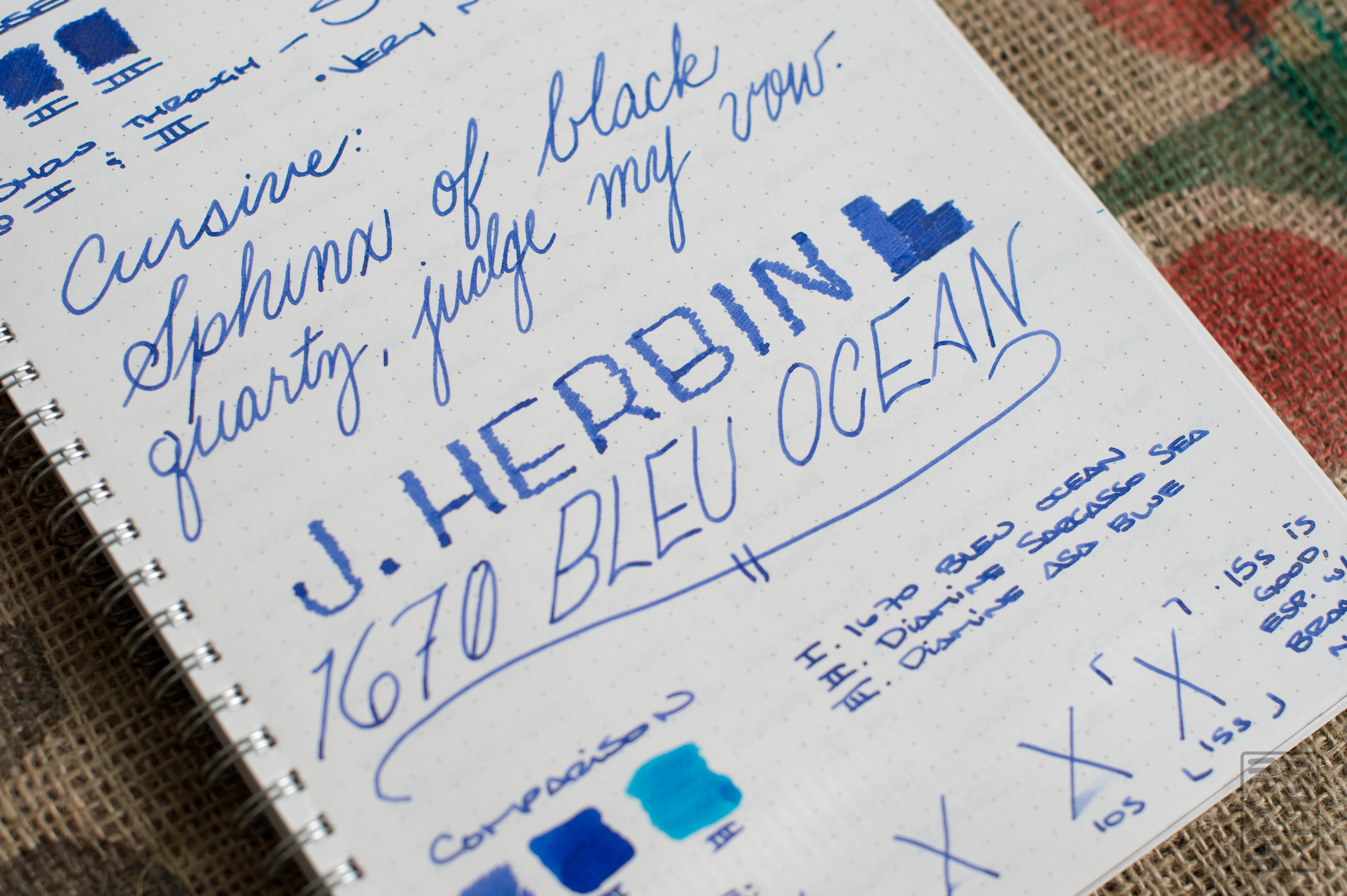
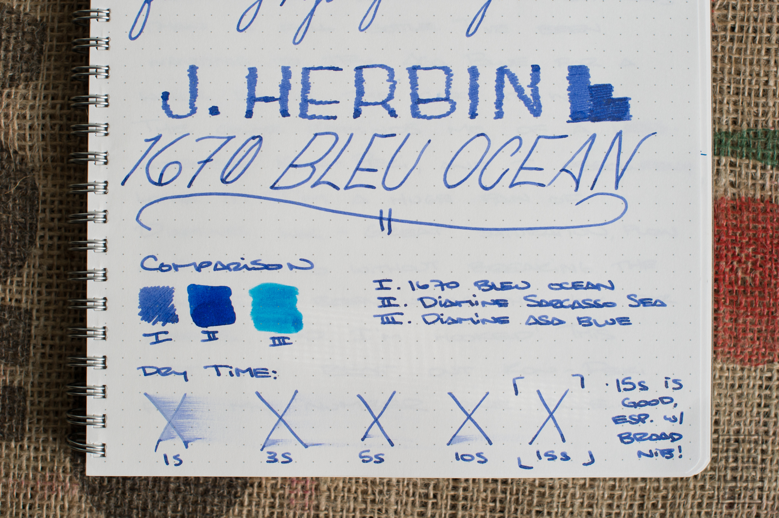
J. Herbin 1670
Bleu Ocean (New w/ Sheen)
Fountain Pen Ink Review
 Pen: Lamy 2000 Stainless Steel – Broad, Folded Nib Dip Pen
Paper: Kyokuto F.O.B. COOP – Dot Grid – B5
Notes:
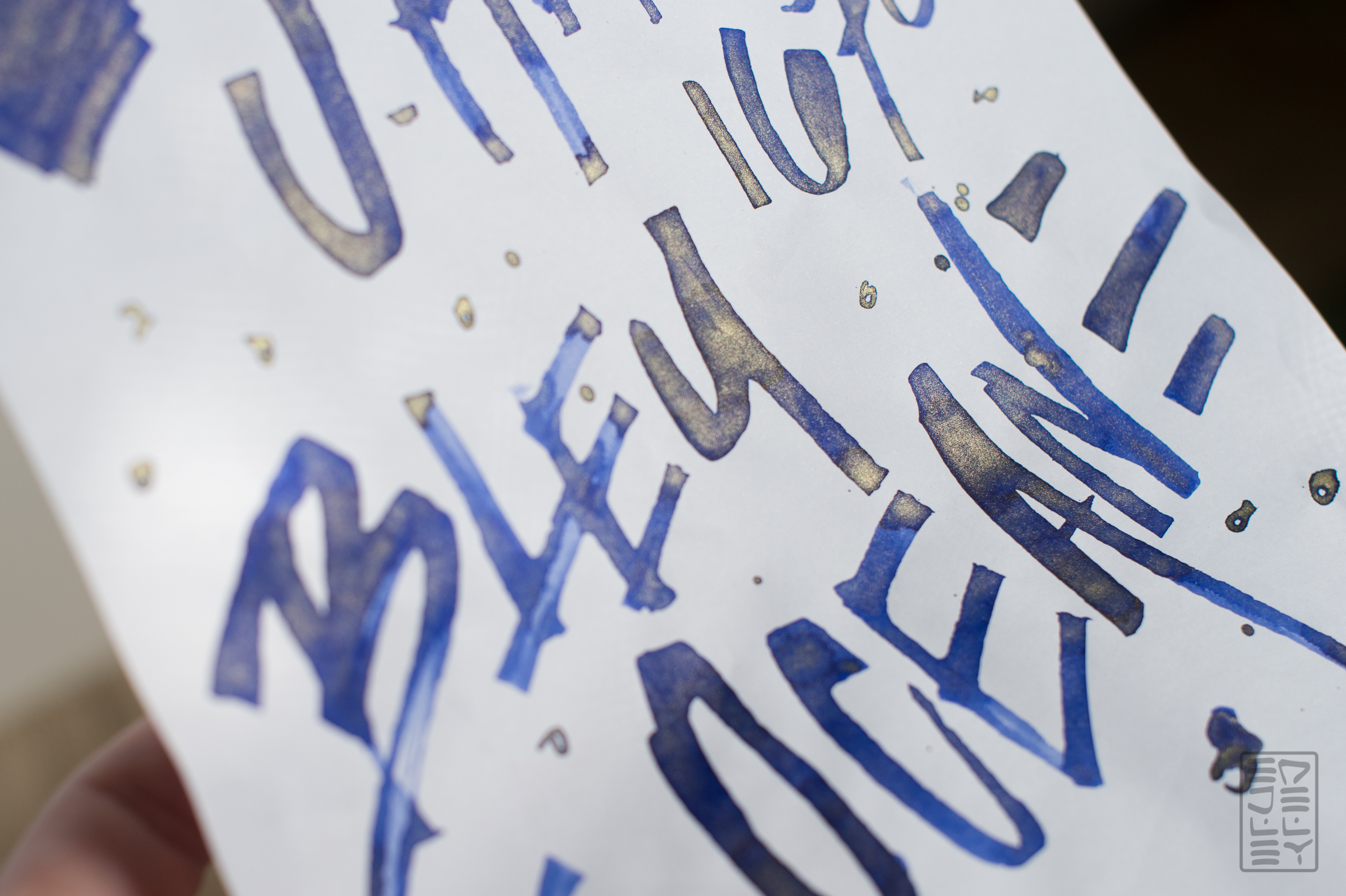
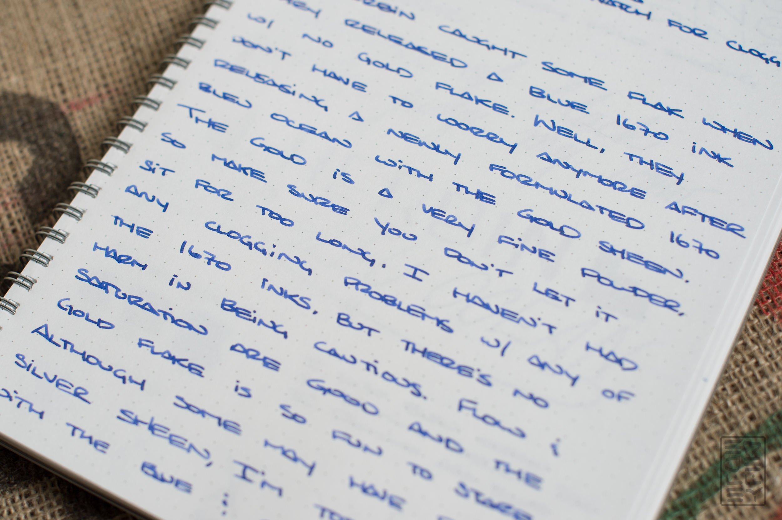
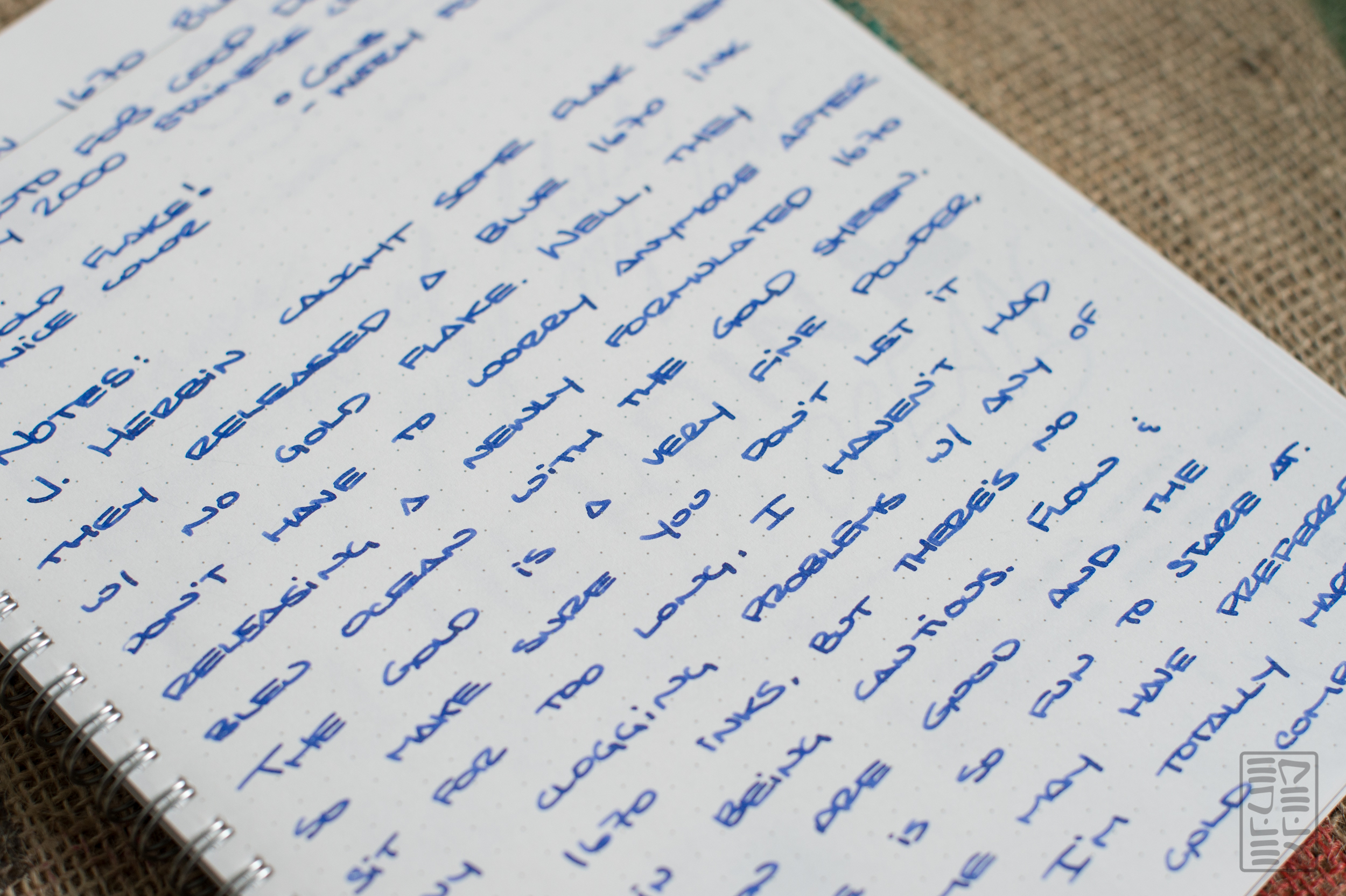
J. Herbin caught some flak when they released a blue 1670 ink a few years back and it had no gold flake. Well, no need to worry any more, as they’ve added a good amount of it to their deep blue 1670 ink. The gold flake (shimmer, whatever you want to call it) is a very fine powder, so be careful about leaving it in any one pen for too long. I haven’t had any clogging issues with regular use, but there’s no harm in being a little bit more cautious with this ink. Flow and saturation are good, and the gold flake really pops against the darker blue. Although some may have preferred a silver sheen, don’t knock it until you try it. The blue and gold looks pretty great in my opinion.
Check out this video I produced for J. Herbin for the new ink:
https://www.youtube.com/watch?v=Zlm0QGL-E1Y
All photos are uploaded in hi-res, click to enlarge!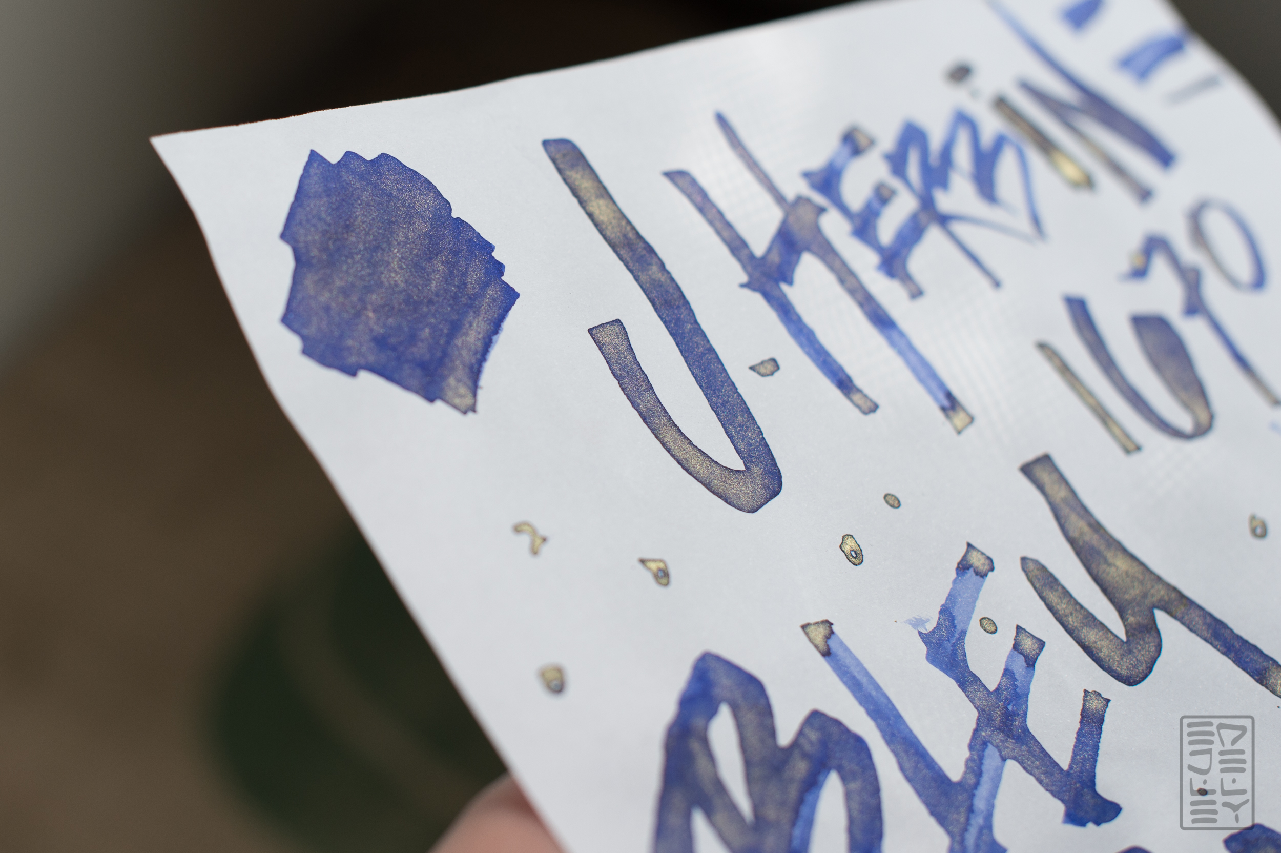
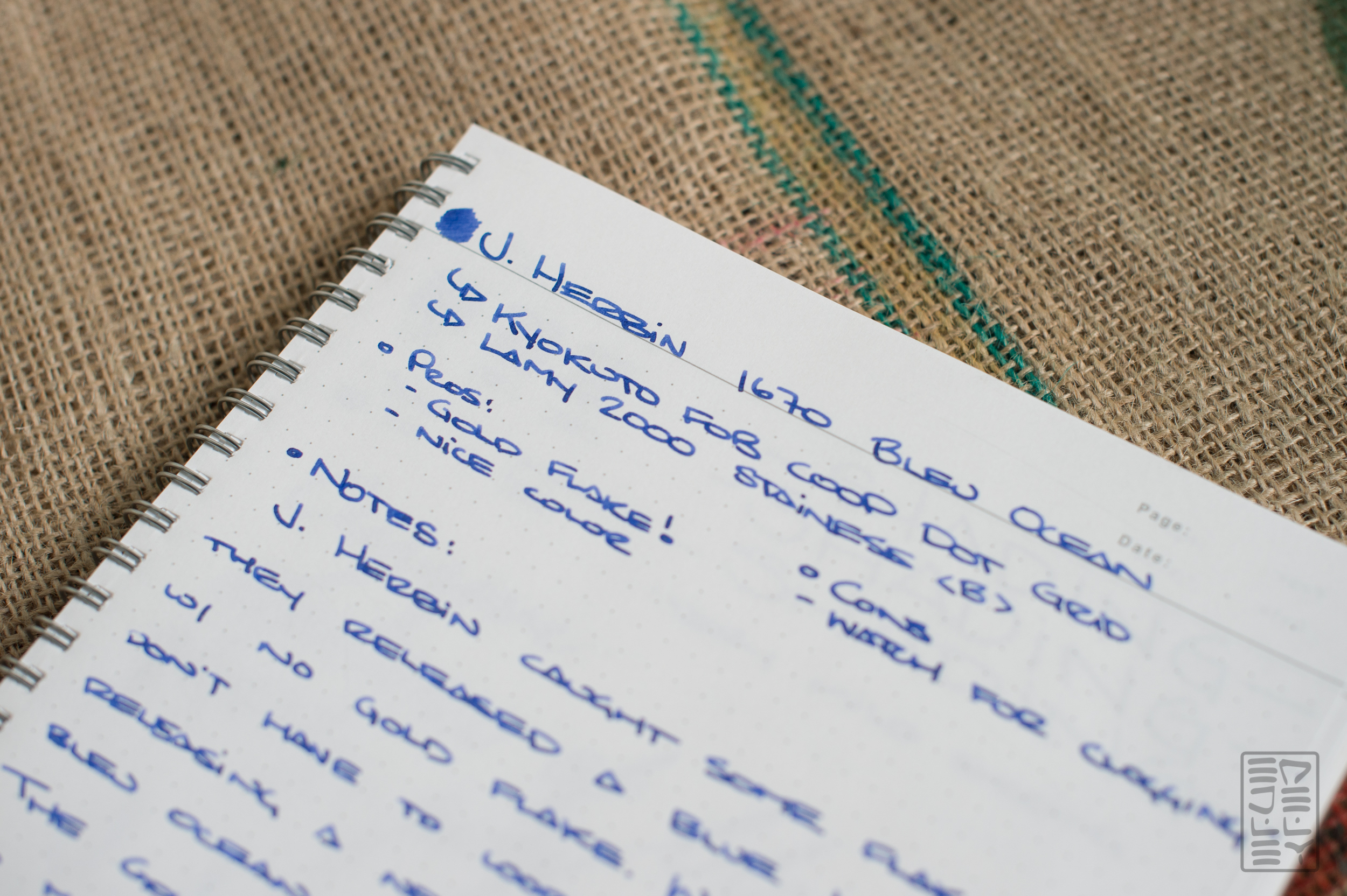
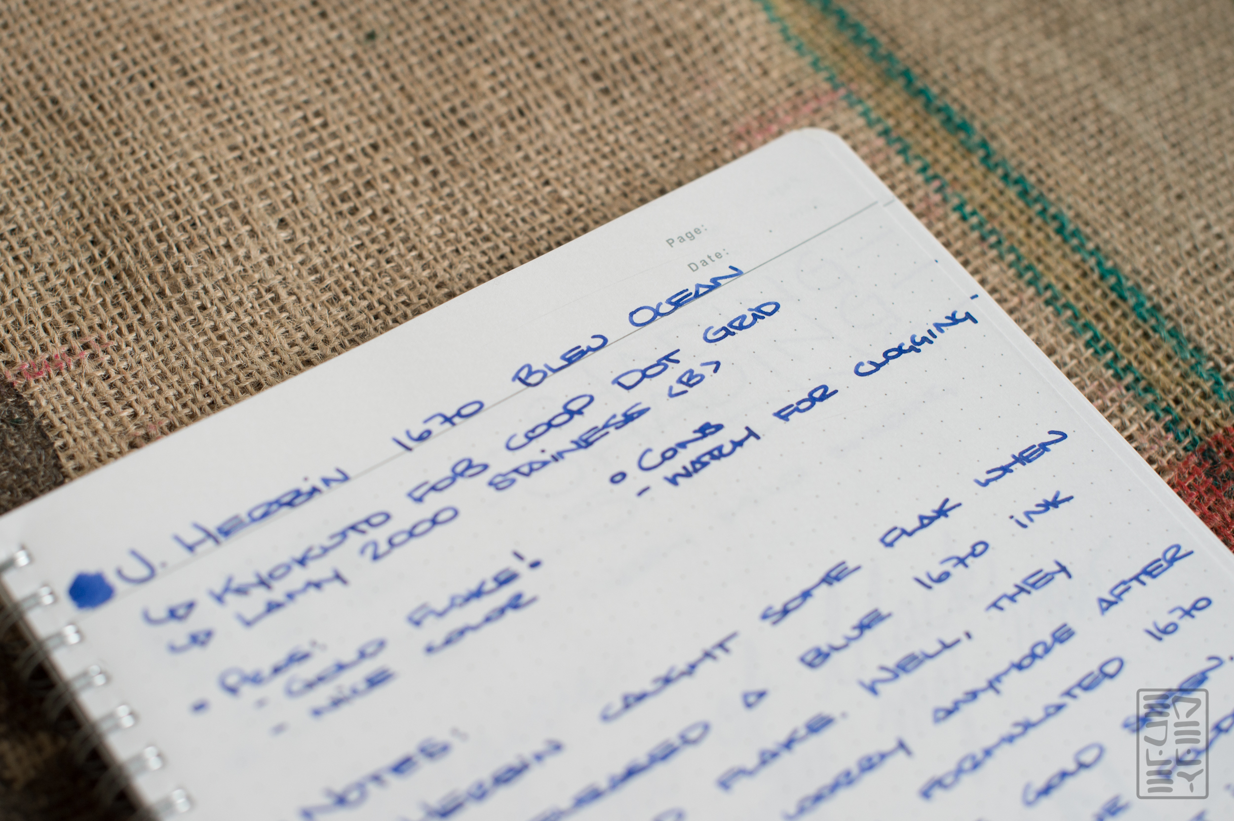
Pros:
- OMG GOLD FLAKE
- Nice Color
Cons:
- Watch for clogging
Gallery:


you titled this review of Blu Ocean ” Emerald of Chivor?”
On Fri, Oct 16, 2015 at 7:49 AM, edjelley.com – Fountain Pen, Ink, and
I goofed, I use the “copy post” to make formatting easier, and sometimes I forget to change the title. I fixed it, but not before the email went out. thanks for the heads up!
Your third ink in the comparison seems more like a turquiose than asa blue, but it looks awesome