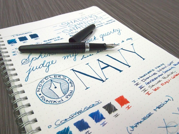
Noodler’s Ink – Navy
Handwritten Review
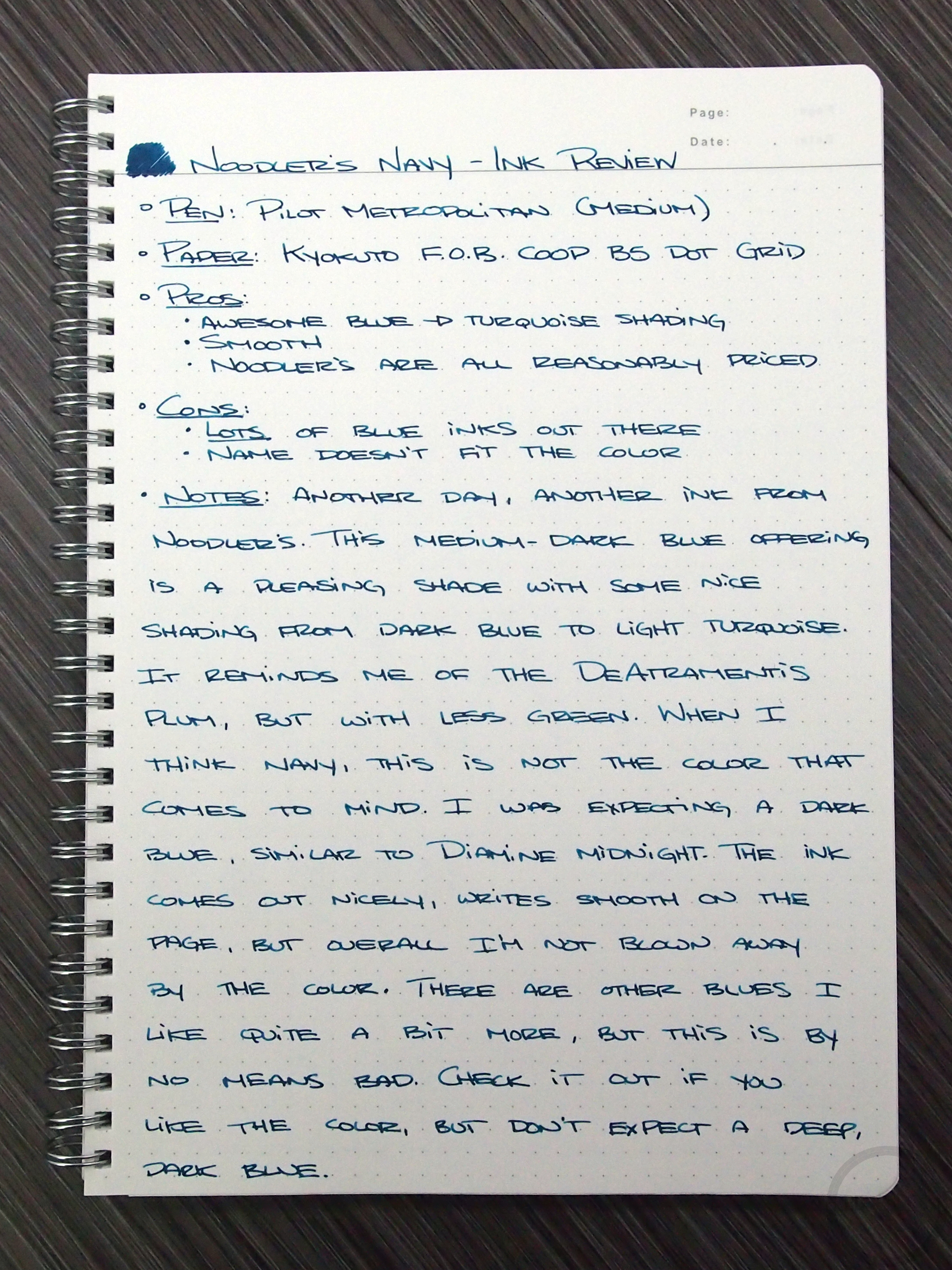
Pen: Pilot Metropolitam, Medium Nib
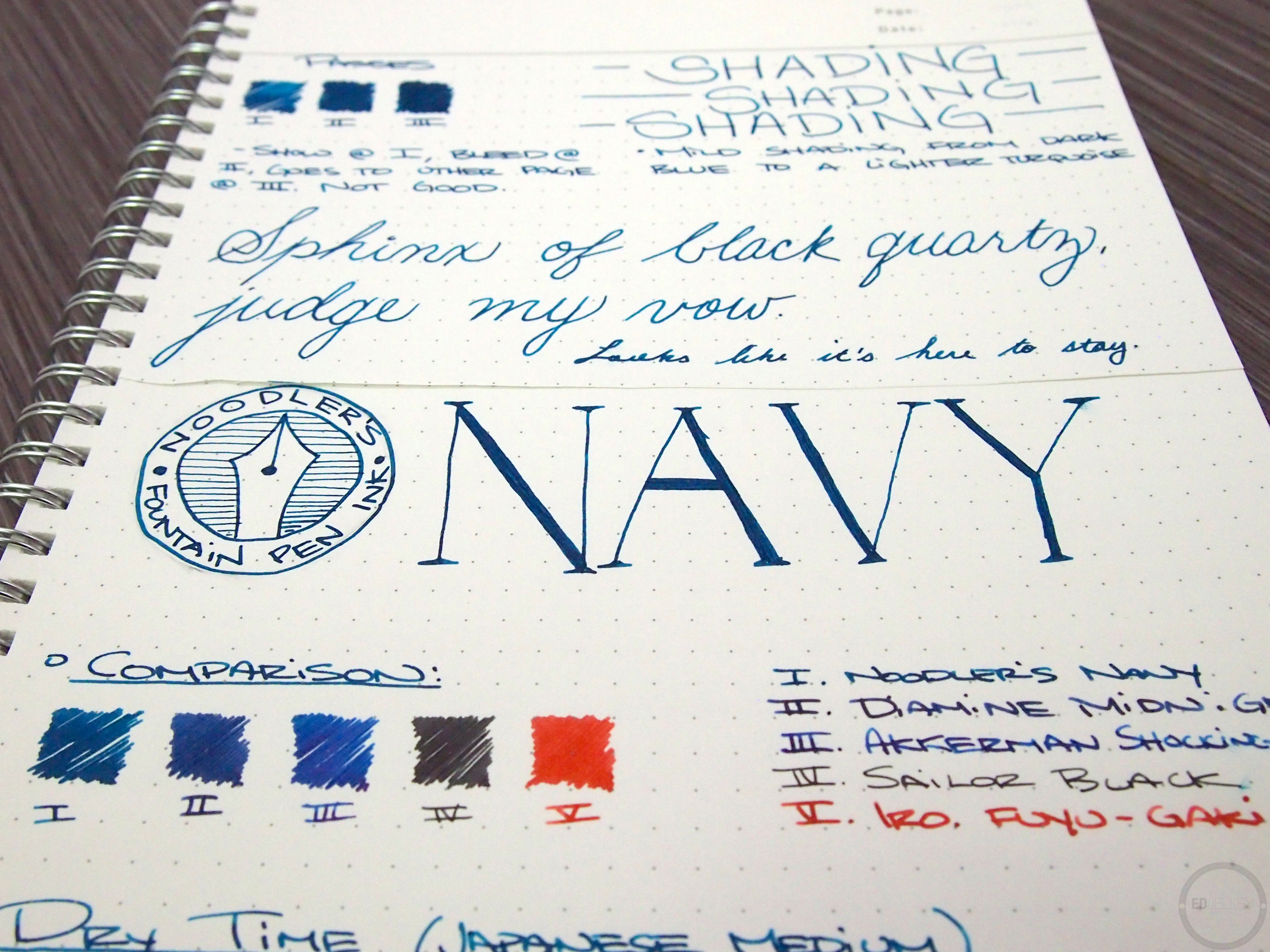
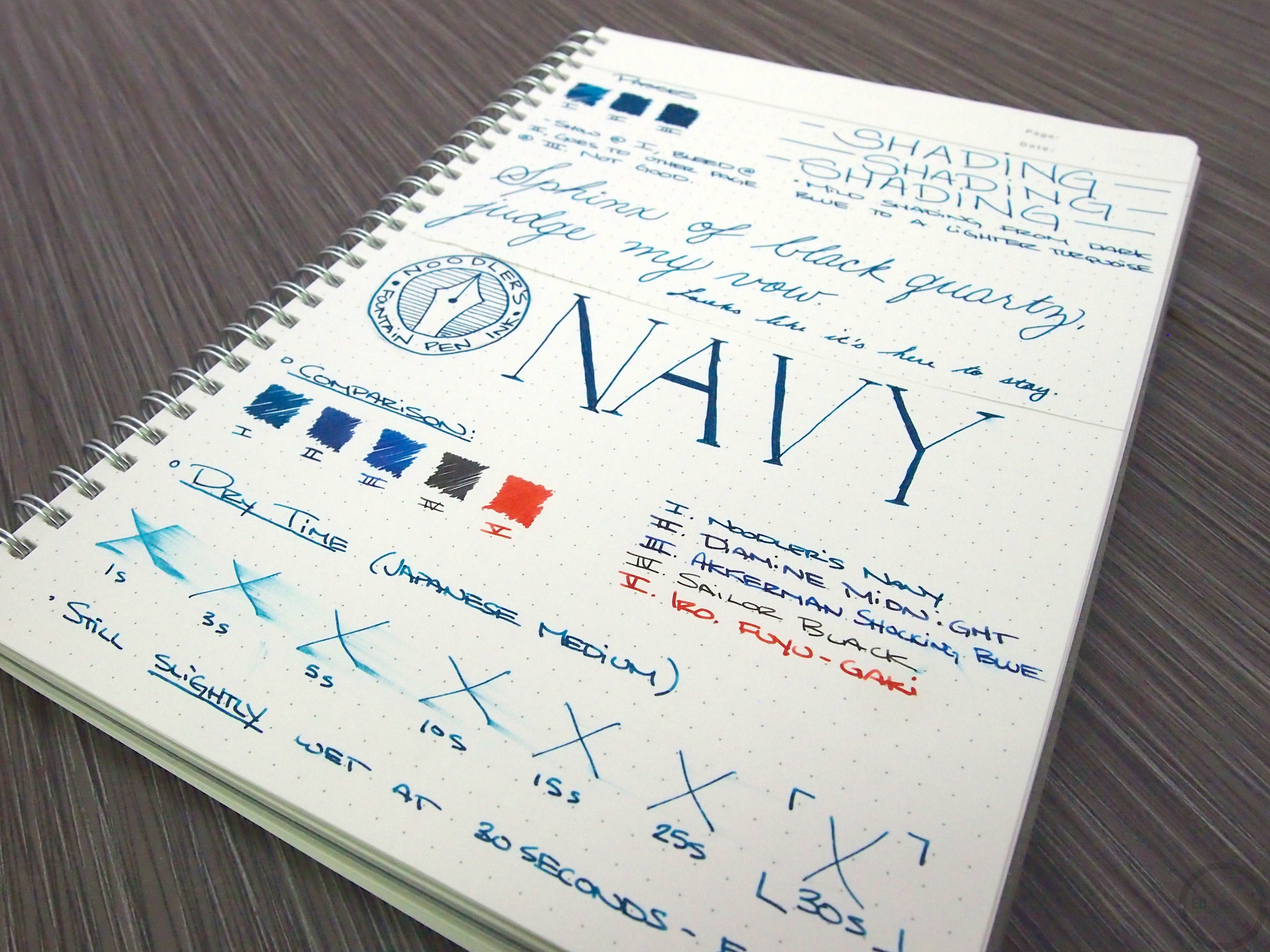
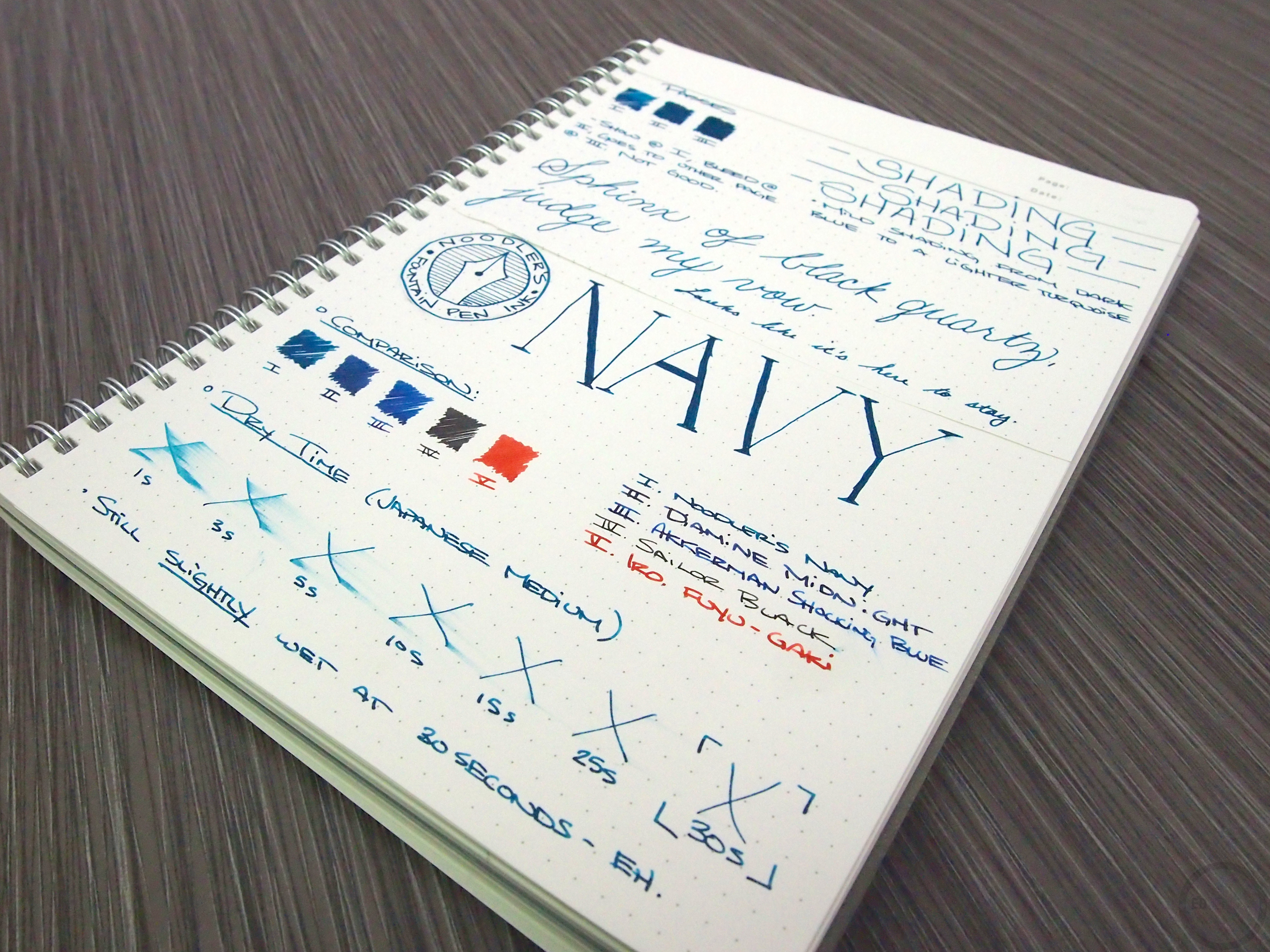
Ink: Noodler’s Navy
Paper: Kyokuto FOB COOP Dot Grid – B5 (Available at JetPens.com)
Notes:
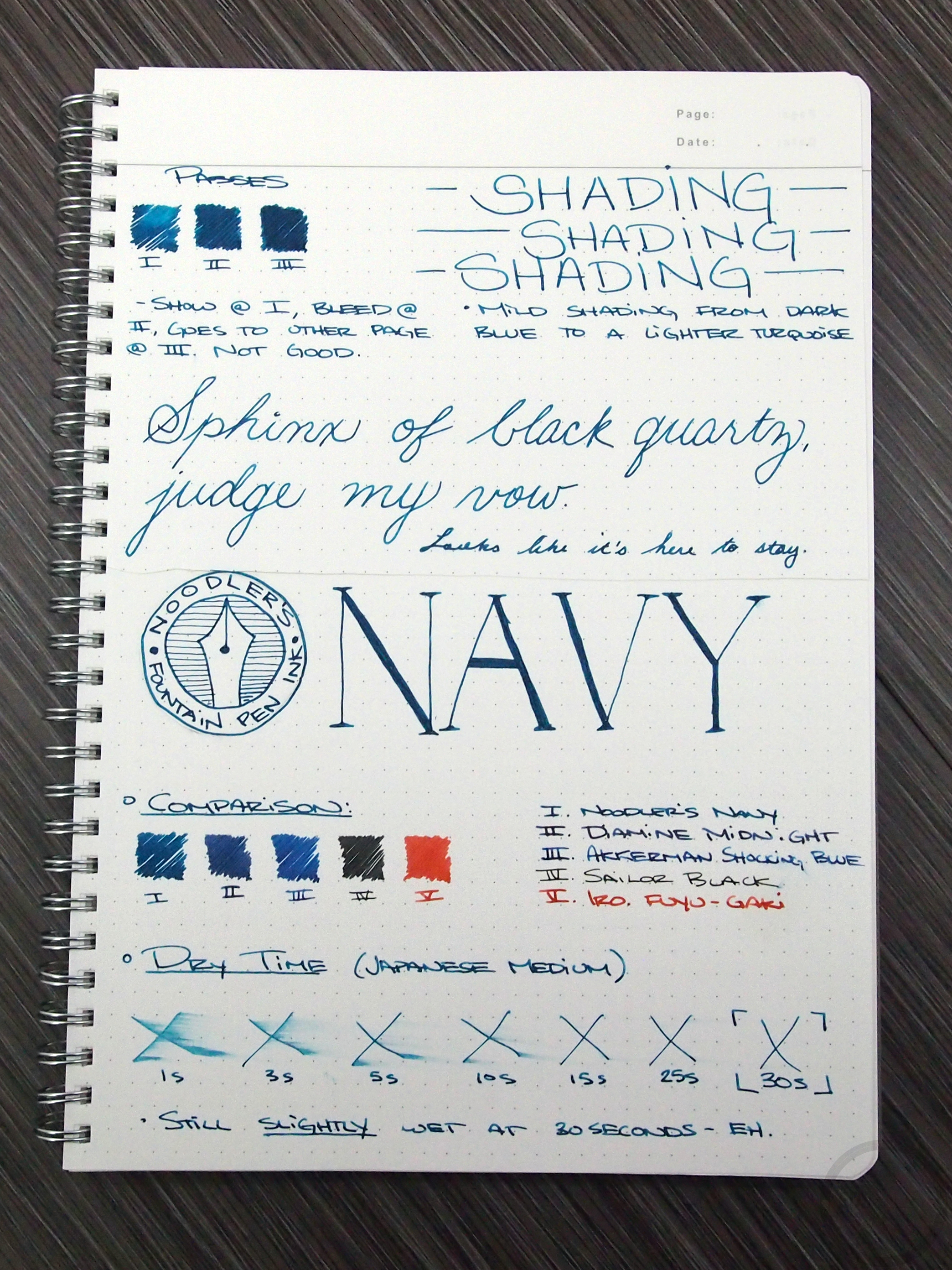
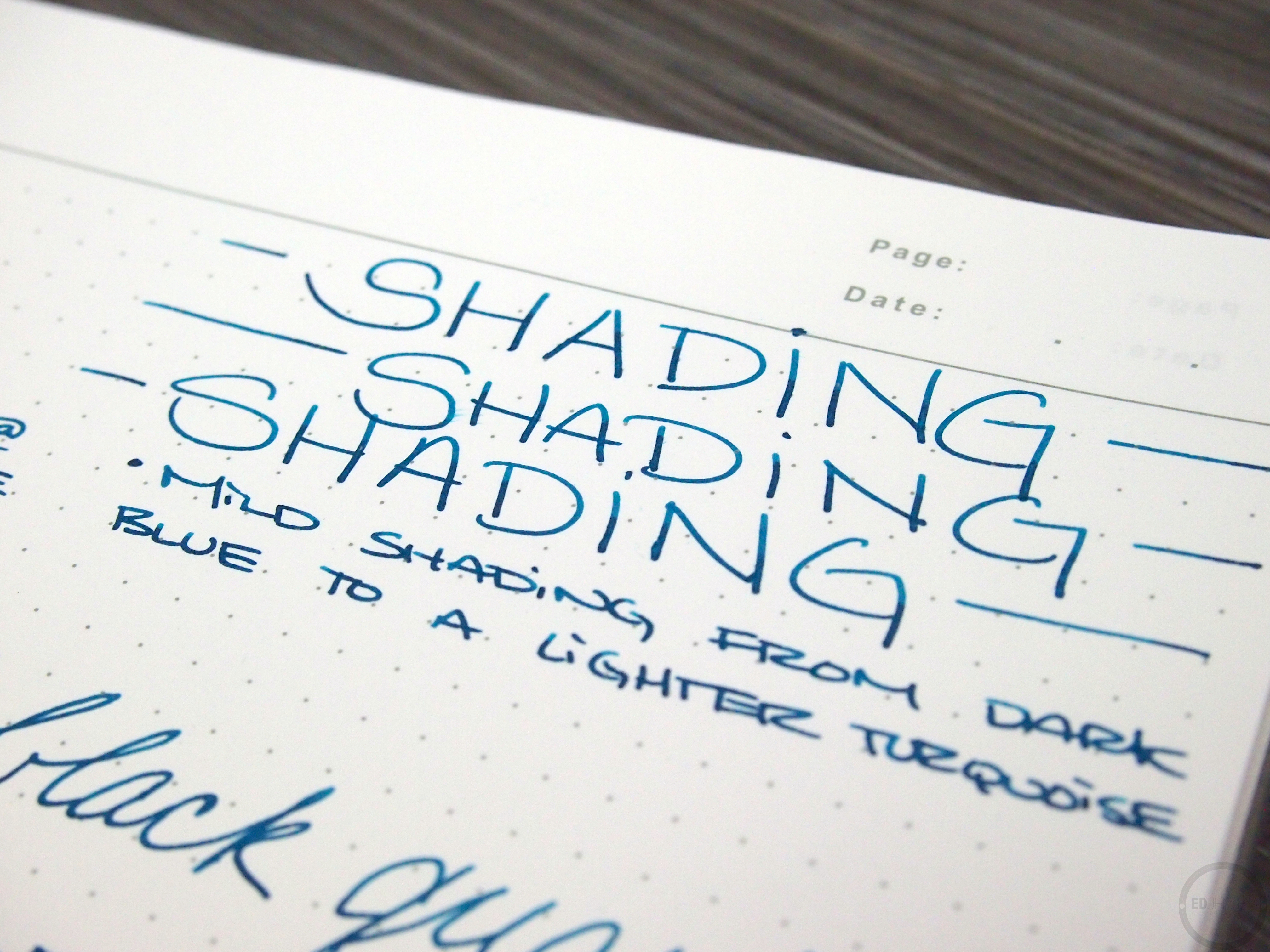
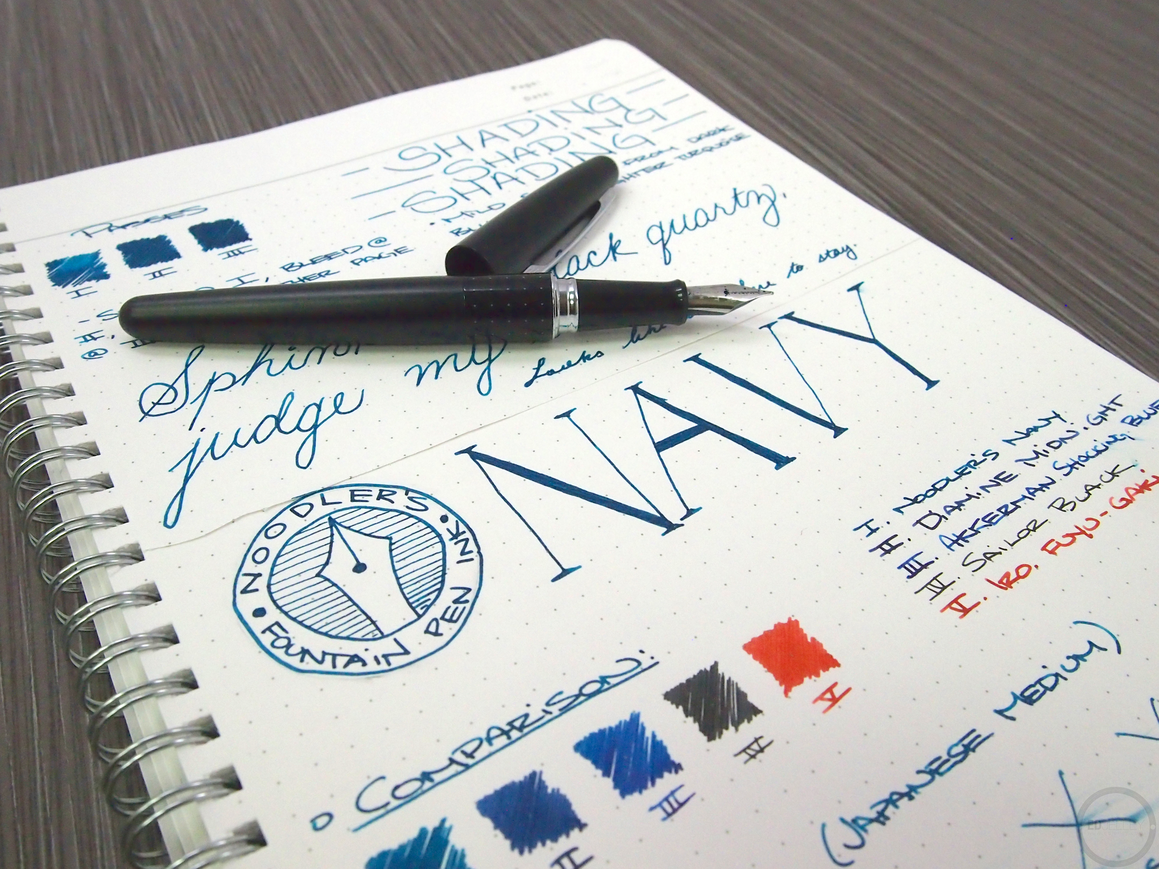
Another day, another ink from Noodler’s. This offering is a medium-dark shade of blue that exhibits some nice shading properties, ranging from a light turquoise to a dark blue. It reminds me a bit of De Atramentis’ Plum, but without the green tone. When I think of Navy blue, this is not the color that comes to mind. I was expecting a dark blue with a bit of grey in it, like Diamine Midnight or Noodler’s 54th Massachusetts. The ink performs well, flowing effortlessly from the Metropolitan’s medium nib. Lubrication and smoothness are on point with what’s expected, but overall I’m not blown away by the color. There are other blue inks that I like more that I already have in my collection, but Noodler’s Navy is by no means bad. Just be aware that you’re not going to get that deep dark blue that comes to mind when you hear “Navy” blue.
Pros:
- Awesome blue to turquoise shading
- Smooth
- Noodler’s inks are a great value
Cons:
- The name doesn’t really fit the color


 Gallery:


Hmmmmm. Interesting. I have never bought this color because I was always puzzled by the color and the fact that it was not anywhere NEAR navy blue. Now that I see it though, I kind of like it!
It’s a really nice color, and there’s some cool shading going on. but its not navy blue haha.
I would go the sample route first, there are so many blue inks out there and I think that there are some much better ones.
I got a sample of this recently and loved it. I was going to buy a bottle but now you’ve got me intrigued, what blues do you like more?
I’m a big fan of Noodler’s Bad Blue Heron and 54th Massachusetts. Iroshizuku Kon Peki is great, as is Diamine Denim.
Navy is by no means a bad ink, go for it!