
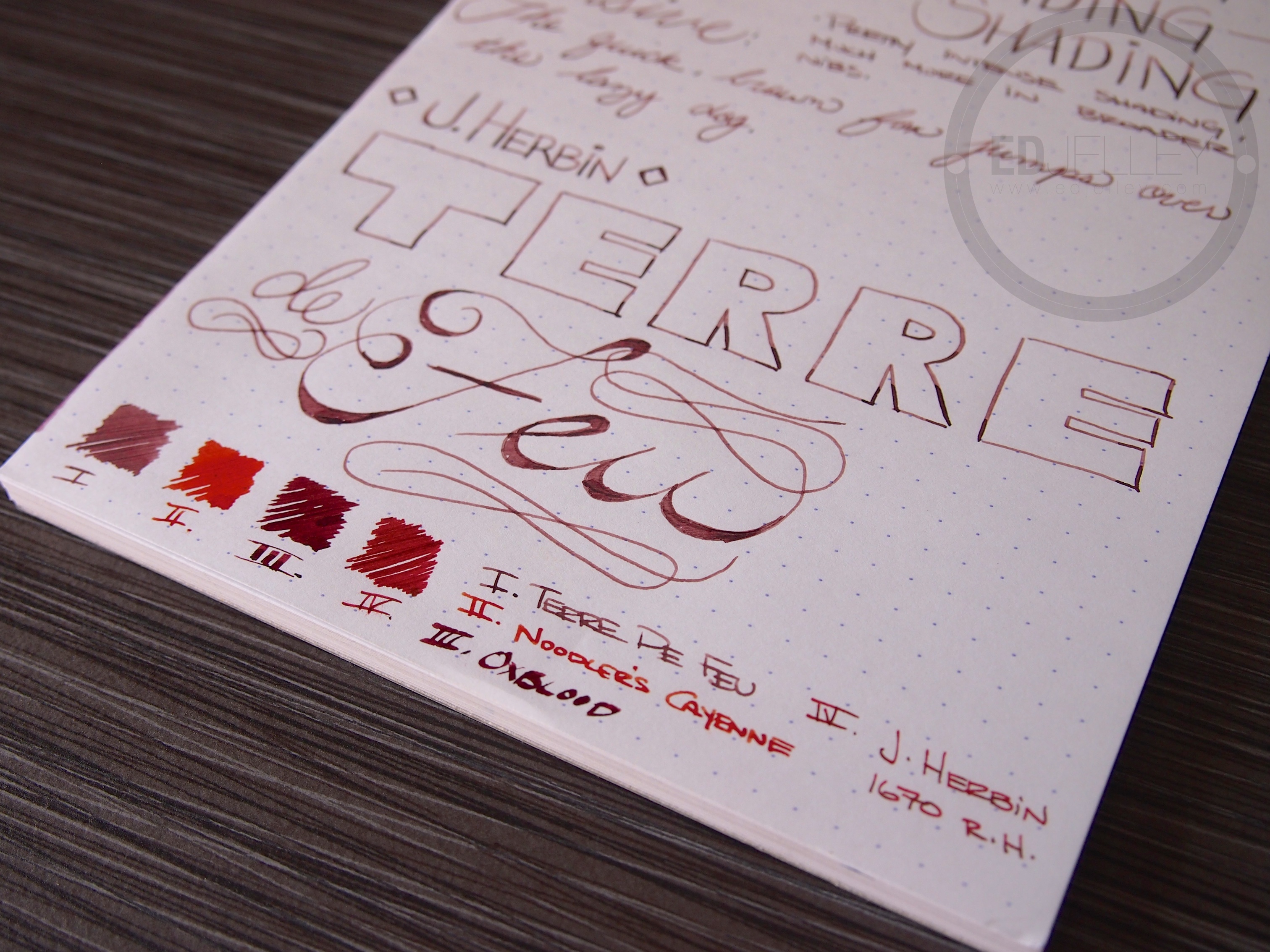
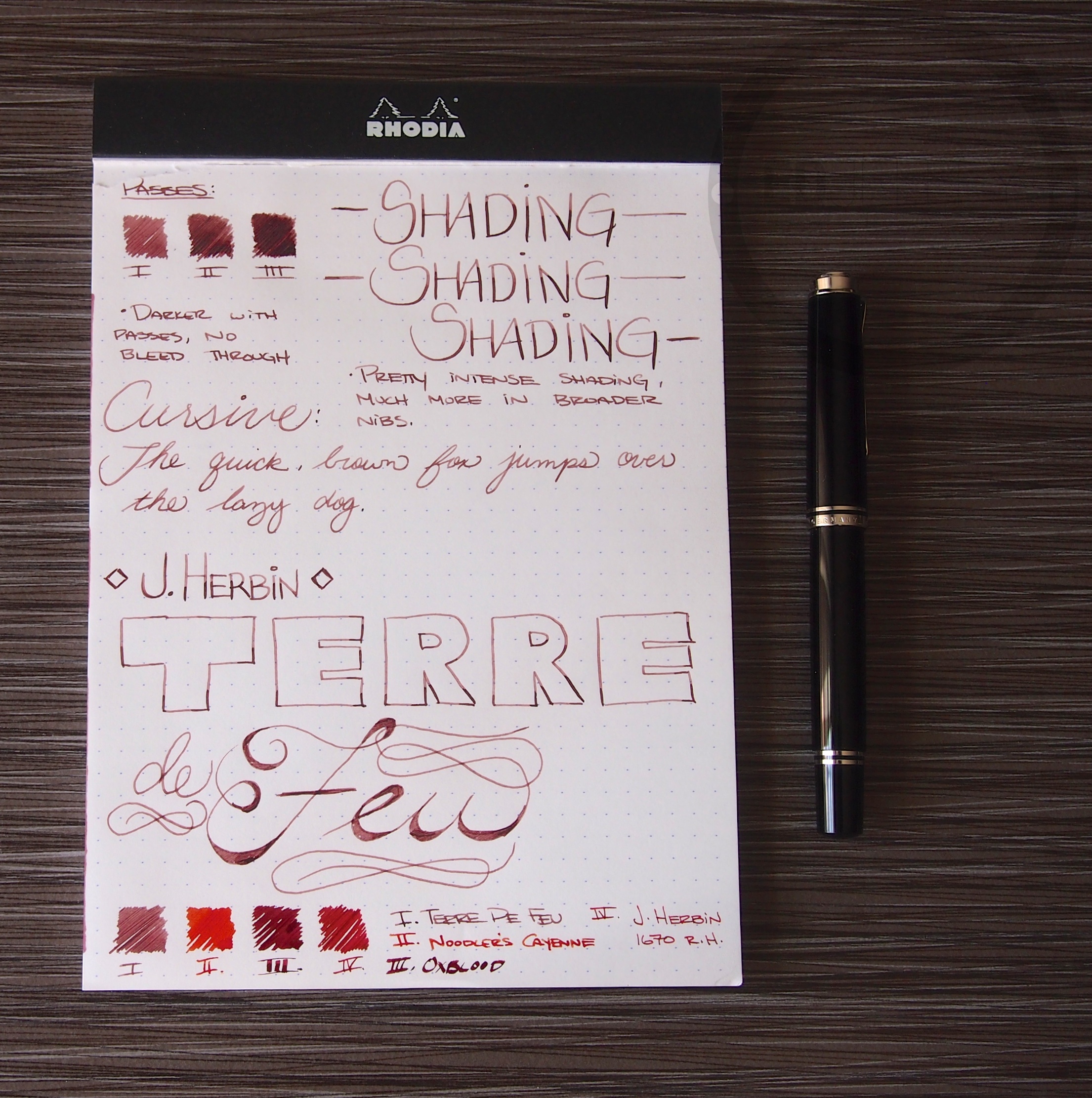
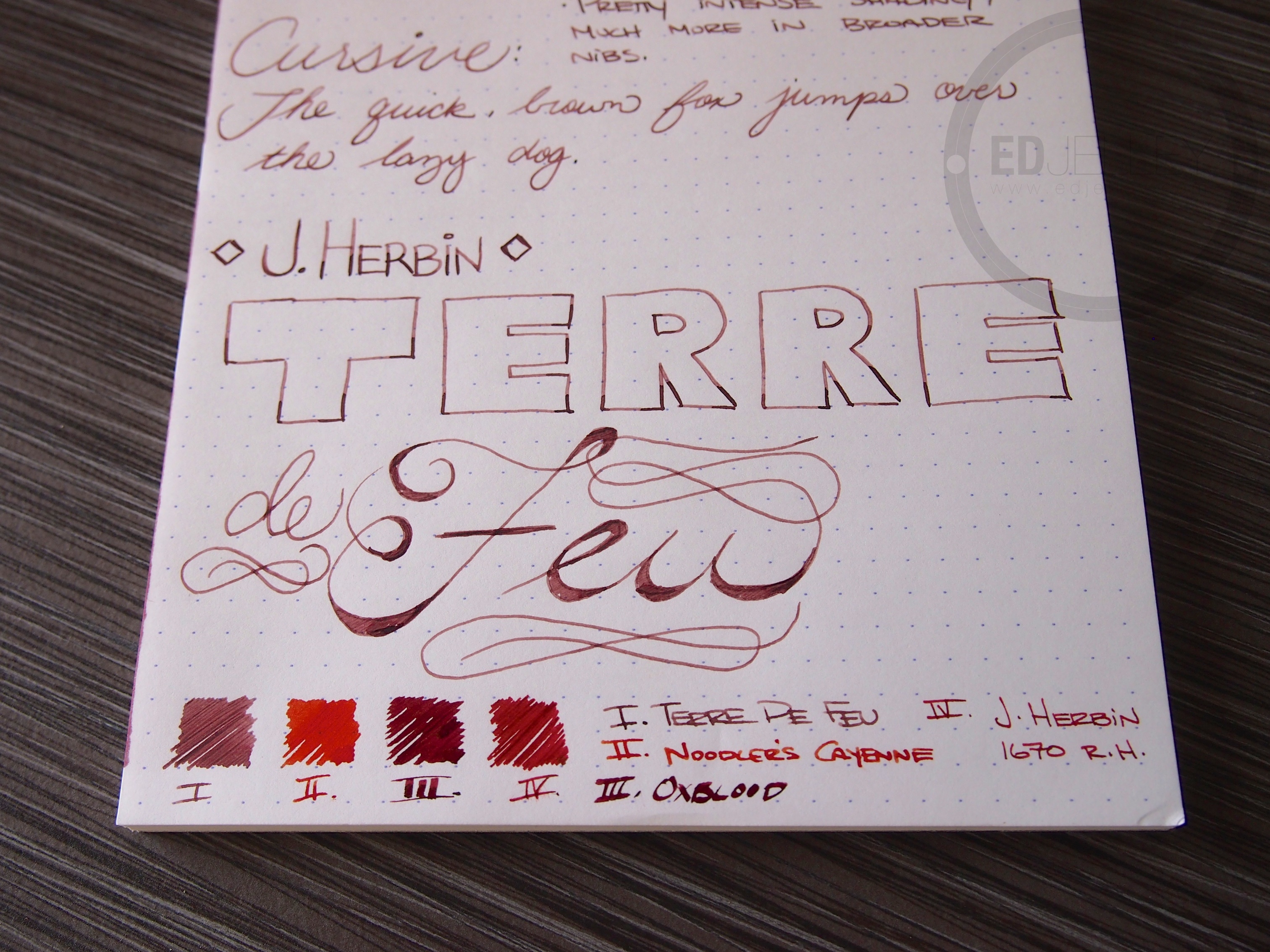
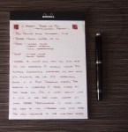
J. Herbin : Terre de Feu Fountain Pen Ink
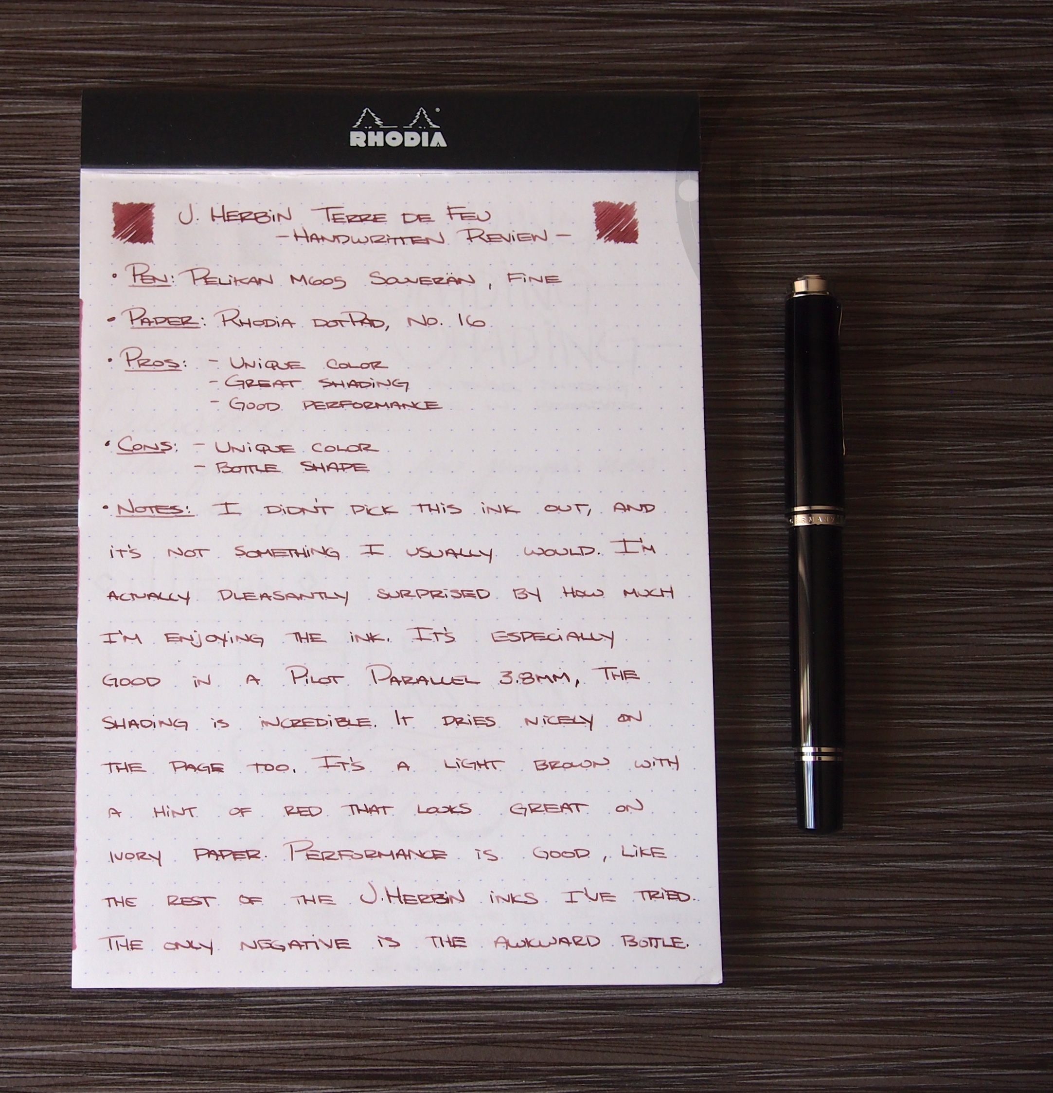
 Pen: Pelikan Souveran M605 – Fine nib
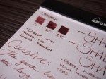
Ink: J. Herbin Terre de Feu
Paper: Rhodia dotPad, No. 16 – Top Spiral Bound
Pros:
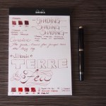
- Unique Color
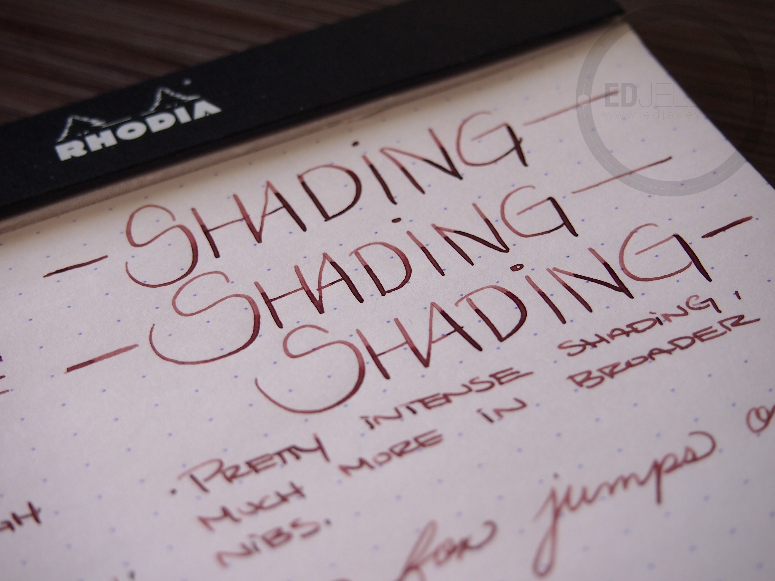
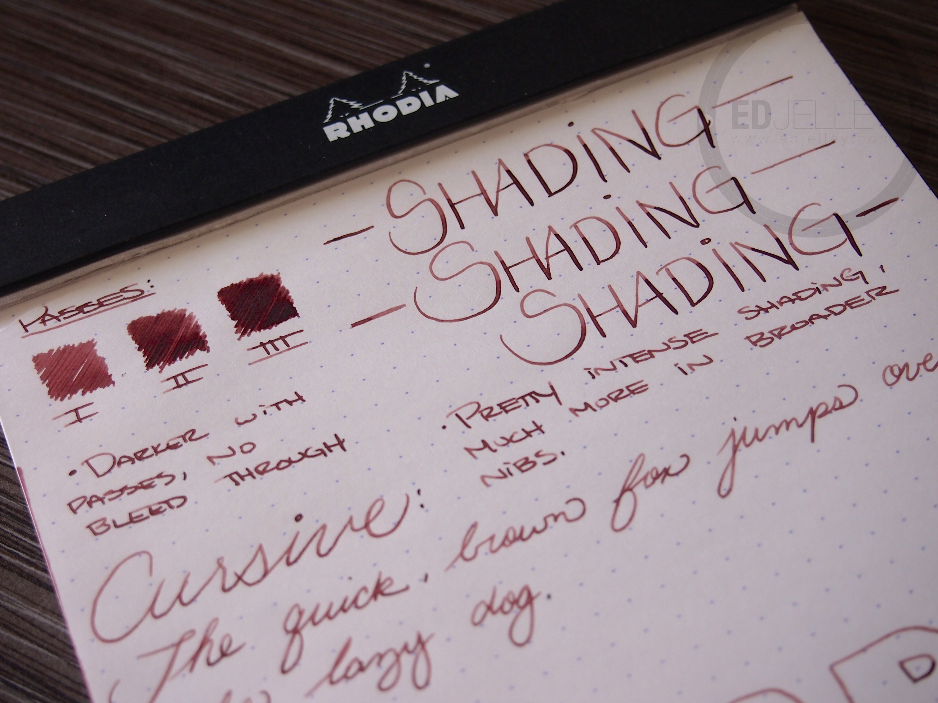
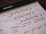
- Great Shading
- Good Performance
Cons:
- Unique Color
- Bottle Shape
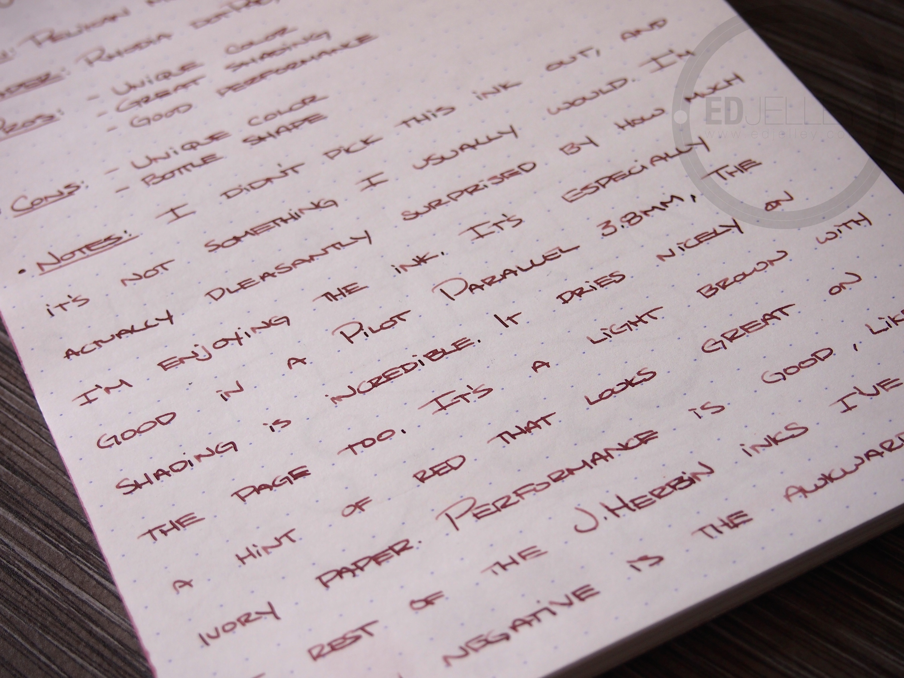
Notes: If you notice that I put “unique color” as both a pro and a con. The ink is definitely a different color from the offerings out there. I didn’t pick this ink out, and it’s not something I usually would. I’m actually pleasantly surprised by how much I’ve been enjoying it though. It’s especially good (due to the great shading) in a Pilot Parallel 3.8mm, the shading is incredible. It also dries nicely on the page. I would call Terre de Feu (Land of Fire) a medium reddish brown. When you translate the name from French, it does a pretty good job of describing the ink. I particularly like this ink on ivory paper, as it cuts down on some of the red and looks almost like a sepia. Like most J. Herbin inks, the performance is good but the bottle is poorly designed. I like the ink quite a bit and use it on a regular basis. Overall, it’s definitely worth checking out.
Thanks for reading, and enjoy the review!


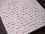
Gallery:


Related Reading:

Very nice. I’m actually a big fan of J. Herbin’s colors. I think they’re very pretty and overall great with shading! I will have to add this to my list! Thanks for the review!
I use this ink for my notes related to Buddhism, because it looks a lot like the robes that the monks wear in Thailand. If you’re into ink pairing, it goes nicely with JH Vert Empire.
Interesting!
I happen to have a bottle of the Vert Empire, I think I’ll need to try them out with each other.
It was actually bought for me along with a bottle of Iroshizuku fuyu-syogun, which happens to pair nicely as well.
Thanks for reading!
Nice to see a review on one of my favorite inks. Actually I am very fond of J. Herbin’s color family- Lie de The, Terre de Feu and Cafe de Iles. All of these colors are outstanding on the pale ivory of Midori MD paper and the shading does pop. Fortunately all of these inks will shade no matter what the nib size, but but a broad or stub is pretty awesome.
Glad you enjoyed it, thanks for reading!
Usually, I’m not a big fan of browns, but this one works for me. I think the shades of red in this ink help me like it more though.
J. Herbin across the board has some great shading.
Dull old brown with a secret –
If you add water you get the most beautiful coral!