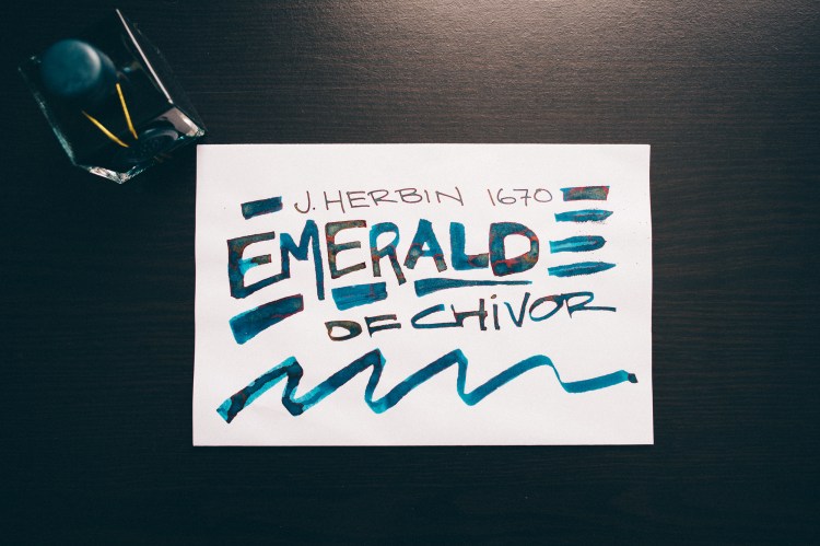
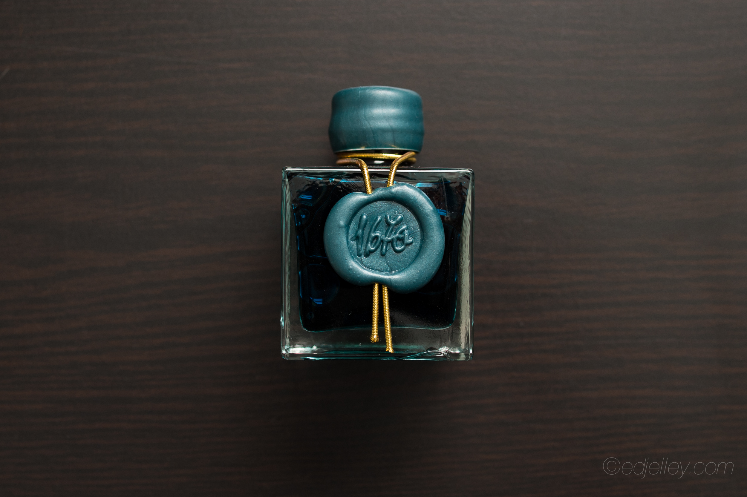
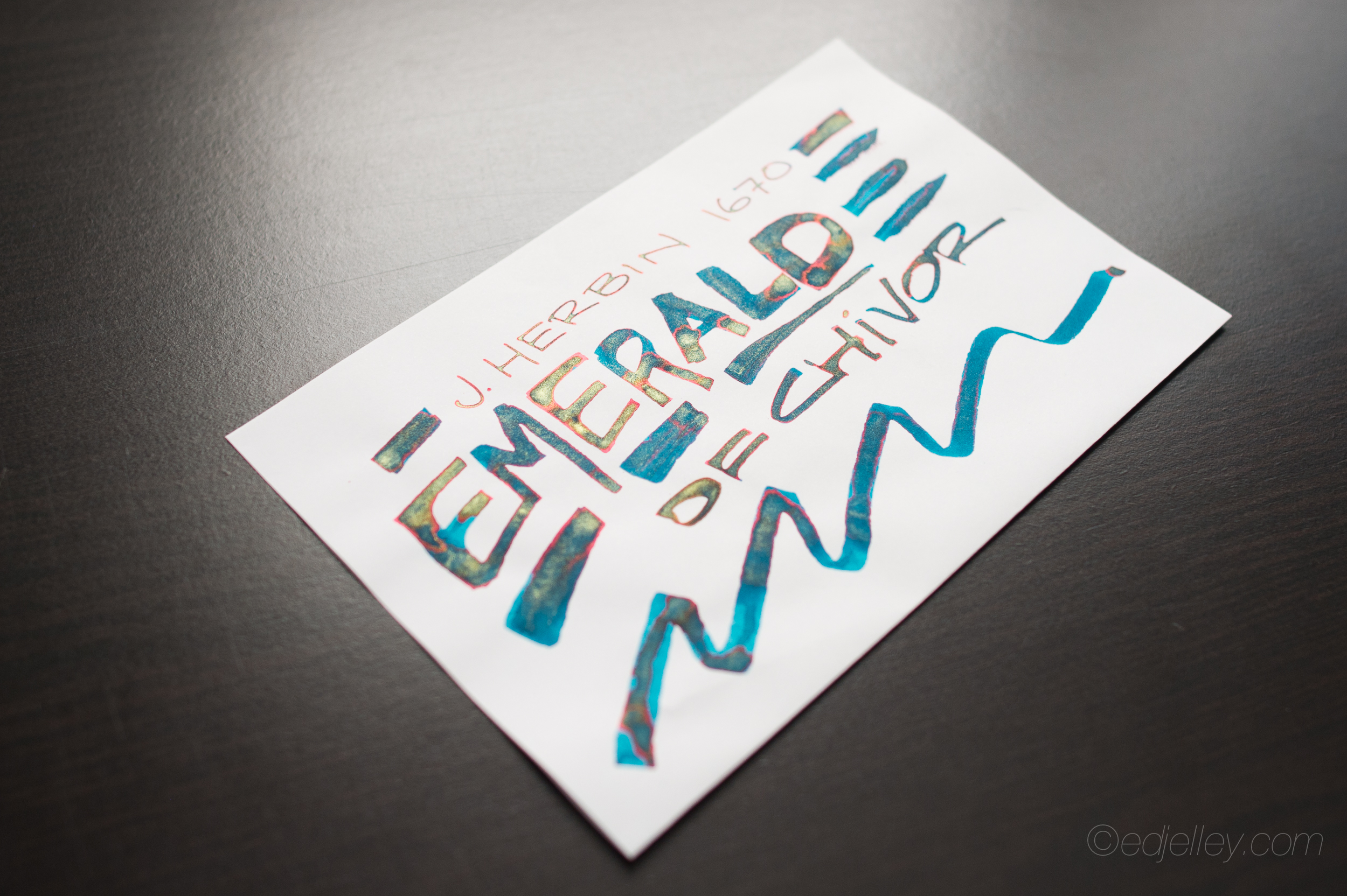
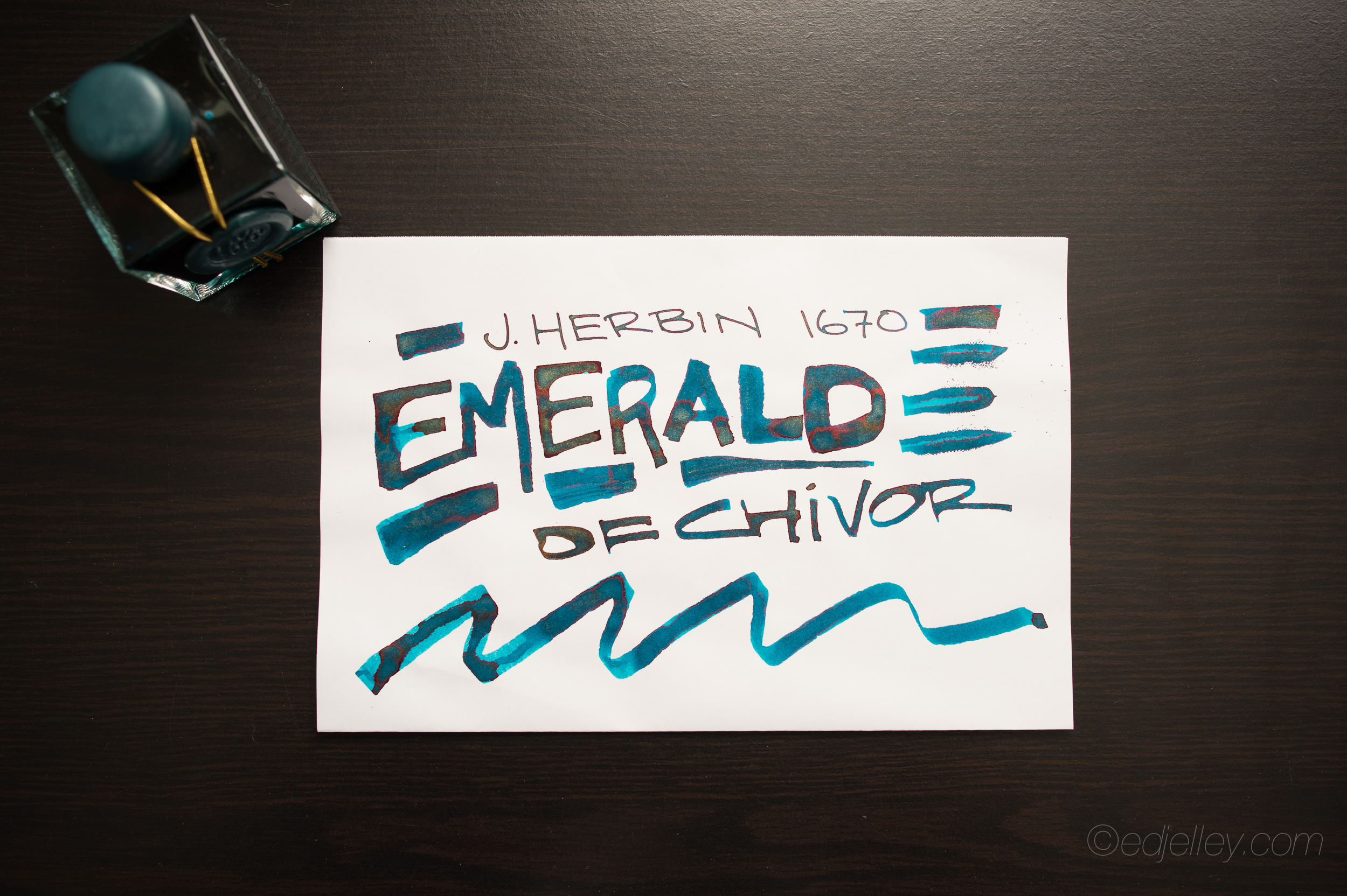
J. Herbin 1670
Emerald of Chivor
Fountain Pen Ink Review
Pen: Lamy 2000 Stainless Steel – Broad, Folded Nib Dip Pen
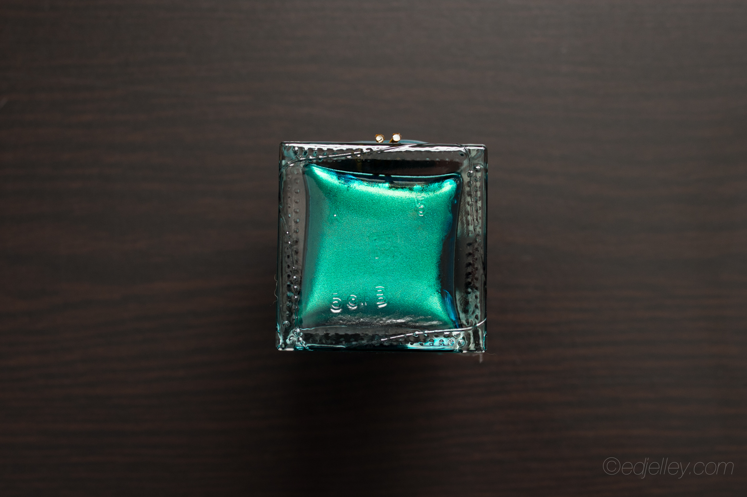
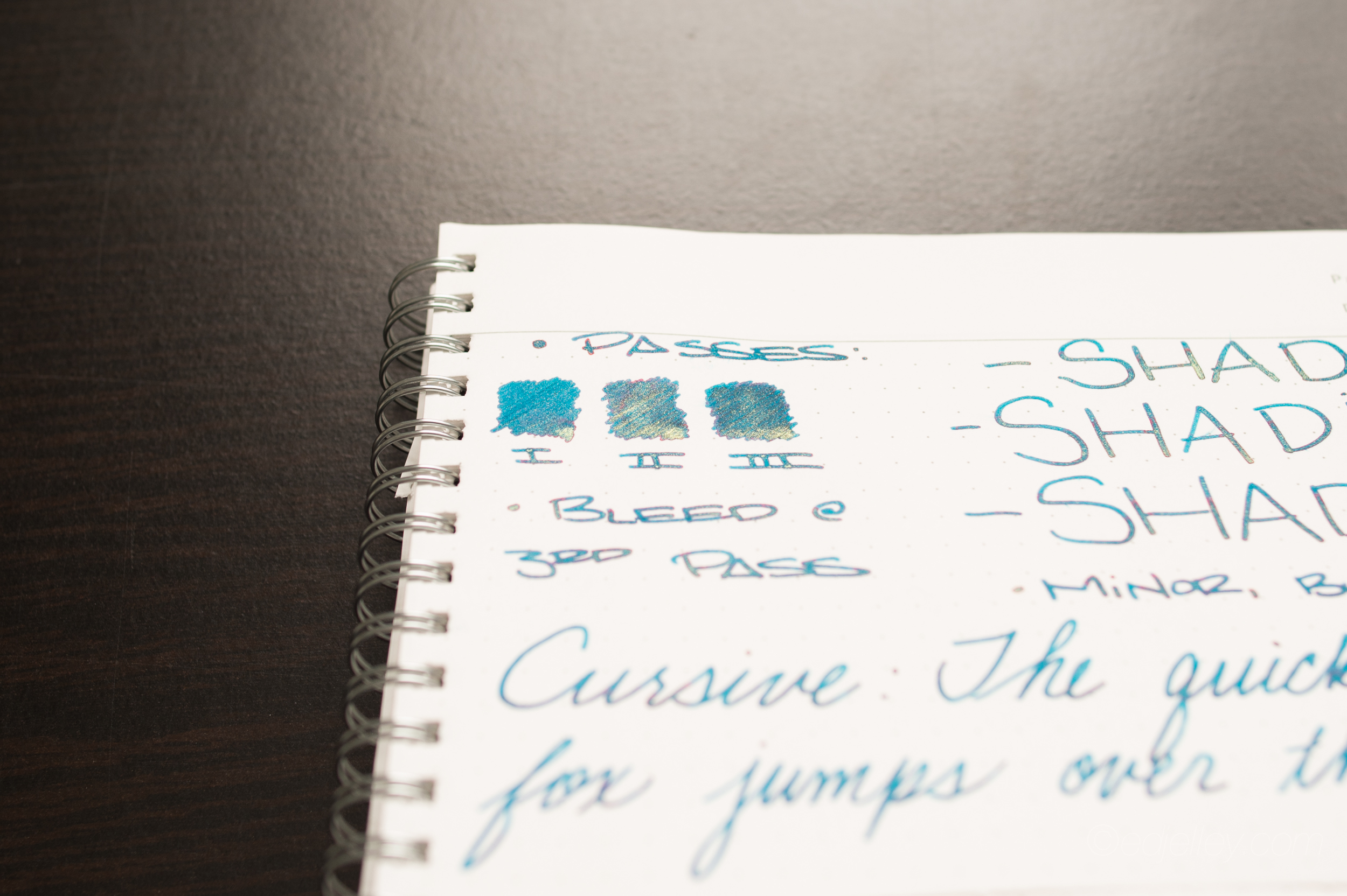
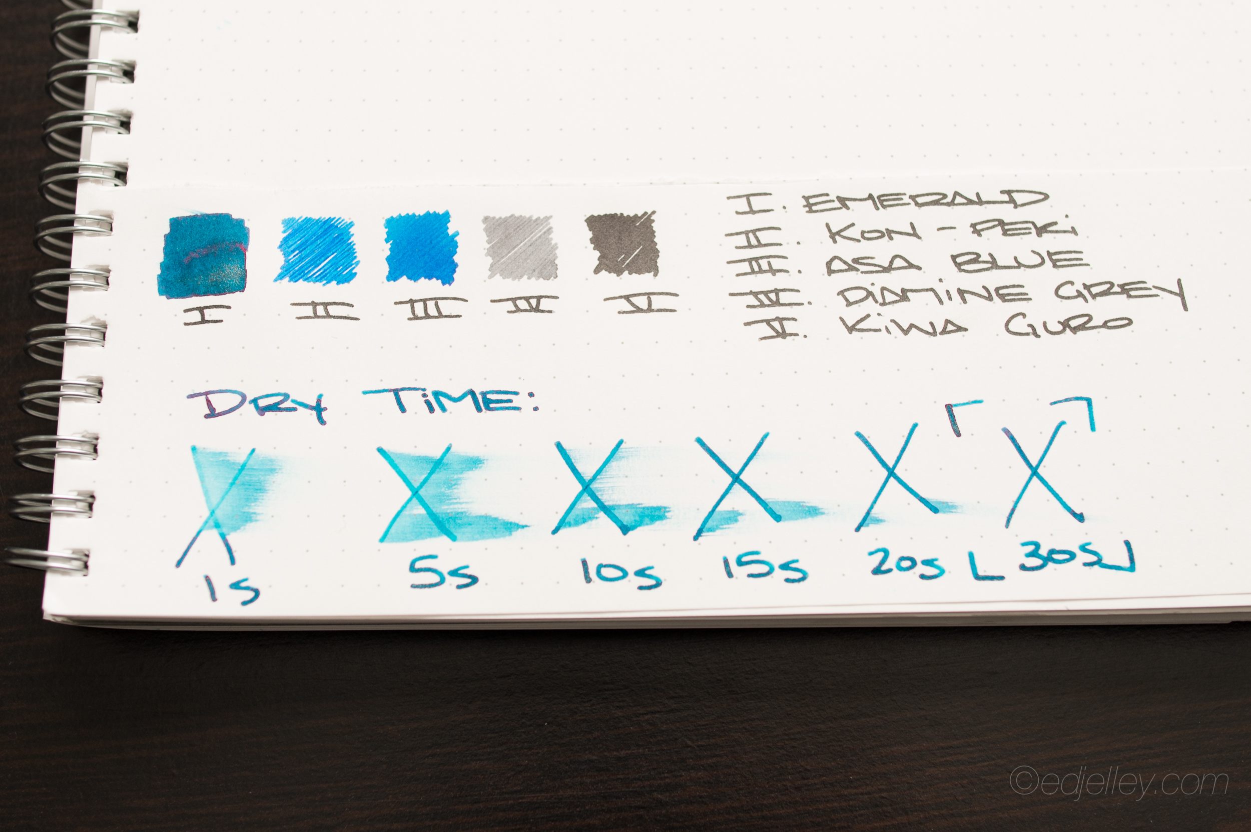
Ink: J. Herbin 1670 Emerald of Chivor
Paper: Kyokuto F.O.B. COOP – Dot Grid – B5
 Notes:
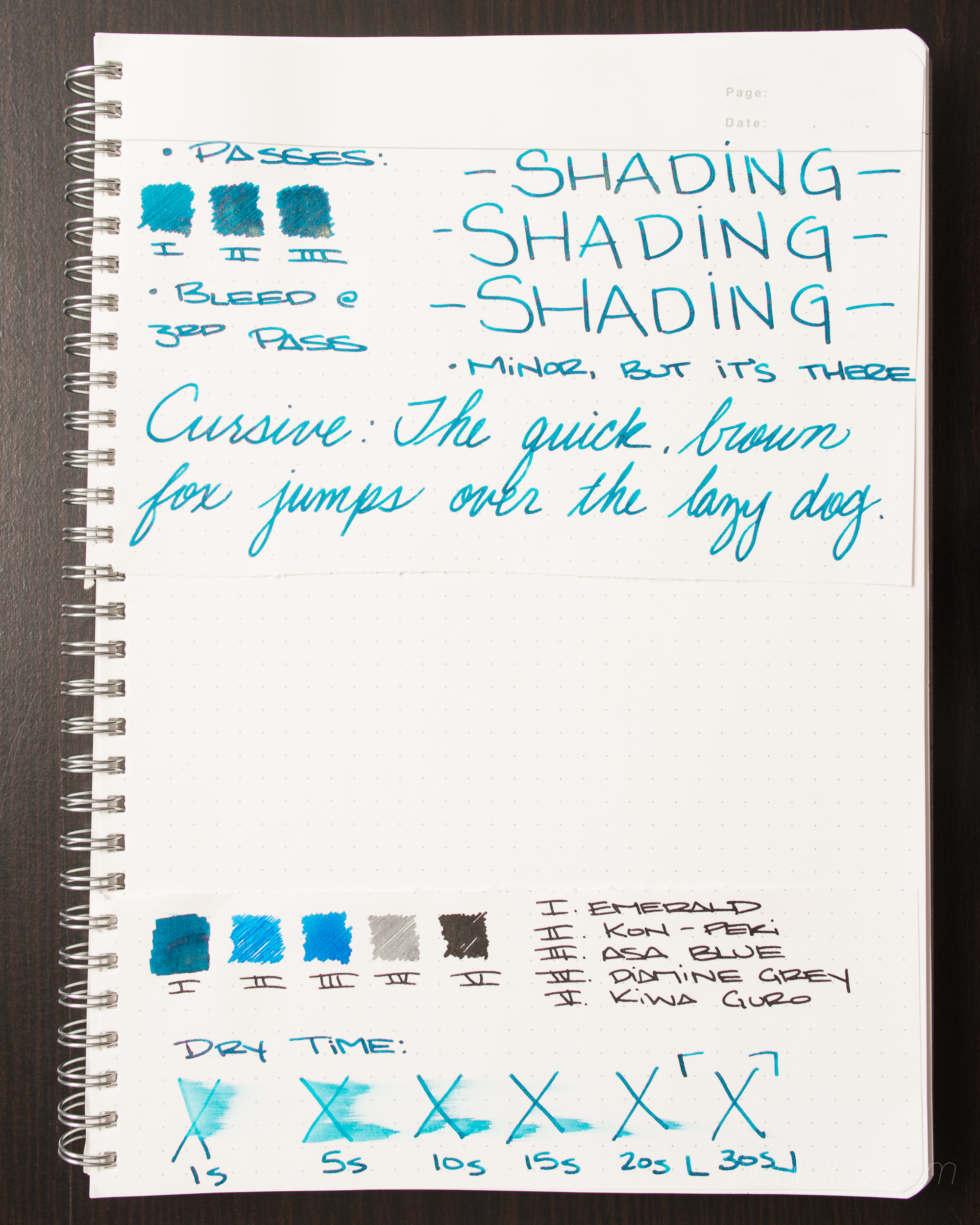
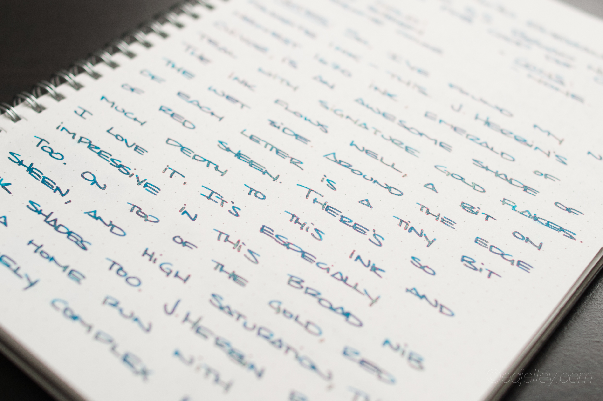
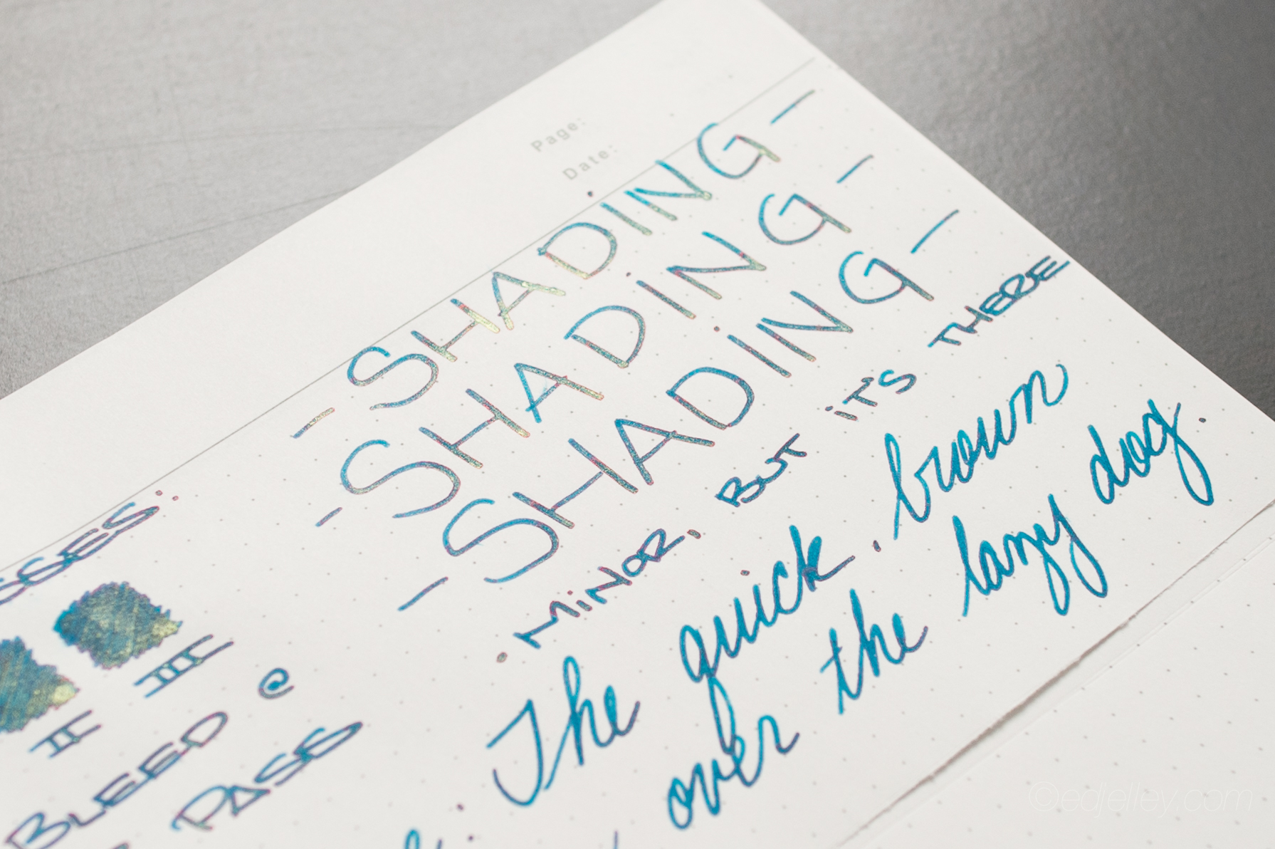
So, I’ve found my new favorite ink…this one. J. Herbin’s Emerald of Chivor is an awesome shade of teal with the signature 1670 gold flakes. In addition to the gold, there’s an incredible red sheen seen around the edges of each letter and where the ink pools – resulting in an ink with intense depth. The ink flows well, if anything a bit on the wet side in my Lamy 2000’s broad nib. There’s so much depth to this interesting ink and I absolutely love it. Even my friends who have seen it (who couldn’t care less about fountain pens and ink) commented on how cool it looked. I think the ink looks best in a broad nib, and even better in a folded nib dip pen. On top of the gold flakes, the red sheen, and the high saturation, the ink has a nice degree of shading. J. Herbin really hit it out of the park with this intensely complex ink!
Be on the lookout for Emerald of Chivor in stores later this summer!
Check out this video I produced for J. Herbin for the new ink:
https://www.youtube.com/watch?v=cxnRasiQFbM&feature=youtu.be
All photos are uploaded in hi-res, click to enlarge!
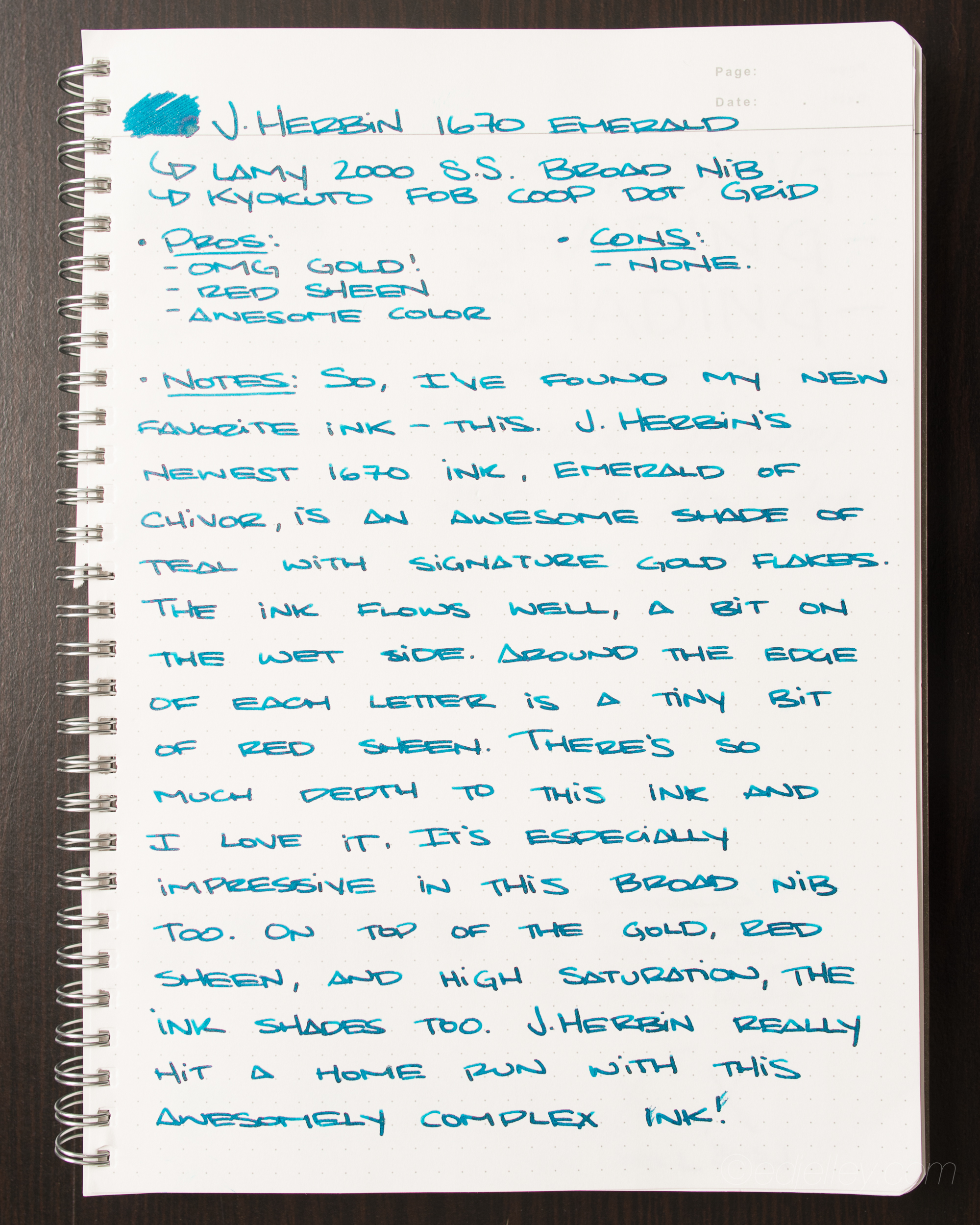
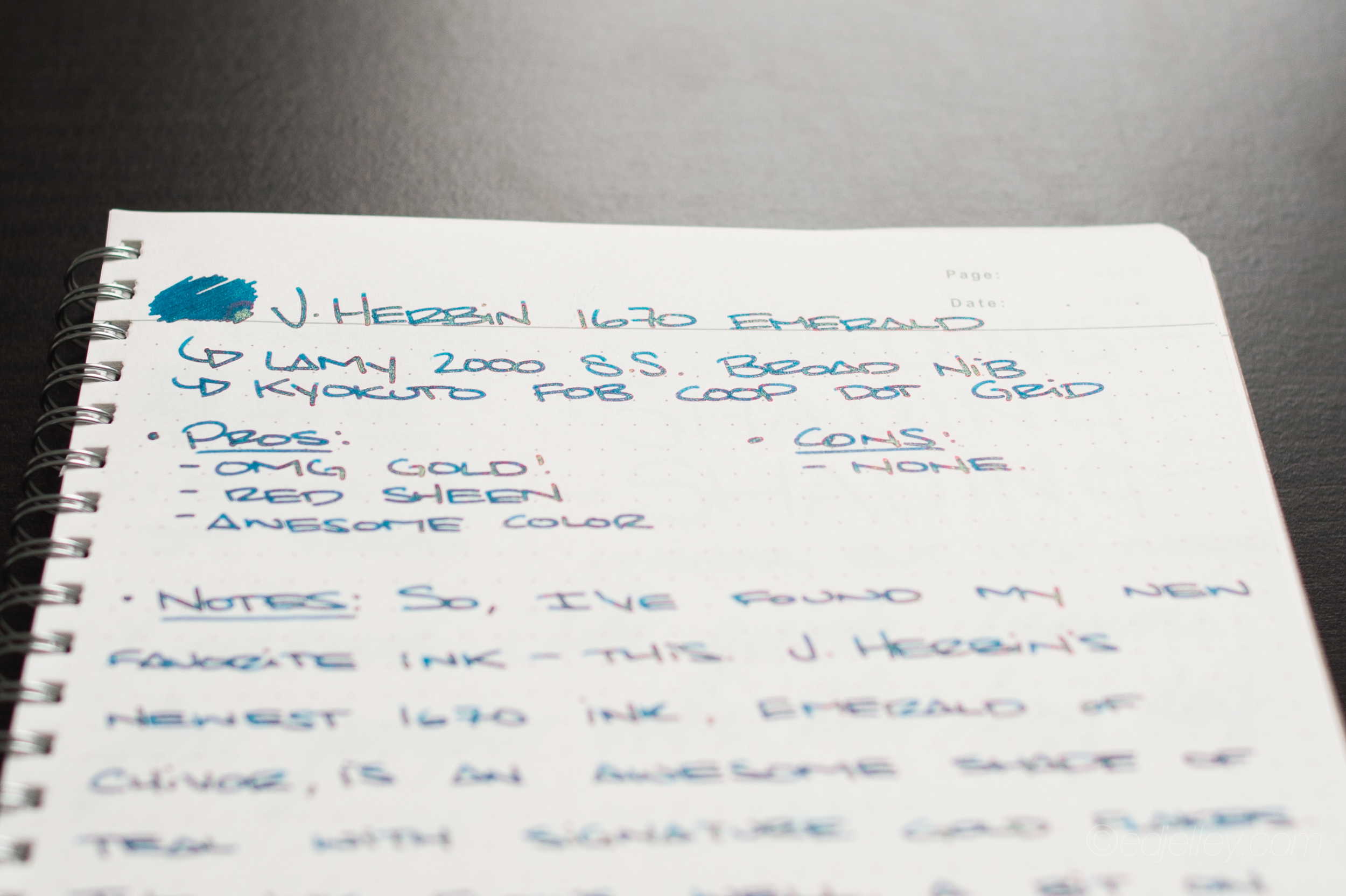
Pros:
- OMG GOLD FLAKE
- Red Sheen
- Awesome color
- Great shading
Cons:
- None!
Gallery:


Disclaimer: I received this bottle of ink pre-release for purposes of product photography and video production. I was not compensated for this post – all opinions are my own.

Wow!!!
This might be the one 🙂
Thank you, thank you, thank you. I knew this ink was special, but your review shows it to be a most exceptionally gorgeous ink — it is beyond what I could imagine a beautiful ink to be. I so look forward to getting into the fray, trying to get a bottle early. Love that you used a folded pen!
Thank you, thank you, thank you. I knew this would be a gorgeous ink, but your review shows that it is beyond my wildest imaginations of what the epitome of a beautiful ink might be. I love that you used a folded pen, but I am so happy to see it look so extraordinary in your bold-nibbed fountain men.
I am looking forward to joining the fray to acquire an bottle early!
I didn’t feel strongly about the 1670 line…until now. This ink gives me all the feels!
Probably the most impressive ink I have seen in quite some time 🙂
OMG This one is a real stunner!
absolutely i was waiting for this review. appreciated much. as one of those lucky guys who had the opportunity to try all four 1670s, can you please compare their “gold” ratio? i use blue ink for my everyday needs but when i read around most of the reviewers think that “1670 bleu ocean” doesnt represent that “gold” as others. if so i may choose the “1670 stormy grey”. should i try “1670 emerald of chivor” for my semi-formal use? what can you say about that?
amazing! I agree with chewytulip, whilst I’ve liked previous 1670s, they’ve not leapt out as a “Buy Me” like this one does!
How does it compare to Yama-dori?
This is definitely a contender for the “best ink ever made” award.
I will definitely pick this up when it is released!
Beautiful video for a beautiful ink. May I ask what it is you are writing with? I haven’t seen one like that before. Folded nib?
Thank you! Yes, it’s a folded nib. The brand is Horizon.
Reblogged this on linhd29.
How did you get that sheen? Is it the nib that you used, or is it the paper? Or did you shake the bottle first, then ink your pen?
I shook the bottle a bit and the writing is with an exceptionally wet broad nib!
And a recommendation for an exceptionally wet broad nib?
My Lamy 2000 Stainless Steel has one!
What kind of paper are you using?
Both this (https://edjelley.com/2014/03/29/kyokuto-f-o-b-coop-b5-dot-grid-and-lined-notebooks-review/) and Rhodia!